


We can use a Geo Chart or Geo Chart with Markers in Google Sheets to display data on a geographical map of a country, continent, or region.
You can select one of the continents: Africa, Asia, Europe, North America, and South America; the region Oceania; or the country America to emphasize that specific area on the map.
A Geo Chart (with Markers as well) can be beneficial for various purposes, including the geographical distribution of data, regional data comparison, sales and performance analysis, tracking website presence or performance across the globe, population density, project management, market analysis, etc.
For example:
If you own a product targeting a broader area, whether within your country or globally, you can visualize location-wise product sales on a map within Google Sheets. Hovering your mouse on the map will display the data, which changes as you move from country to country or city to city.
Similarly, teachers can use this chart as study material by visualizing multiple Geo Charts with data available from reliable sources online, such as food grains production by country, arms import by country, etc.
Data Layout and Geo Chart Selection
Both the Geo Chart and Geo Chart with Markers require data organized in two columns or rows. An additional column or row can be used to display extra information, but it does not impact the highlighting or markers within the map.
Generally:
For the Geo Chart, it is preferable to have one column/row containing the continent/region/country/state/city names and another column/row containing numeric data.
For the Geo Chart with Markers, it is recommended to have one column/row containing country/state/city names and another column/row containing numeric data.
It’s important to use specific terminology relevant to your data and the varying granularities you require.
How to Create a Geo Chart in Google Sheets
Let’s consider sample data featuring the top 10 countries where this blog has a presence and the number of visitors from each region.
Disclaimer: We have no control over the geographical boundaries of countries on the map. We are utilizing the map available within Google Sheets.
Sample Data:
My data is organized in columns where column A contains country names, column B contains the total number of users in these countries. Additionally, there is an informational column in C that contains new users, but it doesn’t impact the chart visualization.
The data range is A1:C11, with A1:C1 containing the field labels Country, Users, and New Users, respectively.
| Country | Users | New Users |
| United States | 29394 | 27566 |
| India | 10508 | 9712 |
| Philippines | 6516 | 5884 |
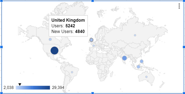
| United Kingdom | 5242 | 4840 |
| Indonesia | 5156 | 4636 |
| Canada | 3532 | 3308 |
| France | 2696 | 2454 |
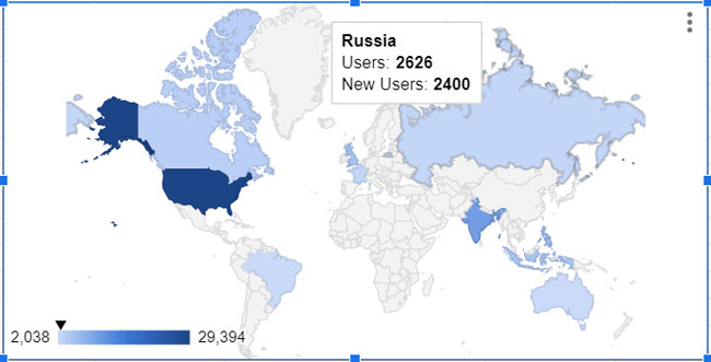
| Russia | 2626 | 2400 |
| Brazil | 2100 | 1960 |
| Australia | 2038 | 1910 |
Step-by-Step Instructions to Create a Geo Chart in Google Sheets
To create a Geo Chart, please follow the step-by-step instructions below.
Select the data range A1:C11.
Click on “Insert” > “Chart” to create a chart and open the sidebar panel containing options to choose the required chart and customization (if you accidentally close the editor, you can double-click on the chart to reopen it).
In the chart editor, navigate to the “Setup” tab. Click the drop-down under the “Chart type” and select “Geo chart” under the “Map” group.
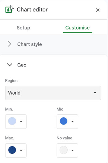
Now, under the “Customize” tab, click on “Geo,” and click the drop-down under “Region” to select “World.” You can choose one of the available options based on the data you have and the granularity you require.
Adjust the Min, Mid, Max, and No value colors if desired.
By following these steps, you can create a Geo Chart in Google Sheets. Click on the chart and hover your mouse over the map to view data in specific locations.
How to Create a Geo Chart with Markers in Google Sheets
I’ve already explained when to choose a Geo Chart with Markers, and the above data is also ideal for this specific chart.
To create a Geo Chart with Markers, follow all the steps outlined in ‘Step-by-Step Instructions to Create a Geo Chart in Google Sheets.’ Then make the following change:
In the chart editor, navigate to the “Setup” tab. Click the drop-down under the “Chart type” and select “Geo chart with markers.”
That’s all. To view country-specific data, hover your mouse over the markers on the map.
Additional Customization
Geo Charts don’t offer extensive customization options. Apart from the previously mentioned choices for Max, Min, Mid, and No value colors, you have the flexibility to modify the background and border color of the chart, as well as font types.
Access these options by clicking on “Chart style” under the “Customize” tab in the chart editor.
Resources
This tutorial describes how to create Geo Charts in Google Sheets. There are plenty of other charts that Google Sheets boasts. Here are the relevant tutorials.
- How to Create a Line Chart in Google Sheets
- How to Create a Bar Chart or Bar Graph in Google Sheets
- Learn How to Create Area Charts in Google Sheets
- How to Create a 3D Pie Chart in Google Sheets – With Pictures
- How to Create Radar Chart in Google Sheets [Step by Step Guide]
- Scatter Chart in Google Sheets and Its Difference with Line Chart
- How to Create Column Chart in Google Sheets [Step by Step Guide]
- How to Create a McKinsey Style Waterfall Chart in Google Sheets
- How to Create Site Organisation Chart in Google Sheets
- Scorecard Charts in Google Sheets – All that You Want to Know
- How to Create a Tree Map Chart in Google Sheets
- How to and Example to Annotated Timeline Chart in Google Sheets
- How to Create Gauge Chart in Google Sheets
- How to Create a Bubble Chart in Google Sheets
- Pareto Chart in Google Sheets Step-by-Step
- How to Quickly Create a Histogram Chart in Google Sheets
- How to Create a Candlestick Chart in Google Sheets
- How to Create a Bell Curve Graph in Google Sheets