To color each data point in the column or bar chart according to the target, we can utilize miniature charts in Google Sheets.
We can generate these miniature charts directly within Google Sheets by leveraging the SPARKLINE function.
Imagine you have daily, weekly, or monthly targets alongside actual values. How can you dynamically highlight the bar color in red if the actual value falls below the target, and green if it exceeds the target?
For instance, let’s consider monthly targets and actual values for the year 2023.
Below are step-by-step instructions for creating both bar and column charts with colors corresponding to the specified targets in Google Sheets.
Column Chart with Target Coloring in Google Sheets
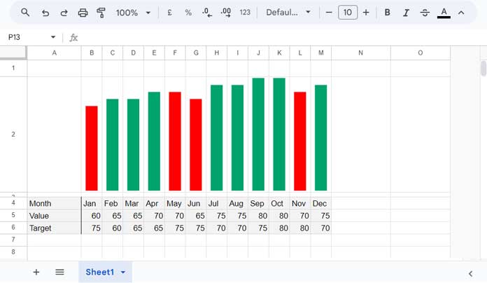
For a column chart with target coloring, I suggest arranging the data horizontally. This way, we can use the data directly as the chart’s data table.
In the following sample data, each row represents a different category (Month, Value, and Target), and each column represents a different month followed by its corresponding value or target.
| Month | Jan | Feb | Mar | Apr | May | Jun | Jul | Aug | Sep | Oct | Nov | Dec |
| Value | 60 | 65 | 65 | 70 | 70 | 65 | 75 | 75 | 80 | 80 | 70 | 75 |
| Target | 75 | 60 | 65 | 65 | 75 | 75 | 70 | 70 | 75 | 80 | 80 | 70 |
Upon reviewing the data, it’s evident that the monthly target varies each month.
To create a month-wise column chart where the columns change to green if the target is met or red if it’s not, we can use the SPARKLINE Column Charts as per the step-by-step instructions below.
Step-by-Step instructions
- Enter the above sample data in cells A4:M6.
- Enter the following formula in cell B2:
=LET(value, B5:M5, target, B6:M6, MAP(value, target, LAMBDA(r, rr, SPARKLINE(r, {"charttype", "column"; "color", IF(r>=rr, "#00A36C","red"); "ymin", 0; "ymax", MAX(value)})))) - Increase the row height to increase the height of the columns (vertical bars).
- The vertical axis of this chart has a minimum value of zero [
"ymin", 0]and a maximum value equal to the maximum value in the data range ["ymax", MAX(value)]. If your data contain negative values and you want to display those columns, replace"ymin", 0with"ymin", MIN(value).
That’s all you need to do to create a miniature column chart with green and red vertical bar colors for target met and not met, respectively.
How Do I Use This Formula for a Different Range?
In the formula, replace B5:M5 with the row range containing the data points to plot the bars and B6:M6 with the target value range. Ensure that both ranges are of equal size.
What If My Data Range Is Vertically Arranged?
If your data is arranged vertically, then you should wrap the above formula with the TRANSPOSE function like this: =TRANSPOSE(sparkline_formula_here)
Bar Chart with Target Coloring in Google Sheets
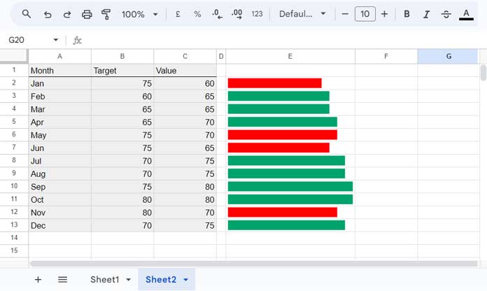
When using SPARKLINE Bar Charts for target coloring, arrange the data vertically.
In the following example, months are in column A, target values are in column B, and actual values are in column C.
| Month | Target | Value |
| Jan | 75 | 60 |
| Feb | 60 | 65 |
| Mar | 65 | 65 |
| Apr | 65 | 70 |
| May | 75 | 70 |
| Jun | 75 | 65 |
| Jul | 70 | 75 |
| Aug | 70 | 75 |
| Sep | 75 | 80 |
| Oct | 80 | 80 |
| Nov | 80 | 70 |
| Dec | 70 | 75 |
Let’s create the bar chart with target coloring from this data.
Steps:
- Arrange the above data in cells A1:C13.
- In cell E2, enter the following formula:
=LET(value, C2:C13, target, B2:B13, MAP(value, target, LAMBDA(r, rr, SPARKLINE(r, {"charttype", "bar"; "min", 0; "max", MAX(value); "color1", IF(r>=rr, "#00A36C", "red")})))) - Increase the column width to increase the length of the bars.
- The horizontal axis of this chart has a minimum value of zero [
"min", 0]and a maximum value equal to the maximum value in the data range ["max", MAX(value)]. If your data contain negative values and you want to display those bars, replace"min", 0with"min", MIN(value). - If your data range is arranged horizontally, then wrap this formula with the TRANSPOSE function.
When using this formula, make two changes:
- Replace C2:C13 with the column reference containing your data points.
- Replace B2:B13 with the column reference containing the target values.
The TRANSPOSE function is only necessary if you use row references (horizontal data) instead of column references (vertical data).
Resources
We’ve seen examples of target coloring in column and bar charts in Google Sheets, using SPARKLINE miniature charts. Here are some additional resources.


