Gantt charts are essential for project scheduling. A basic, free Gantt chart is always within your reach. Here, I’m talking about Google Sheets and its SPARKLINE function. You can easily create a free Gantt chart using SPARKLINE in Google Sheets.
There are clear benefits to creating a Gantt chart in Google Sheets. First, it’s free. More importantly, you can collaborate with your team in real time from anywhere.
When it comes to creating a Gantt chart in Google Sheets, there are four main options:
- Using a custom formula with conditional formatting to color cells from the start date to the end date on the timeline.
- Using a bar chart in a specific way.
- Using the SPARKLINE function.
- Using the built-in Timeline view.
While the Timeline view is not available for free users of Google Sheets, you can focus on the other options. Here, we will discuss creating a Gantt chart using the SPARKLINE function in Google Sheets. You can find information about the conditional formatting and bar chart options, along with other advanced Gantt chart techniques, in the resources section at the end.
Step 1: Preparing the Sample Data
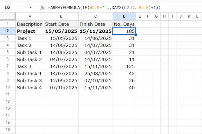
The sample data consists of tasks in column A, task start and end dates in columns B and C, respectively. Column D contains the number of days required for each task. We will use a formula to calculate the number of days, so leave column D empty when entering the data.
Let’s understand the data in detail since it’s the core part of creating the Gantt chart using the SPARKLINE function.
Every project has a start and end date, along with the number of days required to complete it. In the sample data, cell B2 contains the project start date, and cell C2 contains the project end date. Below that, you’ll see the tasks listed from rows 3 to 10.
Use the following formula in cell D2 to calculate the number of days required for the project and for individual tasks:
=ARRAYFORMULA(IF(B2:B="",,DAYS(C2:C, B2:B)+1))This formula includes both the start and end dates when counting days. For example, if a task is scheduled for one day starting on 09 Jan 2025, both the start and end dates should be 09 Jan 2025.
Important: Tasks must fall within the project’s start and end dates, while subtasks, if any, should fall within their parent task’s duration.
Step 2: Creating a Proper Date Scale for the Sparkline Gantt Chart
Next, create a date scale at the top of the Gantt chart bar area. The date scale, often called the timeline, represents the chronological intervals (e.g., days, weeks, months) aligned with the tasks.
For a shorter duration (e.g., two weeks), you can use sequential dates across rows starting from cell E2. For longer durations, specify intervals like weekly, biweekly, or monthly.
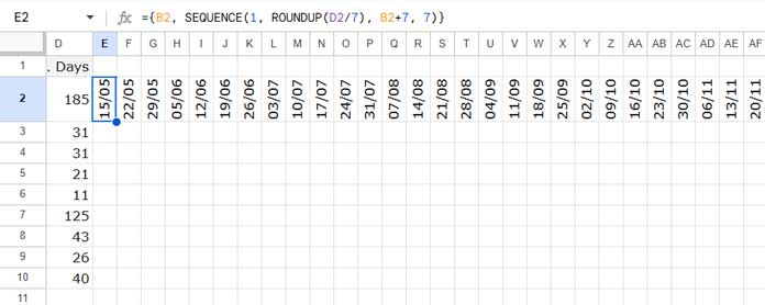
Since the project duration in this example is 185 days, we will use a weekly timescale spanning 28 cells. Use the following formula in cell E2:
={B2, SEQUENCE(1, ROUNDUP(D2/7), B2+7, 7)}The result will be date values. Select these cells and format them by navigating to Format > Number > Custom Date and Time.
Note:
- Replace
7with14for biweekly intervals. - Replace
7with1for daily intervals.
Step 3: Merging Columns for the Sparkline to Expand
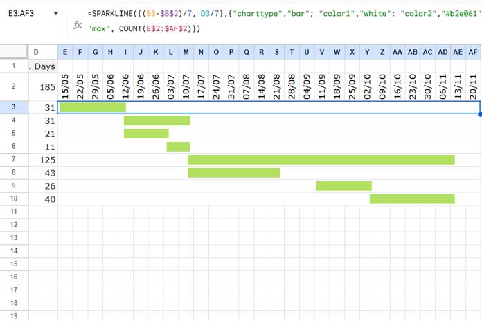
Select the range E3 to the last column with a value in the date scale (e.g., E3:AF3). Then navigate to Format > Merge Cells > Merge Horizontally.
Unlike conditional formatting, merging is essential for creating the Gantt chart with SPARKLINE. Without merging, the SPARKLINE will remain confined to cell E3.
Step 4: Creating a Gantt Chart with the SPARKLINE Function
In cell E3, enter the following formula:
=SPARKLINE({(B3-$B$2)/7, D3/7},{"charttype","bar"; "color1","white"; "color2","#b2e061"; "max", COUNT(E$2:$AF$2)})Replace 7 with the divisor used in the formula in cell E2 that creates the date scale. Since we used 7 as the divisor in the earlier formula, it’s the same here.
Drag the formula down to the last row containing tasks.
Formula Breakdown
Creating the Gantt chart with SPARKLINE is straightforward once you understand the function. Let’s break down the formula:
(B3-$B$2)/7: This calculates the number of days from the project start to the task start, divided by 7 (to match the timescale).D3/7: This divides the task duration by 7 to shrink the bar according to the timescale.COUNT(E$2:$AF$2): This sets the maximum value for the SPARKLINE to match the total project duration (rounded up).
There are two data points: (B3-$B$2)/7 and D3/7.
- The color for the first data point should match the background of the sheet. In our case, it is set to “white.”
- The color of the second data point should be any color other than the background color. I’ve specified a custom color “#b2e061,” which is a shade of green. You can specify colors like “red,” “blue,” or hexadecimal color codes like the one I used.
Adding Colors for Tasks and Subtasks
One advantage of using SPARKLINE is the ability to customize colors. To highlight specific tasks or differentiate tasks and subtasks, you can edit the color2 value in the formula.
For example:
=SPARKLINE({(B5-$B$2)/7, D5/7},{"charttype","bar"; "color1","white"; "color2","red"; "max", COUNT(E$2:$AF$2)})This formula in cell E5 would return a red-colored bar. It is useful when you want to highlight a specific task for reasons such as being on hold, requiring clearance, being completed, or other conditions.
Resources
- Create Gantt Chart Using Formulas in Google Sheets
- Creating a Gantt Chart with Stacked Bar Charts in Google Sheets
- Split a Task in Custom Gantt Chart in Google Sheets
- Multi-Color Gantt Chart in Google Sheets
- Flexible Timescale for Gantt Chart in Google Sheets
- Days Remaining in Gantt Chart in Google Sheets
- Date Filter in Gantt Chart in Google Sheets
- GANTT_CHART Function in Google Sheets (Named Function)
- Track Remaining Days in Tasks with Sparkline Gantt Charts


That is a thing of beauty! Thank you so much for sharing.
Hi,
How do I make it into days? Instead of weeks?
=
ArrayFormula(TRANSPOSE(row(indirect("A1:A"&int(datedif(B2,C2,"D")/7)))))Hi, Earl Shujan,
If you want to plot Gantt chart by date instead of week, you can use the below formula to populate the dates. The formula would return date values.
=ARRAYFORMULA(TRANSPOSE(row(indirect("A"&B2):indirect("A"&C2))))Select those date values and format to either dates or days (Format > Number > Date or Format > Number > More formats > Custom number format >
dd)Now after the introuduction of the SEQUENCE function, there is a much more simple way to pouplate the dates required for Gantt Chart by date.
=sequence(1,days(C2,B2)+1,B2,1)The output should be formatted as detailed above.
Thank you for this!
An excellent introduction to sparkline function!
Is there any way to include a label or icon in the sparkline to remind the name of the task or % of completion?
Hi, Fabrice,
Thanks for your feedback!
Regarding your query, I think there is no such feature available.