This tutorial demonstrates how to make a multi-color Gantt chart in Google Sheets.
A multi-color Gantt chart will help you easily assess completed tasks, ongoing tasks, and upcoming tasks with their unique colors.
By checking ongoing and upcoming tasks, you could assess how long a project will take to complete.
Without addon, you can make three types of Gantt charts in Google Sheets.
- By highlighting cells (Conditional formatting)
- Plotting individual bars using formulas (SPARKLINE function)
- Using a built-in chart.
Unlike professional Gantt charts, there won’t be any milestone symbols on the bar created using the above three options in Google Sheets. Also, please don’t expect features such as dependencies.
Here you can learn how to make two different types of multi-color Gantt chart in Google Sheets.
Multi-Color Gantt Chart in Google Sheets (How-To)
Sample Data
Note:- I’ll share my example sheet in the last part of this tutorial.
We will use a sample dataset for the example that contains project start date (B1), project end date (B2), task names (A4:A9), task start dates (B4:B9), task end dates (C4:C9), and task statuses (D4:D9).
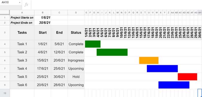
In B1, used =min(B4:B) to get the project start date, i.e., 01-June-2021, and in B2, used =max(C4:C) to get the project end date, i.e., 30-June-2021.
In cell range E3:AH3, entered the sequence of dates from the project start date to end date.
Assigning Colors to Tasks in a Multi-Color Gantt Chart
Our aim here is to assess the current phases of each task more easily. For that, we will highlight the tasks based on the status column D as below.
| Status | Bar Color |
| Complete | Green |
| In-progress | Orange |
| Upcoming | Blue |
| Hold | Red |
Of course, you will have the option to change the color as per your taste.
Let’s go to make the multi-colored Gantt chart in Google Sheets. You have two options to choose from, and here are them.
Option 1 – Based on Cell Highlighting
This method uses Google Sheets conditional formatting rules. I have already detailed part of the same here – Create a Gantt Chart Using Formulas in Google Spreadsheet.
There we have no condition specified to change the color of the bars conditionally. If we follow that tutorial, the formula here will be as follows.
Rule “Apply to Range”: E4:AH10
=AND(E$3>=$B4,E$3<=$C4)It will apply one unique color to all the bars.
Since we want to make a multi-color Gantt chart, we require multiple rules.
Here are them.
Rules “Apply to Range”: E4:AH10
Green:
=AND(E$3>=$B4,E$3<=$C4,$D4="Complete")Blue:
=AND(E$3>=$B4,E$3<=$C4,$D4="Upcoming")Orange:
=AND(E$3>=$B4,E$3<=$C4,$D4="Inprogress")Red:
=AND(E$3>=$B4,E$3<=$C4,$D4="Hold")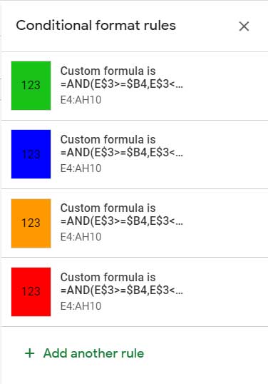
If you are new to conditional formatting, to get guidance applying the rules, please check my earlier post (link already given above.)
Pros and Cons
Please don’t get into the false impression that I am comparing this multi-color Gantt Chart in Google Sheets with professional Gantt Charts.
Pros:
- The formula only uses an AND logical operator and a few comparison operators. So easy to understand.
- Each rule can cover a large area (rows and columns)
Cons:
- We need to use separate rules for each color.
- The units on the timescale (the dates on the top row in the bar area) must be entered wisely. In our example, it’s “Days” from 1st June 2021 to 30th June 2021. If your tasks’ start and end dates span several weeks/months/years, input them carefully.
You May Like: Array Formula to Generate Bimonthly Dates in Google Sheets.
Option 2 – Based on Sparkline
We can make a Gantt Chart Using Sparkline in Google Sheets. It’s a pure formula-based approach, and no highlighting is involved.
I prefer the SPARKLINE function when it comes to making multi-color Gantt chart in Google Sheets.
In cell E4, insert the following formula.
=SPARKLINE(
     {$B$1-B4,C4-B4},
     {"charttype","bar";"color1","white";"color2",
     ifs(
        D4="Complete","green",D4="Inprogress",
        "Orange",D4="Upcoming","Blue",D4="Hold","Red"
     );
     "max",$B$2-$B$1+1}
)
Then copy-down.
Once copied, merge columns in each row. I mean merge, E4:AH4, E5:AH5, and so on.
Here changing the color is quite simple. Please see the IFS statement within the SPARKLINE formula. You can change the color from there.
Pros and Cons
Pros:
- The formula doesn’t consider the dates on the timescale (the top row in the bar area). So we have the freedom to put texts like “Day-1”, “Day-2”, etc., in that rea.
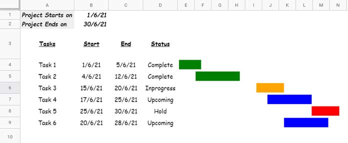
- We can visualize our project progress in a very small area on the screen. For example, we have merged E4:EH4 for the first task. That means the bar is spread across 30 columns. If you want, you can constrain the merging to just 10 columns from E4 to N4. When doing so, remove the dates on the timescale (please refer to the screenshot below.)
- The bars look better than the cell highlighting.
Cons:
- The formula required against each task.
- We may want to merge the cells in the plot area.
- The function may confuse newbies.
That’s all about how to create an online multi-color Gantt chart in Google Sheets.
Thanks for the stay. Enjoy!
Resources:


