Sparklines are miniature charts. We can create four different sparkline charts using the SPARKLINE function in Google Sheets.
Unlike traditional charts that display a full set of data points on a larger scale, sparklines are designed to be embedded within a cell in Google Sheets.
They offer a quick visual summary of data patterns, making them useful for enhancing your summary reports.
When you think outside the box, you can use the SPARKLINE function to create a percentage progress bar within a cell or merge cells and generate a Gantt Chart.
It’s a built-in array function that evaluates an array. To make it expand or spill, you need to use MAP, BYROW, or BYCOL lambda helper functions.
Syntax of the SPARKLINE Function in Google Sheets
Syntax:
SPARKLINE(data, [options])Arguments:
data: The range or array containing the data to plot.options: This is an optional argument. If omitted, the SPARKLINE function will plot a line chart. The options argument is for specifying optional settings for chart customization. This is where we can specify the four different sparkline charts: Line, Bar, Column, and Winloss.
The options argument should contain at least two values: the option and the value that the option is set to. You can specify multiple options, and they may or may not differ in the four sparkline charts.
Ref.: Official Documentation
Using the SPARKLINE Function Without Options: A Basic Example
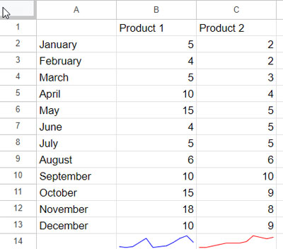
Let’s say you work in sales, and you want to quickly visualize the monthly sales trends for two products.
The data layout is as follows: Month names from January to December in A2:A13, monthly sales data of Product 1 in B2:B13, and sales data of Product 2 in C2:C13.
You can use the following SPARKLINE formula in cell B14 and copy-paste it to C14:
=SPARKLINE(B2:B13)If you want to change the color of lines, you can do so without using the ‘options’ argument. Navigate to the cell containing the sparkline and click on the ‘Text color’ icon in the Google Sheets Toolbar.
Four Different Sparkline Charts Using the SPARKLINE Function in Google Sheets
In the options argument of the SPARKLINE function, you can specify one of the four available sparkline chart types using the ‘charttype’ option.
Use the following ‘charttype’ options:
line: line graphbar: stacked bar chartcolumn: column chartwinloss: a special type of column chart that plots two possible outcomes: positive and negative.
Example 1: Line Chart (for Trends)
In the following example, we have scores of a 50-over limited cricket match in cells B3:K3 for one team and cells B4:K4 for another team.
Please insert the following formula in cell L3 and copy-paste it into L4 to observe how the team progresses over by over.
=SPARKLINE(B3:K3, {"charttype","LINE"})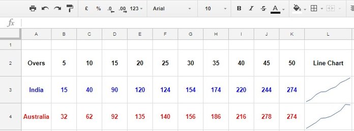
The SPARKLINE function has the following options for the line chart:
| Options | Purpose |
xmin | to specify the min value in the X-axis |
xmax | to specify the max value in the X-axis |
ymin | to specify the min value in the Y-axis |
ymax | to specify the max value in the Y-axis |
color | to specify the line color |
empty | to handle empty cells using the options zero and ignore |
nan | to handle non-numeric data using the options convert and ignore |
rtl | to handle chart rendering using the options true or false (right to left or left to right). |
linewidth | determines line thickness |
To learn the usage, please check out my detailed tutorial: Sparkline Line Chart Formula Options in Google Sheets.
Example 2: Column Chart (for Comparison)
We can use the miniature column chart for quick comparisons. The following formula compares the marks of four students in cells A1 to A4, and the formula is in cell B1.
=SPARKLINE(A1:A4, {"charttype", "column"})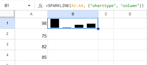
The SPARKLINE function has the following options for the column and winloss chart:
| Options | Purpose |
color | to specify the color of chart columns. |
lowcolor | to specify the color of the min value |
highcolor | to specify the color of the max value |
firstcolor | to specify the color of the first column |
lastcolor | to specify the color of the last column |
negcolor | to specify the color of all negative columns (for Winloss) |
empty | to handle empty cells using the options zero and ignore |
nan | to handle non-numeric data using the options convert and ignore |
axis | decides if an axis needs to be drawn (true/false) |
axiscolor | sets the color of the axis (if applicable) |
ymin | to specify the custom minimum value used for scaling the height of columns (not applicable for Winloss) |
ymax | to specify the color of the maximum value (not applicable for Winloss) |
rtl | to handle chart rendering using the options true or false (right to left or left to right). |
To learn the usage, please check out my detailed tutorial: Sparkline Column Chart Options in Google Sheets.
Example 3: Bar Chart (for Ranking)
We can use the bar chart option in the SPARKLINE function to create a miniature chart for ranking purposes.
In the above example, we have the marks of four students in the cell range A1:A4. We have compared them using the column chart. How to show their relative ranking?
Replace the B1 formula with this one:
=SPARKLINE(A1:A4, {"charttype", "bar"})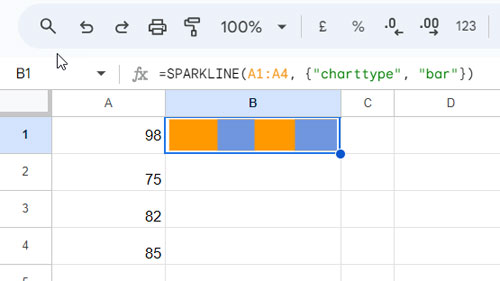
In this context, the length of the bars in the chart in cell B1 reflects the relative ranking of the students based on their scores. Higher bars represent higher scores, allowing for a quick visual comparison of the student’s performance.
The SPARKLINE function has the following options for the bar chart:
| Options | Purposes |
max | to specify the maximum value along the X-axis |
color1 | to specify the first color used for bars in the chart |
color2 | to specify the second color used for bars in the chart |
empty | to handle empty cells using the options zero and ignore |
nan | to handle non-numeric data using the options convert and ignore |
rtl | to handle chart rendering using the options true or false (right to left or left to right). |
To learn the usage, please check out my detailed tutorial: Sparkline Bar Chart Formula Options in Google Sheets.
Example 4: Winloss (for Outcomes)
A winloss sparkline chart is a simplified form of a column chart, used for representing binary outcomes where the data has only two possible values (e.g., win/loss, success/failure, yes/no, up/down).
It consists of just positive (win) and negative (loss) columns, making it easy to visualize binary data.
In the following example, I have used it to visualize the ups and downs in the monthly search traffic of two of my blogs. The data for the first blog is in cells A3:M3, and for the second blog, it is in cells A4:M4.
To draw the chart, enter the following formula in cell N3 and then copy-paste it to N4:
=SPARKLINE(A3:M3,{"charttype","winloss"})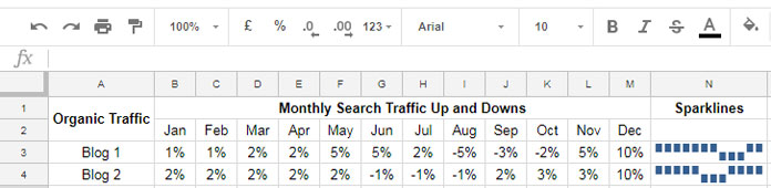
For winloss formula options, please refer to the column sparklines options above. There are a few changes, though.
The ymin and ymax options in column sparkline are not applicable in the winloss sparkline chart.
The negcolor option is not applicable in column sparkline. You can use this option in winloss to change the color of all negative columns.
Resources
This tutorial covered how to use the SPARKLINE function in Google Sheets. We have discussed all four sparkline charts. The intention is to help you use the function and also understand when to use each chart type.
Among the four, the bar chart is widely used and is especially useful for creating Gantt charts. Here are some additional resources to help you explore further:


