There are a few important points you should know when using the SPARKLINE function for column charts. I’ve explained them after the syntax below.
Syntax:
SPARKLINE(data, [options])Points to Note:
"data"can be arranged in columns or rows."options"must be enclosed in curly brackets{}.- Each option name must be entered as a string (inside double quotes).
- Each option value must also be entered as a string (inside double quotes), except for Boolean values (
TRUE/FALSE) and numbers, which are entered without quotes. - Each option pair should be separated by a semicolon
;, and the option name and value must be separated by a comma,.
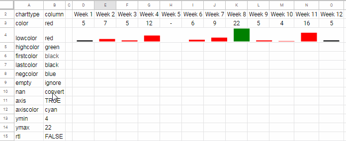
In the formula below (in cell D4), I’ve included all the available Sparkline Column Chart Options in Google Sheets:
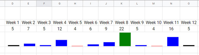
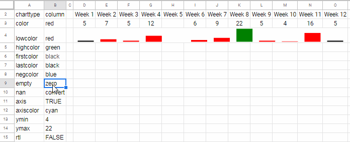
=SPARKLINE(D3:O3, {
  "charttype", "column";
  "color", "blue";
  "lowcolor", "red";
  "highcolor", "green";
  "firstcolor", "black";
  "lastcolor", "black";
  "negcolor", "blue";
  "empty", "zero";
  "nan", "convert";
  "axis", TRUE;
  "axiscolor", "cyan";
  "ymin", 4;
  "ymax", 22;
  "rtl", FALSE
})
I’ve merged cells D4:O4 to improve the visual appearance and readability of the Sparkline columns. Of course, the chart can remain in a single cell like D4 too.
You can spot each of the important points listed above within this formula. I’ll now explain each Sparkline option in detail.
Control Sparkline Column Chart Options Externally
Before diving into the explanation, here’s one more important tip.
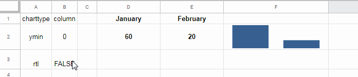
You can make the Sparkline column chart more dynamic by referencing the chart options from outside the formula. Didn’t get it?
Check out the same chart as above, but this time with a simpler formula in D4. The range A2:B15 stores the chart options externally.
=SPARKLINE(D3:O3, A2:B15)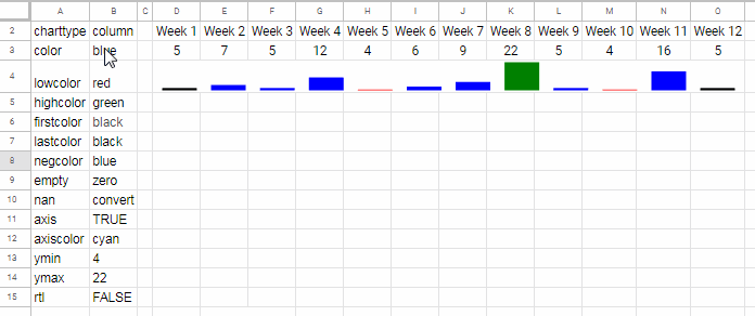
This approach lets you control the Sparkline Column Chart Options in Google Sheets without modifying the chart formula itself.
Basic Sparkline Column Chart Example
Here’s a basic example using just one option:
=SPARKLINE(A2:B2, {"charttype", "column"})"ymin" Sparkline Column Chart Option in Google Sheets
Use the "ymin" option to set the minimum value used for scaling the height of the columns.
Why start with "ymin"? Because even if you specify "charttype", the column chart may not look visually balanced unless you define "ymin".
Example:
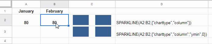
=SPARKLINE(A2:B2, {"charttype", "column"; "ymin", 0})If "ymin" is not defined, the function automatically sets it to the minimum value in the range. That’s equivalent to:
=SPARKLINE(A2:B2, {"charttype", "column"; "ymin", MIN(A2:B2)})"ymax" Sparkline Column Chart Option
Use this option to set the maximum value for scaling.
I typically use the MAX function for this:
=SPARKLINE(A2:B2, {"charttype", "column"; "ymin", 0; "ymax", MAX(A2:B2)})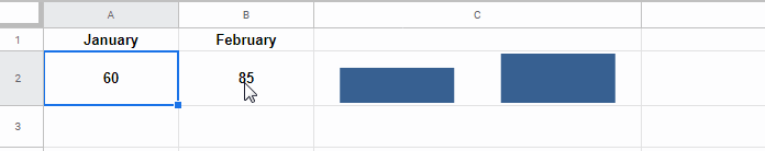
Once you’ve covered "ymin" and "ymax", it’s time to explore the color options.
Control the Color of Sparkline Column Chart in Google Sheets
There are six main color options in Sparkline column charts:
"color"– sets the default column color"lowcolor"– for the lowest value"highcolor"– for the highest value"firstcolor"– for the first column"lastcolor"– for the last column"axiscolor"– for the x-axis (used alongside the"axis"option)
Note: The "negcolor" option only applies to the Winloss chart type, so it won’t affect column charts.
Example using all of them:
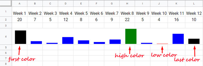
=SPARKLINE(A2:L2, {
  "charttype", "column";
  "color", "blue";
  "lowcolor", "red";
  "highcolor", "green";
  "firstcolor", "black";
  "lastcolor", "black";
  "ymin", MIN(A2:L2);
  "ymax", MAX(A2:L2)
})
"axis" and "axiscolor" Options
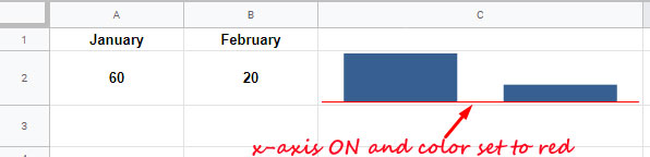
Use "axis" to toggle the horizontal axis and "axiscolor" to set its color.
=SPARKLINE(A2:B2, {
  "charttype", "column";
  "ymin", 0;
  "ymax", MAX(A2:B2);
  "axis", TRUE;
  "axiscolor", "red"
})
Note: Always set "ymin" to 0 if you want the horizontal axis to be visible.
"empty", "nan", and "rtl" Options
These additional options help handle data more flexibly.
"empty": controls how blank cells are treated –"zero"or"ignore""nan": controls how non-numeric cells are handled –"convert"or"ignore""rtl": renders the chart right-to-left if set toTRUE
Example to "rtl":
=SPARKLINE(D2:E2, A1:B3)If rtl is TRUE, the chart is rendered from the last to the first data point.
Example to "empty":
=SPARKLINE(D3:O3, A2:B15)If H2 is blank, you can control its effect using "empty".
Example to "nan":
=SPARKLINE(D3:O3, A2:B15)This helps manage non-numeric entries gracefully.
That’s all about Sparkline Column Chart Options in Google Sheets. With these customizable settings, you can turn compact cells into visually insightful mini charts. Enjoy experimenting!


