Adding a target line to a column chart isn’t difficult. With a combo chart in Google Sheets, anyone can easily accomplish it. You just need to know how to format the data to include the target value.
With just one additional column in your source data, you can incorporate a target line into your column chart. I’ll explain that in detail below.
In this tutorial, I’ve also included a dynamic column chart with a target line added. I’ve utilized a data validation drop-down menu to dynamically switch between months.
Target Line in Column Chart
When you’ve set a shared target for multiple categories, visualizing that data with a column chart is beneficial.
For example, if I’ve assigned identical targets to different salespeople, I can compare their performance against this shared target.
I can quickly discern which individuals have met my expectations by incorporating a column chart with a target line.
Example (Target Line Added to a Column Chart in Google Sheets):
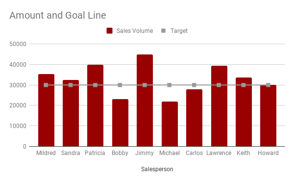
Observe the target line running across the column chart. Each column represents the sales volume for individual salespersons. The horizontal line indicates the target set for them.
This visualization allows you to readily identify the underperforming salespersons, namely “Bobby,” “Michael,” and “Carlos.”
Here are the step-by-step instructions for adding a target line to a column chart in Google Sheets.
Steps
- Enter the sample data as follows: Column A contains the names of salespersons (category), column B contains sales volume, and column C contains targets.
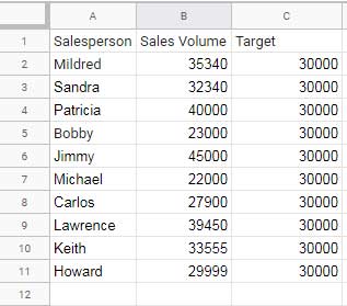
- Select the data in cells A1:C.
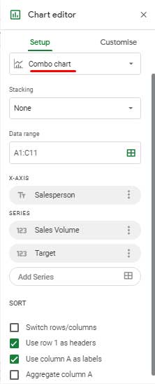
- Click on the Insert menu and select Chart. Google Sheets will likely insert a Column chart with a target line based on the provided data formatting. If not, proceed with the subsequent steps.
- In the right-hand side chart editor panel, choose the chart type as “Combo chart”.
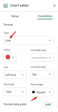
- Click on the “Customize” tab in the chart editor.
- Click on the “Series” drop-down.
- Select the series “Sales Volume” and ensure it is set to “Column”. Then select the “Target” series and set it to “Line”. Lastly, change the data point shape to “Square”.
By following these steps, you can create a column chart with a target line in Google Sheets.
Column Chart: Monthly Sales and Targets with Selectable Month Dropdown
Take a look at this dynamic column chart featuring the added target line.
Note: In this visualization, the target line is subtly displayed. I’ve opted to showcase the data square points instead to enhance the visual appeal of the chart.
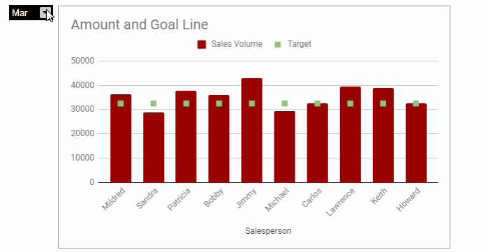
The chart above displays the monthly targets of each salesperson alongside their performance.
Here also, you can follow the same step-by-step instructions mentioned above to add monthly targets to the column chart. The source data will contain three columns: Salesperson (Category), Sales Volume, and Target. However, each month’s sales volume and target will be extracted from a master dataset.
Data Preparation
The sample data contains the names of salespersons in column A. Columns B and C are currently empty.
The sales volumes and targets for January, February, and March are located in cells H2:M.
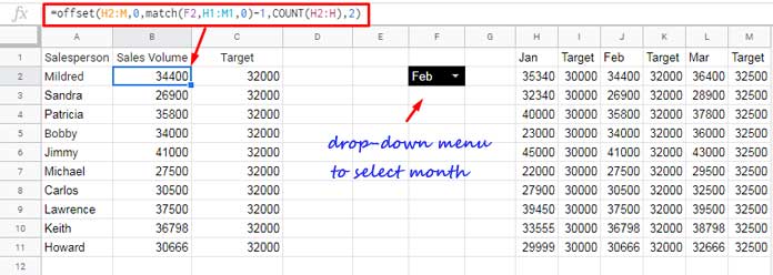
We will utilize a formula to dynamically extract the monthly sales volume into column B and the target into column C based on the month selected in cell F2.
I have applied the OFFSET + MATCH combination formula below in cell B2 to extract the data from the range H2:M dynamically.
=OFFSET(H2, 0, MATCH(F2, H1:M1, 0)-1, COUNT(H2:H), 2)Formula Breakdown:
Syntax:
OFFSET(cell_reference, offset_rows, offset_columns, [height], [width])The formula shifts 0 rows and MATCH(F2, H1:M1, 0)-1 columns. The height (number of rows) will be COUNT(H2:H), and the width will be 2.
MATCH(F2, H1:M1, 0)-1: matches the month in cell F2 with the header of the monthly targets and sales volumes. Cell F2 contains a drop-down, and if “Jan” is selected, MATCH will return 1. We deduct 1 from it to return 0.COUNT(H2:H): returns the count of data points.
Creating the Drop-Down
To create the drop-down in cell F2 to select a month and dynamically refresh the data in the column chart, follow these steps:
- Navigate to cell F2.
- Click on the Insert Menu and select “Drop-down”.
- Replace “Option 1” with “Jan”, and “Option 2” with “Feb”.
- Click “Add another item” and enter “Mar”.
- Continue adding all months and click “Done”.
In this dynamic column chart, muting the horizontal target line can be achieved by adjusting the line thickness to 0px for the series “Target.” However, please note that this feature may not be functioning as expected at present. You can find this option under the chart editor’s customize tab, then series, and select “Target”.


Is it possible to add the “target line” to the chart without adding the Target column to the table?
I didn’t find a way to do that.