If you arrange your data properly, you can easily create a 3D pie chart in Google Sheets with just three steps.
A pie chart is circular in shape and two-dimensional (flat), divided into slices to represent the proportions of a whole. A 3D pie chart adds a three-dimensional effect but is essentially the same in terms of data representation.
Pie charts are often part of dashboard reports in Google Sheets. They are one of the best options for visually representing survey results, budget allocations, and more.
Pie charts are simple to read and understand, making them one of the most popular data visualization tools in Google Sheets.
However, one of the drawbacks of pie charts is the number of categories. More categories make the slices with proportionally less quantity very small, and they may miss labels.
If you have more than 6 categories, it is suggested to switch to a bar chart.
In this tutorial, we will see how to properly arrange data and create a 3D pie chart in just a few steps.
Steps to Create a 3D Pie Chart in Google Sheets
Arrange your data in two columns where the first column contains the categories (acts as labels) and the second column contains corresponding numerical values representing the amount for each category.
For example, we’ll use data on the number of native speakers of five Indian languages. The first column will list the languages (e.g., Hindi, Bengali), and the second column will contain the number of speakers for whom each language is their primary language.
Steps:
- Select the Range: Select the range A1:B.
- Insert the Chart: Click the Insert menu and select Chart.
- Change Chart Type: It will probably insert a 2D pie chart by default. Within the Chart Editor sidebar panel, click the drop-down under Chart Type and select 3D Pie Chart.
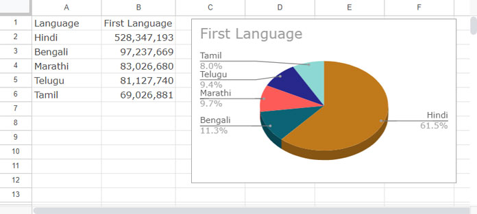
By following these steps, you can create a 3D pie chart in Google Sheets.
Exploding a 3D Pie Chart in Google Sheets
You can separate each slice from a pie chart to bring focus, a technique called pie chart explosion. The exploded slices appear as if they were cut out from the pie, and you can adjust how far each slice should be moved from the center.
Here’s how to explode a 3D pie chart in Google Sheets:
- Double-click on the chart to open the Chart Editor sidebar panel.
- Navigate to the Customize tab.
- Click on “Pie Slice” and select the slice that you want to move outwards.
- Choose a default distance from the center (0% to 100%) or enter your value.
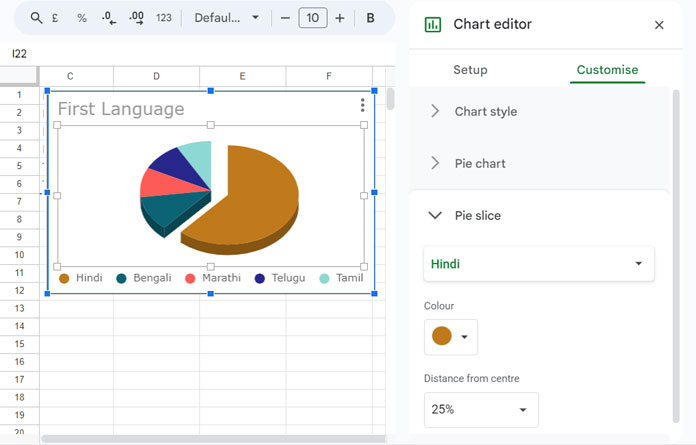
By following these steps, you can effectively explode slices in a 3D pie chart in Google Sheets to highlight specific data points.
Please note that this may disable some legend options under Customize > Legend, leaving you with the options Top, Left, Bottom, and Right.
Understanding Legends and Slice Labels
When creating a 3D pie chart, you might often be confused with legends and slice labels.
Slice labels appear within the slices and can display actual values rather than percentages.
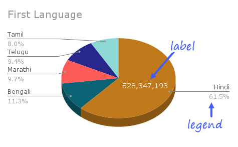
To show actual values within slices, click on Customize > Pie Chart and select “Value” under slice labels.
However, keep in mind that with a large number of data points or limited space within the slices, some values might not be visible.
Legends, on the other hand, serve a different purpose. You can display them outside the chart. They help identify each slice with color codes or connecting lines.
Resources
- Pie Chart Using Boolean Values in Google Sheets
- How to Include Filtered Rows in a Chart in Google Sheets
- How to Use Slicer in Google Sheets to Filter Charts and Tables
- Choosing a Suitable Chart Type for Your Data in Google Sheets
- How to Format Data to Make Charts in Google Sheets
- How to Change Data Point Colors in Charts in Google Sheets
- Adding a Custom Formula in a Slicer For Chart in Google Sheets


