I prefer to exclude filtered rows in Chars as it can help me to fine tune my chart. But there may be certain situations where I want the filtering does not affect the chart. Sheets chart has a built-in option for this. Below you can find the step-by-step instructions on how to include filtered rows in a chart in Sheets.
You can exclude or include filtered rows in a chart in two ways. One is the built-in option within the chart editor pane. The other is the popup option (notification) that appears on your Sheet.
Let’s start with creating a basic Pie chart below. In that chart, we can try to apply the required settings.
Sample Data for Chart:
| A | B | |
| 1 | Student | Mark |
| 2 | a | 88 |
| 3 | b | 99 |
| 4 | c | 86 |
| 5 | d | 90 |
| 6 | e | 91 |
Select the columns A and B (A1:B) and go to the menu Data > Create a filter. In the next step, I am going to create a Pie chart for the example purpose. How?
To create a simple Pie graph, again select the range A1:B and go to Insert > Chart > Chart type > Pie chart.
How Filtering Affects Chart in Google Sheets
Before going to know the tips to include filtered rows in a Chart in Google Sheets, see how the filtering affects the just created Pie chart in Sheets.
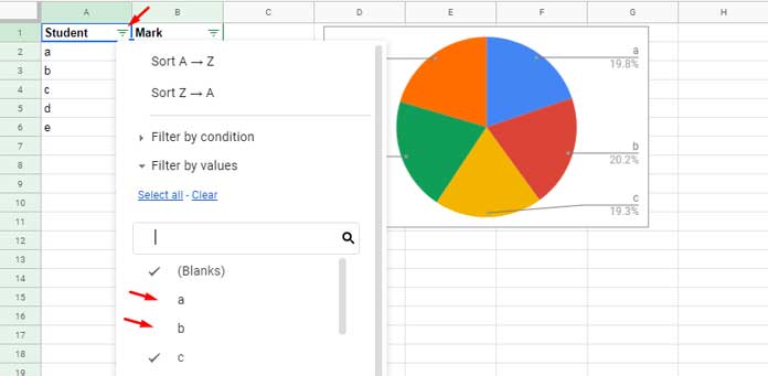
Click the filter icon in cell A1 and uncheck the student names ‘a’ and ‘b’ and hit the “OK” button. This will exclude the relevant rows from the Sheet and also from your chart.
When you filter your data for the first time after creating the chart, you will probably see a notification on the bottom of your screen saying “Data in filtered rows is excluded from the chart”.
That notification has an option to include or exclude filtered rows (turn on or turn off) in charts in Google Sheets. The notification will disappear within a few seconds that eventually exclude filtered rows from your chart.
Can I re-enable the notification or is there any other method to control the filtered rows in charts?
Yes! There are options for that. You can follow the instructions below.
Two Methods to Include Filtered Rows in a Chart in Google Sheets
As I have mentioned at the beginning of this tutorial, there are two methods to include filtered rows in a chart.
- Include/Exclude Filtered Rows Using the Chart Editor Pane.
- Include/Exclude Filtered Rows By Re-enabling the Notification.
Include Filtered Rows Using the Chart Editor
This is the recommended settings.
Step 1:
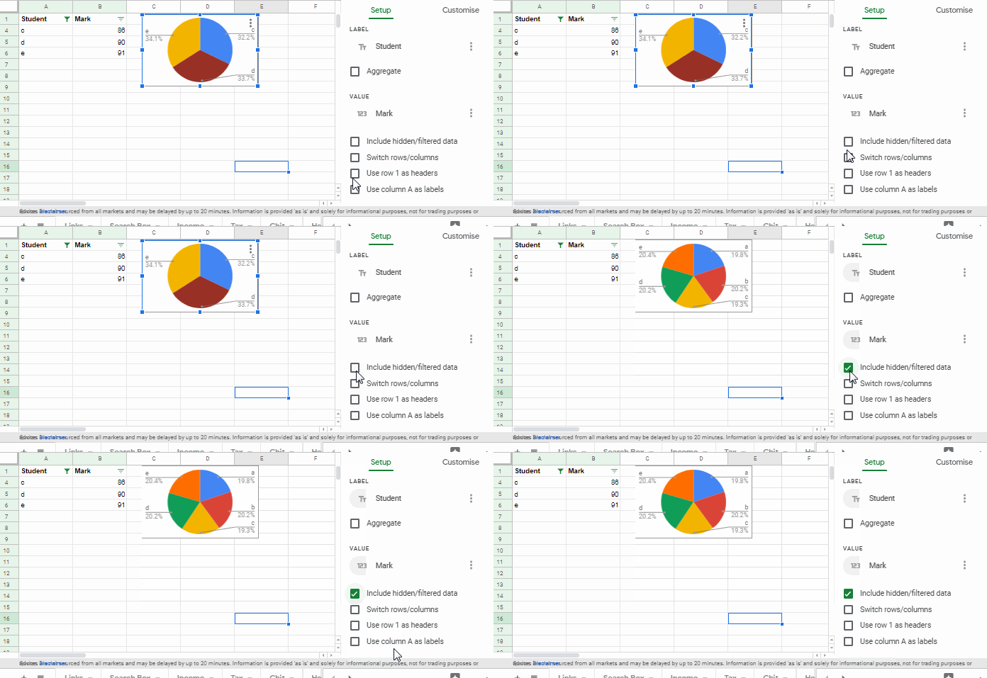
Double click on the chart. This will open the chart editor pane on your right-hand side of your computer screen.
Step 2:
Scroll down to the bottom of the ‘Setup’ tab.
Step 3:
Enable ‘Hidden/Filtered data’ option .
Re-enable the Notification to Show or Hide Hidden or Filtered Data on Chart
I normally follow this method as I feel it so comfortable to use.
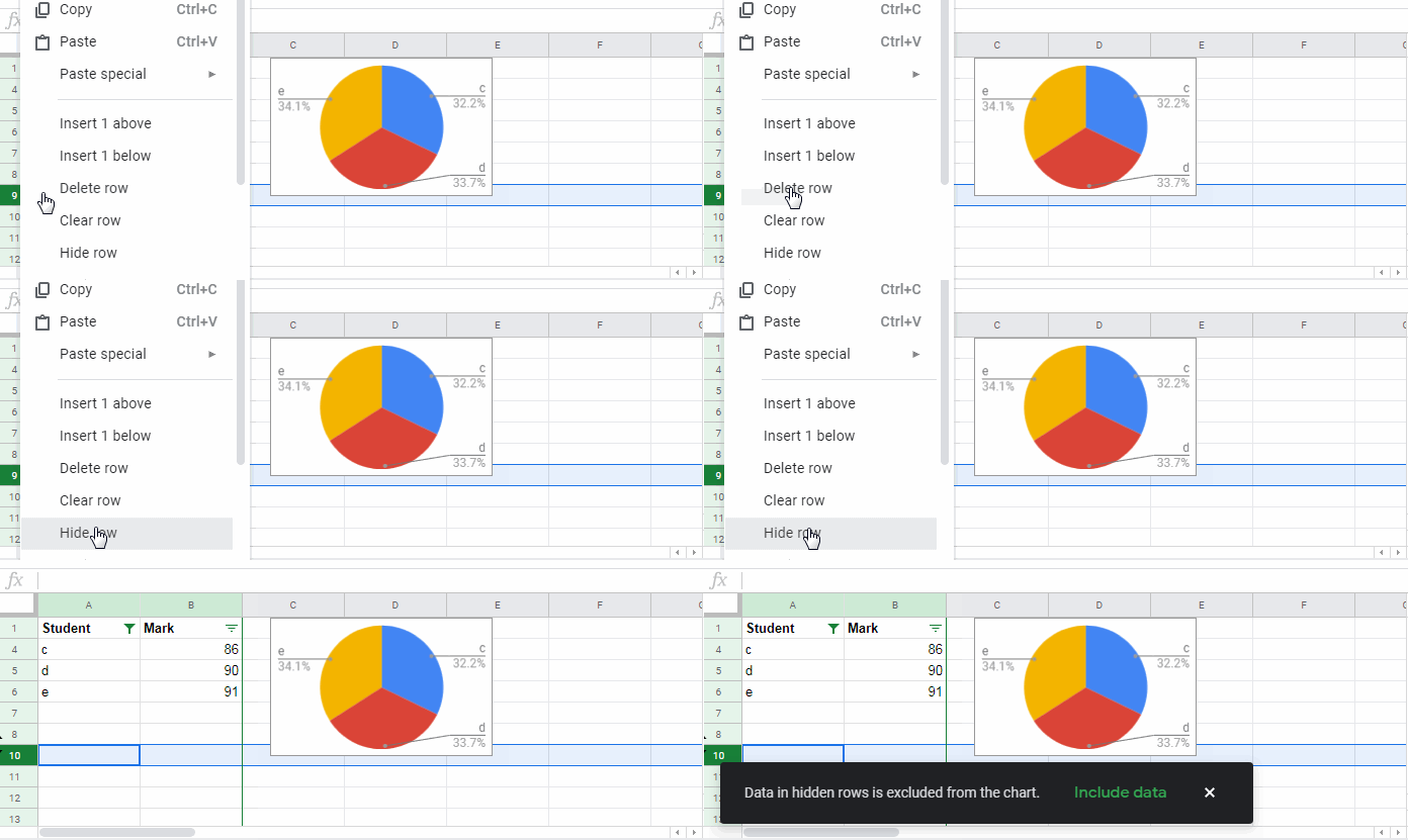
Assume your data is filtered and the chart has excluded the filtered rows. To enable the said notification that let you control the filtered rows do as follows.
Step 1:
Assume your chart is in “Sheet 1”. In “Sheet 2” do any activity like enter a value in any blank cell.
Step 2:
Right-click and hide any visible rows on “Sheet 1”. The notification will re-appear.
Follow any of the above methods to include filtered rows in a Chart in Google Sheets.
More Charts Tips and Tricks:
