Do you know how to dynamically restrict conditional formatting within the Pivot Table area in Google Sheets?
Google Sheets doesn’t offer specific highlight rules for Pivot Tables out of the box. However, we can achieve this functionality precisely by utilizing custom formula rules based on the GETPIVOTDATA function.
In this tutorial, I’ll explore this overlooked topic to help you improve your productivity in Google Sheets.
In practice, there are two specific types of highlight rules that you may want to apply to your Pivot Table range:
- Highlighting a Specified Row Label in the First Column.
- Highlighting Aggregated Values Based on Specific Conditions.
By using custom formulas based on GETPIVOTDATA, we can dynamically limit conditional formatting within the Pivot Table area, providing more precise and customized formatting choices.
This tutorial is part of a larger hub covering advanced Pivot Table formatting, output handling, and special behavior in Google Sheets.
Conditional Formatting for Pivot Tables to Highlight Row Labels
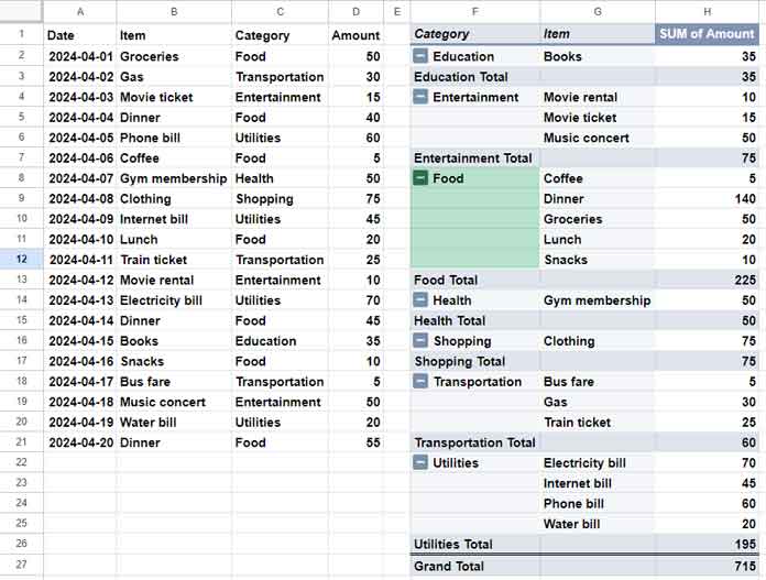
We will use sample data organized in A1:D to create a Pivot Table and apply conditional formatting to row labels. The data structure is as follows: Date, Item, Category, and Amount.
For the sake of learning, let’s utilize the same sample data. Once you’ve grasped the concept, apply this rule to your data by making necessary changes.
To access the sample data and pre-configured Pivot Tables with applied highlight rules, click the button below:
Creating the Pivot Table
Next, to summarize your data by category and item, follow these steps:
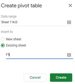
- Select the cell range A1:D.
- Click on “Insert” > “Pivot Table”.
- Choose “Existing Sheet”.
- In the field below, enter the cell reference F1.
- Click “Create” to open the “Pivot table editor”.
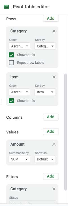
- Drag and drop the fields ‘Category’ and ‘Item’ under “Rows”, and ‘Amount’ under “Values”.
- Drag and drop ‘Category’ under “Filter”.
- Click the “Filter” drop-down and uncheck “Blanks”.
- Click “OK”.
Your Pivot Table is now prepared for analysis.
Coding the Custom Formula to Highlight Pivot Table Row Labels
As previously mentioned, we will utilize the GETPIVOTDATA function for conditional formatting in Pivot Tables within Google Sheets.
Although this function is typically used for extracting aggregated values from Pivot Tables, you might be curious about how we apply conditional formatting for row labels in the Pivot Table.
The answer is straightforward. We extract the aggregated values of the row labels we wish to highlight. When applying the highlight rule, we direct it to the column containing the row labels, rather than the column with the aggregated values.
Syntax:
GETPIVOTDATA(value_name, any_pivot_table_cell, original_column1, pivot_item1, original_column2, pivot_item2)Formula to highlight rows corresponding to the row label “Food”:
=GETPIVOTDATA("SUM of Amount", $F$1, "Category", "Food", "Item", G2)To highlight the row label “Transportation” in the Pivot Table, replace “Food” with “Transportation”.
Where:
value_name: “SUM of Amount” – This represents the name of the aggregated value.any_pivot_table_cell: $F$1 – Any cell reference within the pivot table. It’s advisable to use the very first cell in your Pivot Table.
We aim to retrieve the aggregated value (“SUM of Amount”) for the “Category” labeled “Food”. To achieve this, we specified:
original_column1: “Category” (the field label in the source data).pivot_item1: “Food”.
Furthermore, to retrieve each aggregated value of each “Item” in the “Food” category, we specified:
original_column2: “Item” (the field label in the source data).pivot_item2: G2. Since we need all values, we specified the starting cell reference oforiginal_column2.
Conditional Formatting Pivot Table Row Labels Dynamically
When you scroll up and view the Pivot Table, you’ll notice the range is from F1 to H27, with the ‘Category’ range being F1 to F27.
In this case, the range to highlight is F2 to F27. However, considering the potential expansion of the Pivot Table, it’s advisable to specify F2:F50 or a larger row range. Don’t worry; the formula rule will dynamically restrict the conditional formatting applied within the Pivot Table, thanks to the GETPIVOTDATA function.
To apply the formatting, follow these steps:
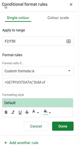
- Select the range F2:F50.
- Go to “Format” > “Conditional formatting”.
- Select “Custom formula” under “Format rules”.
- Enter the above formula in the field below.
- Click “Done”.
This method allows us to dynamically apply conditional formatting to Pivot Table row labels in Google Sheets.
Conditional Formatting Aggregated Values in Pivot Tables Based on Specific Conditions
This scenario involves highlighting aggregated values in a Pivot Table based on specific conditions. Let’s explore how to achieve this in Google Sheets with an example.
Pivot Table Settings
Select the cell range A1:D and click on “Insert” > “Pivot Table”. In the window that appears, select “Existing Sheet” and enter the cell reference F1. Then, click “Create”.
The settings in the Pivot Table editor (sidebar panel) are as follows:
- The field ‘Items’ is added in “Rows”, ‘Category’ in columns, and ‘Amount’ in “Values”.
- ‘Category’ is added in “Filters”, and “Blanks” is unchecked.
I won’t detail these settings since we’ve explained the steps in our previous example with screenshots. Let’s focus on the highlight rule.
Highlight Rule
Syntax:
GETPIVOTDATA(value_name, any_pivot_table_cell, original_column1, pivot_item1, original_column2, pivot_item2)Formula:
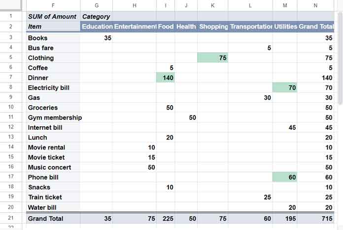
=GETPIVOTDATA("SUM of Amount", $F$1, "Item", $F3, "Category",G$2)>50Where:
value_name: “SUM of Amount” – This is the name of the aggregated value in the Pivot Table.any_pivot_table_cell: $F$1 – Specify the very first cell in the Pivot Table, although you can specify any cell within your Pivot Table.original_column1: “Item” – This refers to the field label (header row value) from the source data of the column used for row grouping.pivot_item1: $F3 – This is the cell reference of the first item corresponding to theoriginal_column1.original_column2: “Category” – This is the field label (header row value) from the source data of the column used for column grouping.pivot_item2: G$2 – This is the cell reference of the first category corresponding to theoriginal_column2.
The purpose of the above formula is to highlight aggregated values that exceed 50 in the Pivot Table.
If you want to highlight aggregated values in the Pivot Table that fall within the range, say 40 to 100, use the following formula:
=LET(rule, GETPIVOTDATA("SUM of Amount", $F$1, "Item", $F3, "Category",G$2), ISBETWEEN(rule, 40, 100))Where:
- The LET function assigns the name ‘rule’ to the GETPIVOTDATA formula.
- The ISBETWEEN function evaluates whether the ‘rule’ is between 40 and 100.
Applying the Highlighting
If you scroll up and observe the Pivot Table screenshot, you’ll notice that the aggregated value range is G3:M20.
However, to account for any potential expansion of the table vertically and horizontally, it’s advisable to select a larger range such as G3:Q50.
Since we’re using a highlight rule based on GETPIVOTDATA, the formatting will not be applied to values outside the Pivot Table range.
To apply the formatting:
- Select the range G3:Q50.
- Click on “Format” > “Conditional formatting”.
- Choose “Custom formula” and enter the above rule.
- Click “Done”.
This will highlight values in the Pivot Table greater than 50.
Conclusion
The layout of a Pivot Table may vary from user to user based on their preferences for organizing and analyzing data. Therefore, it’s not feasible to create a single custom formula that applies universally to all users.
Instead, I have chosen the two most common layouts and provided formulas for each. With the formulas explained thoroughly, users can easily edit them to meet their specific Pivot Table conditional formatting requirements.


