Creating charts in Google Sheets is straightforward if your data is arranged properly. Most chart types require specific data structures. In this guide, you’ll learn how to prepare data for various popular charts in Google Sheets.
Additionally, you’ll receive a free chart template with sample data tailored for these chart types.
Introduction
Before creating charts in Google Sheets, ask yourself this important question: What would you like to show?
To create an effective chart in Google Sheets (or any other application), you must thoroughly understand your data. Consider whether you’re highlighting comparisons, distributions, or relationships. If you’re unsure, refer to this tutorial: Choose Suitable Chart for Your Spreadsheet Data – How To.
Once you’ve identified your goal, review the chart types below to see how to prepare data for each.
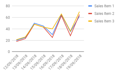
1. Line Chart
Use a Line chart to visualize trends in data over time intervals.
How to Prepare Data for Line Charts in Google Sheets
Prepare your data as shown below:
- The first column contains data for the x-axis (e.g., dates, days, months, years, or time intervals).
- Subsequent columns contain data for the y-axis.

Creating the Line Chart
- Select the entire dataset (e.g., A1:D9).
- Go to Insert > Chart > Line Chart.
- In the Chart Editor, ensure the following options are checked:
- Use Row 1 as Headers
- Use Column A as Labels
2. Area Chart
The Area chart is similar to the Line chart but emphasizes magnitude by filling the space below the line with color.

Preparing Data for Area Charts
The data format for Area charts is identical to Line charts.
Creating the Area Chart
Follow the steps for Line charts, but choose “Area Chart” in the Chart Editor.
3. Bar Chart
Bar charts represent categorical data with horizontal rectangular bars proportional to the values they represent. Use Bar charts to compare data among categories.

How to Prepare Data for Bar Charts in Google Sheets
- Column A: Categories (x-axis labels).
- Subsequent columns: Values (y-axis).

Creating a Bar Chart
- Select your dataset.
- Go to Insert > Chart > Bar Chart.
- Ensure the following options are checked:
- Use Row 1 as Headers
- Use Column A as Labels
4. Column Chart
Column charts are similar to Bar charts but with vertical bars.

How to Prepare Data for Column Charts in Google Sheets
The data format is identical to Bar charts.
Creating a Column Chart
- Highlight the dataset (e.g., A1:D11).
- Go to Insert > Chart > Column Chart.
5. Pie Chart
Pie charts visualize numerical proportions as slices of a circle.

How to Prepare Data for Pie Charts
- Column A: Category names (e.g., “United States,” “Russia”).
- Column B: Corresponding values (e.g., population, sales).

Creating a Pie Chart
- Highlight the range (e.g., A1:B11).
- Go to Insert > Chart > Pie Chart.
- Check:
- Use Row 1 as Headers
- Use Column A as Labels
6. Scatter Chart
Scatter charts help identify relationships between two numerical variables.

How to Prepare Data for Scatter Charts
- Column A: x-axis values (independent variable).
- Column B: y-axis values (dependent variable).

Creating a Scatter Chart
- Select your dataset.
- Go to Insert > Chart > Scatter Chart.
- Enable:
- Use Row 1 as Headers
- Use Column A as Labels
7. Bubble Chart
Bubble charts are three-dimensional, adding a “z” variable (bubble size) to the Scatter chart’s “x” and “y.”

How to Prepare Data for Bubble Charts in Google Sheets
- Column A: x-axis values.
- Column B: y-axis values.
- Column C: Categories (optional) that determine the color. Include this column and leave “-” in each row if you want all bubbles to have the same color.
- Column D: Bubble size.

Creating a Bubble Chart
Select the dataset and go to Insert > Chart > Bubble Chart. Enable “Use Row 1 as Headers.”
8. Geo Chart
Geo charts display data on a map, such as sales by region or population by country.

How to Prepare Data for Geo Charts
- Column A: Locations (e.g., country/state names or ISO codes).
- Column B: Values (e.g., sales or percentages).

Creating a Geo Chart
- Select the range and go to Insert > Chart > Geo Chart.
- Enable “Use Row 1 as Headers.”
- Under the Customize tab, select the desired region by clicking Geo.
9. Waterfall Chart
Waterfall charts visualize how initial values are affected by positive or negative changes.

How to Prepare Data for Waterfall Charts
- Column A: Categories (e.g., salary, expenses).
- Column B: Values (+ve or -ve).

Creating a Waterfall Chart
- Select the range (e.g., A1:B8).
- Go to Insert > Chart > Waterfall Chart.
10. Histogram
Histograms display data distribution across bins (ranges).

How to Prepare Data for Histograms
- Column A: Labels (optional).
- Column B: Numerical data.

Creating a Histogram Chart
Select only Column B, as Column A is not required for the histogram chart. Then insert a chart by going to Insert > Chart > Histogram.
Customize Bin Size for Histogram Graph in Google Sheets:
- Check the box for “Use row 1 as headers”.
- In the chart editor’s Customization tab, adjust the Bin/Bucket size as needed by selecting the “Histogram” drop-down.
11. Radar Chart
Radar charts (Spider charts) compare variables across multiple categories.

How to Prepare Data for Radar Charts
- Column A: Categories.
- Column B/C: Values for comparison.

Creating a Radar Chart
Go to Insert > Chart > Radar Chart.
12. Gauge Chart
Gauge charts resemble speedometers, displaying performance within a range.

How to Prepare Data for Gauge Charts
- Column A: Labels.
- Column B: Values.

Creating a Gauge Chart
Data preparation for a Gauge chart is simple, but chart customization is key to visually interpreting the performance score.
As usual, select the entire data range (e.g., A1:B1) and go to the Insert menu, then click on Chart. From there, select Gauge chart.
Navigate to the Customize tab in the chart editor. Click on Gauge and enter the minimum and maximum values for each gauge level that falls within the gauge range.
13. Candlestick Chart
Candlestick charts are used for financial data, such as stock price movements.

How to Prepare Data for Candlestick Charts
Enter historical stock data in columns A to E, with dates in column A (format as text by clicking Format > Number > Text) and the low, open, close, and high values in the next columns.

If you use the GOOGLEFINANCE function, such as:
=GOOGLEFINANCE("ticker", "all", "01/08/2018", "31/08/2018")You will get data in the column order: Date, Open, High, Low, Close, and Volume, where the first column contains timestamps. However, the date must be formatted as text. Therefore, you should create a new range from this data with the required format.
Creating a Candlestick Chart
- Click Insert > Chart and select Candlestick Chart.
- Make sure to check the option Use row 1 as headers in the Setup tab.
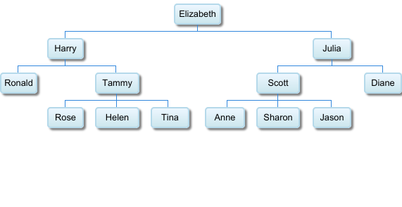
14. Organizational Chart
Organizational charts display employee hierarchy.
How to Prepare Data for Organizational Charts
- Column A: Employee names.
- Column B: Reporting officers.

Creating an Organizational Chart
Go to Insert > Chart > Organizational Chart.
15. Treemap Chart
The Treemap chart is used to display hierarchical data as nested rectangles, representing a tree structure.
Treemapping is particularly effective for comparing proportions within a hierarchy. A common example is showing patient wait times across various departments in a clinic.

Each category in a Treemap is represented with a unique color, making it easy to visualize data. Larger rectangles indicate longer wait times, while smaller ones represent shorter wait times.
How to Prepare Data for Treemap Charts
The data structure for a Treemap chart in Google Sheets typically includes hierarchical data arranged in three columns:

- Hierarchy or Categories:
- In column A, enter the hierarchical levels, such as categories and subcategories.
- For example, “Department” as the category and “General Medicine” or “General Surgery” as subcategories.
- Parent Category:
- In column B, specify the parent category for each subcategory.
- Numeric Values:
- In column C, enter numeric values corresponding to each subcategory to determine the size of the rectangles.
- Include the total of the subcategories against the parent category in the same column.
The sample data should show at least one category and its associated subcategories. Repeat the structure to include more categories and subcategories.
How to Create a Treemap Chart
- Select the data range, such as A1:C, formatted as described above.
- Go to the Insert menu and choose Chart.
- From the Chart Editor, select Treemap as the chart type.
The chart will automatically visualize your hierarchical data.
16. Timeline Chart
The Timeline Chart (previously known as the Annotated Timeline Chart) in Google Sheets visually represents data points in chronological order.

This chart includes a zoom option and a date range selector, allowing users to focus on specific portions of the timeline.
You can add important milestones to the chart as annotations. Previously, these annotations were fully functional. However, currently, they only appear as letters (alphabets) on the chart, while the note section remains blank. This issue could be a bug or an intentional change by the developers.
How to Prepare Data for Timeline Charts in Google Sheets
To create a Timeline Chart, you can use a data structure similar to that of a line chart. However, you can include annotations between each y-series.

For example:
- Enter the categories (x-axis) in Column A.
- Add corresponding y-axis values in Columns B and D.
- Use Columns C and E for annotations related to the respective data points.
How to Create a Timeline Chart
- Select the data range you prepared.
- Go to the Insert menu, then choose Chart, and select Timeline.
- In the Chart Editor, ensure the options Use row 1 as headers and Column A as labels are selected, similar to creating a line chart.
17. Table Chart
The Table Chart is a versatile tool for creating visually appealing and interactive dashboards in Google Sheets. It transforms long lists of data into a paginated and sortable chart, making it easier to display and navigate large datasets within a limited space.

This chart provides the following features:
- Sortable columns: Click on a column header to sort the data in ascending or descending order.
- Page navigation: Easily navigate through pages of data using the controls at the bottom of the chart.
How to Prepare Data for Table Charts in Google Sheets
There are no specific requirements for data preparation. You can use your existing table or dataset as is.
How to Create a Table Chart
- Select your table or dataset.
- Go to the Insert menu, then select Chart.
- In the Chart Editor, choose Table Chart from the chart type options.
The Table Chart is an excellent choice for showcasing large datasets in a compact and interactive manner, especially in dashboards. It enhances readability and usability without the need for additional formatting.
Sample Sheet with Structured Data and All Charts
Can you provide a sheet containing the above charts and formatting?
Of course! Here it is: All Charts
The sheet includes an index page for easy navigation between the charts and their corresponding data.
Additional Reading: Create a Gantt Chart Using Sparkline in Google Sheets.


I did the same thing; changed my sheets to the UK locale and it worked. When I switched it back I got the same error as before. It did not continue to work.
I tried the candlestick formula and it would not work. I then copied and pasted the formula from your spreadsheet that has the working candlestick graph, and it still will not work.
I also copied the formula (without the arrayformula portion of the formula, and did the ‘shift-ctrl-enter’ move, and while it autocompleted the ‘arrayformula with curly brackets’, it still did not produce the table.
The error I get is ” Function Array_ROW parameter 2 has mismatched row size. Expected 2. Actual 1.”
Hi, Johnny,
Share the sheet if possible.
Thanks.
No problem. Here is the link. Thanks for replying so quickly.
Note: Link removed by the admin.
I’m not an expert with Google Sheets, but is it something simple like missing an add-on? This is such a strange problem since everyone basically has the same version of google sheets, unlike Excel which has quite a few versions.
Hi,
I think it has something to do with your spreadsheet’s regional setting.
I removed the formula in your sheet and then changed the locale (File menu) to the UK to match with my Sheet’s settings. Then again applied the formula. It started working.
I have converted back the spreadsheet locale to the US and still, I think, it’s working.
Thanks.