Selecting a suitable chart is not an easy task. Do you know how to choose one from the available options in Google Sheets?
Google Sheets, the cloud-based spreadsheet solution from Google, comes equipped with various popular charts ready for use.
Are you familiar with how to select a chart type that aligns with your data visualization needs in Google Sheets from the numerous options available?
I’ve organized the most frequently used charts into four categories to help you choose a suitable chart for your data. Furthermore, you can find examples of using each in my sample sheets.
Before delving into that, let’s have a brief introduction to charts. I believe it wouldn’t be wise to begin this tutorial without acknowledging the foundational role of charts and their origin.
Introduction
The history of charts dates back to 1786 when William Playfair, a Scottish engineer, invented various diagrams for economic data.
Since then, charts have evolved significantly, now being considered the best way to present data in a graphical or pictorial form.
However, choosing the suitable chart type is crucial for achieving the best results.
Creating a chart from Excel or Google Sheets data is a quick process that requires minimal spreadsheet knowledge, and customization can be done effectively.
However, the challenge often lies in selecting the right chart. To make the right choice, you need a clear understanding of the data at hand and proper organization in rows and columns.
There are various types of charts, such as Bar, Gantt (custom), Column, Line, Area, Pie, Sparkline, Table, and many more.
Explore our charts tutorial to understand how to create some of the popular charts and how to organize data effectively within cells.
How to Choose a Suitable Chart Type for Your Data in Google Sheets
First, follow the categorization of chart types below. This will provide you with a general idea of choosing the suitable/right chart for your data type in Google Sheets.
Afterward, proceed to the sample sheet that immediately follows, containing all the available Google Sheets charts.
Categorizing Charts to Aid in Choosing the Suitable Chart Type
The chart categorization below is intended to help you choose a suitable chart in Google Sheets.
Comparison:
- Line
- Area
- Column
- Bar
- Candlestick (for comparing open, high, low, and close values over time)
- Radar
- Combo Chart
Composition:
- Pie
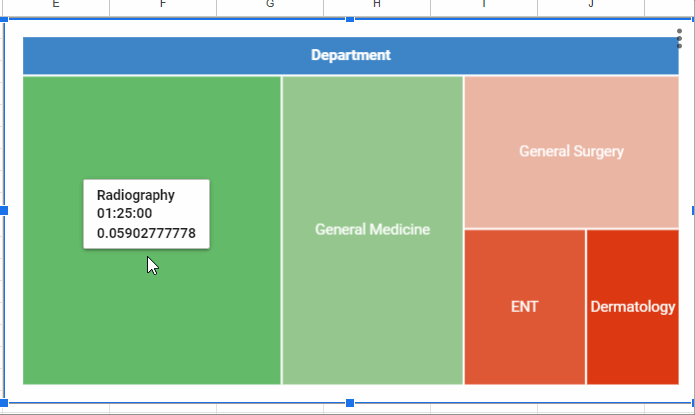
- Treemap (provides hierarchical view and composition within categories)
- Organizational (for representing hierarchical or organizational structures)
Relationship:
- Scatter
- Bubble (can represent the relationship between three sets of data)
- Map (Geo Chart) – Depending on the data, it can show geographical relationships
Distribution:
- Histogram (represents the distribution of a dataset)
- Waterfall (shows the cumulative effect of sequentially introduced +ve or -ve values)
- Gauge (can represent the distribution of a value within a range)
- Scorecard (can show the distribution of performance against goals)
Other:
- Timeline (shows events or milestones over time)
- Table (for displaying data in tabular form)
These categorizations are flexible; some charts might fit into multiple categories based on their usage and the data they represent.
Sample Charts
Please click the button below to preview and copy my template that contains all popular Google Sheets charts. It’s free to use.
Along with the categorization provided above, I hope you will find a way to choose a suitable chart for your data in Google Sheets.
Resources
We have seen the quick way to choose a suitable chart in Google Sheets by understanding the ‘category’ and experimenting with the example charts.
Additionally, you can check the tag “Charts” to learn how to create all of those charts in Google Sheets. Moreover, you can use the function SPARKLINE to create tiny charts within cells.
For the Gantt Chart, you may need to use conditional formatting or the SPARKLINE function. Here are those tutorials:
- Create a Gantt Chart Using Sparkline in Google Sheets
- Sparkline Bar Chart Formula Options in Google Sheets
- Sparkline Column Chart Options in Google Sheets
- Sparkline Line Chart Formula Options in Google Sheets
- SPARKLINE for Positive and Negative Bar Graph in Google Sheets (Array Formula)
- Create Gantt Chart Using Formulas in Google Sheets


