This tutorial explains a Gauge chart and how to create one in Google Sheets. Often called a Speedometer chart, it resembles a speedometer.
The purpose of a Gauge chart is to compare or assess the performance of one or more values against a set target. It is commonly used in executive dashboard reports to track performance.
You can use this chart to visually display progress in various scenarios, such as task completion percentage, achieved target versus goal, customer satisfaction, and more.
In this example, let’s consider the sales target and achieved percentage.
Formatting Data for the Gauge Chart
The data to create a Gauge chart should be presented in two columns: one for labels and the other for data point values. The second column should contain a numeric value, which represents the gauge value.
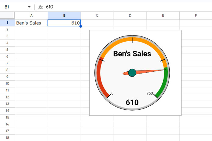
For example, let’s assume you sell gravel and have set a target of 750 cubic meters (Cum) for one of your employees, and his actual sales so far are 610 Cum.
Enter the employee’s name in cell A1 and his sales quantity in cell B1 (e.g., 610).
Steps to Create a Gauge Chart in Google Sheets
We can separate the steps into two categories: Basic Settings and Performance Threshold Level Settings.
Basic Settings
- Select A1:B1.
- Click Insert > Chart.
- In the chart editor panel, under the “Setup” tab, select Gauge Chart as the chart type.
- Click the Customize tab and select Gauge.
- Under Gauge Range, enter the minimum sales quantity in the minimum field (e.g., 0) and the target (750) in the maximum field.
Performance Threshold Level Settings
You can use three different color “ranges” or “color bands” in a Gauge Chart in Google Sheets. These color segments represent different performance thresholds or levels, such as:
- Red: Represents low or below-target performance.
- Orange: Indicates moderate or near-target performance.
- Green: Represents high or above-target performance.
Let’s assume you set the following threshold values: below target (200), moderate target (400), and above target (600). You can set it as follows:
- In the Customize tab of the chart editor, click Gauge.
- Under the first “Range Color,” enter 0 as the minimum and 200 as the maximum, and choose the red color.
- In the second “Range Color,” enter 200 as the minimum and 600 as the maximum, and pick the orange color.
- In the third “Range Color,” enter 600 as the minimum and 750 as the maximum, and pick the green color.
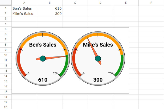
Creating Multiple Gauge Charts in One Go
If you want to create another gauge chart for a different employee, enter the employee’s name in cell A2 and their achieved sales target in cell B2.
The chart will automatically update with this newly entered data and show two gauge charts side by side if you increase the width of the chart, or one below the other if you reduce the width.
If it doesn’t automatically update, open the chart settings and, under the “Setup” tab, replace the Data range A1:B1 with A1:B2.
Additional Customization Options for the Gauge Chart
There are limited customization options, but you can adjust them within the Customize tab of the chart editor.
- Chart Style: This allows basic settings like the chart’s background color, border style, and font color. You can also maximize the space between the chart’s border and its contents.
- Gauge: This section, which we’ve already covered, contains the core settings for the Gauge chart.
- Chart Axis Title: This allows you to add a title to the chart.
Note: If you don’t want to display the employee name or label within the chart, you can delete the label from cell A1 and use it as the title. However, this may not be practical if you have multiple gauge charts.
Resources
- How to Format Data to Make Charts in Google Sheets
- Choosing a Suitable Chart Type for Your Data in Google Sheets
- How to Get Dynamic Range in Charts in Google Sheets
- How to Change Data Point Colors in Charts in Google Sheets
- How to Include Filtered Rows in a Chart in Google Sheets
- How to Use Slicer in Google Sheets to Filter Charts and Tables
- Adding a Custom Formula in a Slicer For Chart in Google Sheets


Thank you for explaining the 10000% thing. I had my mins and maxes set to 0-100 and my needles weren’t budging. Once I switched to 0-1 and the gradations in between, it works like a charm!