Slicers in Google Sheets allow you to filter your source data dynamically, reflecting changes in associated charts and pivot tables.
Benefits of Using Slicers Over Traditional Filters
Imagine you have a dataset and have created both a chart and a pivot table from it. If you apply Data > Create a filter to the source data, it won’t reflect in the chart or pivot table.
For a pivot table, you can filter it using the pivot table settings. However, for a chart, no such direct option exists. You would typically have to use a filter formula to extract the data you need and then create the chart from that subset.
Slicers simplify this process. By connecting a slicer to your source data, you can filter it directly, and both the chart and pivot table will reflect the changes. Slicers are also user-friendly, allowing you to place them conveniently within your sheet.
Slicers to Filter Charts and Pivot Tables, Not the Source Data
Before using a slicer in Google Sheets, it’s essential to understand how it interacts with data filtering and where it should be placed within the workbook:
- Filtering a Data Range (Hiding Filtered Rows): If you want the slicer to hide specific rows based on filter criteria, insert the slicer in the same sheet as your source data. Placing it on a different sheet will not affect row visibility in the source data.
- Filtering Charts or Pivot Tables Without Affecting Source Data: If your goal is to filter charts or pivot tables without changing the visibility of source data rows, create these charts or pivot tables on a different sheet. Then, insert the slicer in the same sheet as the pivot table or chart. This ensures the slicer filters only those elements, leaving the source data intact.
- Filtering Source Data, Charts, and Pivot Tables Simultaneously: To apply a filter across all elements—source data, charts, and pivot tables—place them all on the same sheet. This way, the slicer’s filtering will be reflected across all components at once.
In summary, slicers only affect the sheet they are placed in. Therefore, positioning them strategically based on your filtering needs is crucial.
How to Create a Slicer for a Data Range in Google Sheets
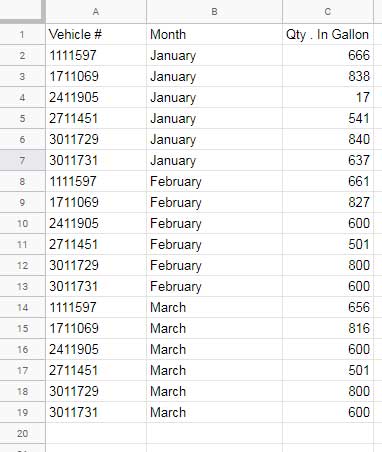
Consider the following dataset, which tracks the monthly fuel consumption of several trucks. Column A contains truck numbers, column B lists months, and column C shows fuel quantities.
Steps to Add a Slicer to a Dataset
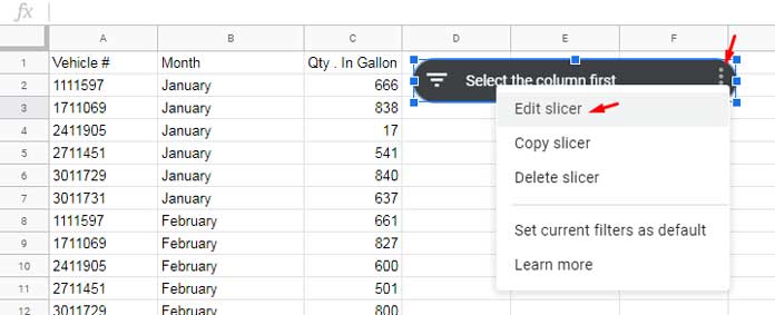
- Select the data range A1:C19.
- Go to the Data menu and click on Add a Slicer. The slicer will appear on your sheet.
- Double-click the slicer or click on it, then select the three-dot menu and choose Edit Slicer.
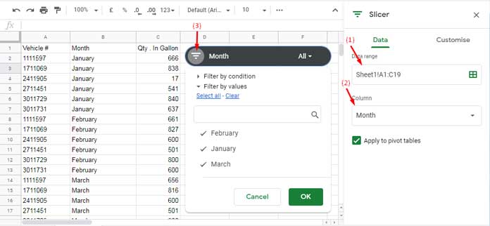
- In the sidebar panel, select the column to filter. Here, we select Month.
Applying a Filter Using the Slicer
To filter the Month column:
- Click the drop-down menu on the slicer and apply the filter as needed. The source data will be filtered accordingly.
Duplicating a Slicer to Add Additional Column Filters
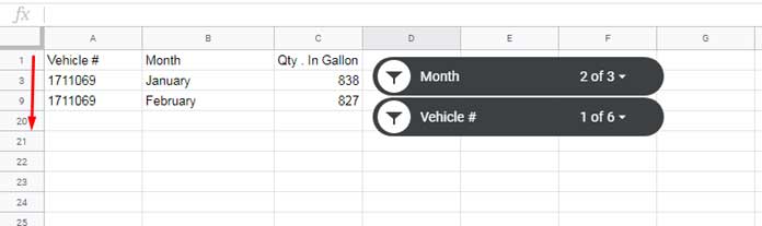
If you need to filter multiple columns (e.g., the Vehicle # column in addition to the Month column), follow these steps:
- Click the three-dot menu on the first slicer and select Copy slicer.
- Right-click anywhere on the sheet and select Paste.
- Double-click the newly added slicer, open the settings, and choose a different column to filter (e.g., Vehicle #).
Now, you can filter the table using two slicers. Based on the filter conditions, Google Sheets will hide or unhide rows accordingly.
Filtering a Pivot Table Using a Slicer
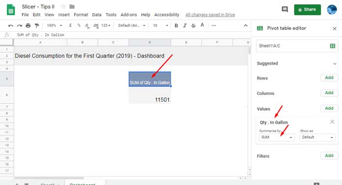
Let’s use the same vehicle fuel consumption dataset from Sheet1 to create a pivot table in a sheet named Dashboard. This setup ensures that filtering the pivot table does not modify the source data.
Creating a Pivot Table
- Select cell D5 in the Dashboard sheet.
- Click Insert > Pivot Table.
- Under Data range, select Sheet1!A1:C19.
- Choose Existing Sheet, enter D5, and click Create.
- In the sidebar panel, drag Qty in Gallons under Values.
Now, your pivot table will sum the total fuel consumption.
Adding a Slicer to a Pivot Table
- Click Data > Add a slicer.
- Select the range Sheet1!A1:C19 and click OK.
- In the sidebar panel, select the Month column.
- Ensure that Apply to pivot tables is checked.

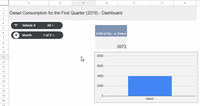
Adding Multiple Slicers to a Pivot Table
To filter the pivot table by vehicle number as well:
- Duplicate the slicer as described earlier.
- Set the new slicer to filter the Vehicle # column.
Now, both slicers can control the pivot table dynamically.
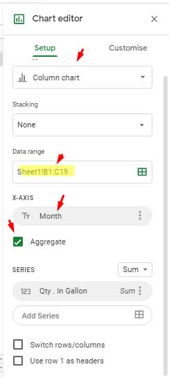
Adding a Slicer to a Chart in Google Sheets
Using the same Dashboard sheet, insert a column chart:
- Click Insert > Chart.
- Under Data range, select A1:C19.
- Add Month under the X-axis.
- Select Aggregate to summarize by month.
Since both the chart and pivot table share the same source data (Sheet1!A1:C19), they can be filtered simultaneously using the existing slicers.
Saving Filter Settings in Slicers
By default, when you close and reopen the sheet, any filters applied to the slicers will be lost. To save your filtering preferences:
- Click the three-dot menu on the slicer.
- Select Save current filter as default.
Customizing Slicers in Google Sheets
You can customize your slicers using the Customization tab:
- Title: By default, the slicer displays the column name. You can edit it to something more descriptive, like “Filter by Month”.
- Background Color: Change the slicer’s appearance to match your theme.
- Text Customization: Modify the title font, size, color, and format.
Conclusion
Now you know how to use slicers in Google Sheets to filter data dynamically. Whether you’re adding slicers to charts in Google Sheets, adding slicers to pivot tables in Google Sheets, or using slicers for a dataset, they provide an efficient and user-friendly way to refine data without modifying the original source.


HI, I use a slicer and pivot table in a dashboard sheet. But when I share it as a protected sheet, it won’t work! How can I change it?
Hi, SCM,
In my test with a protected sheet, it’s working!
Hi again,
Actually, I managed to use your approach in the example given; similar to the pivot table in cell D5 in the Dashboard Tab.
Thanks
Sabba
Hi Prashanth,
Thanks for yet another good tutorial. Is there is a way to retrieve the selected values on the slicer and write in cells on the sheet? All it says Item n number of a total.
Thanks
Sabba
I couldn’t understand the question 🙁