Google Sheets allows for customizing the color of individual data points in its charts, wherever applicable.
With this feature, you can adjust the color of individual bars in a Bar chart, columns in a Column chart, bubbles in a Bubble chart, and data points in a Line and Scatter chart.
Why is this feature important?
Custom colors can be used to highlight specific data points of particular interest or importance, such as status indicators (e.g., red for critical, green for normal), drawing the viewer’s attention.
The default data point colors will depend on the Format menu theme color. When you change the theme, the customized data point colors will also adjust.
Therefore, I recommended choosing the theme color you want before attempting to change individual data point colors of the series.
Let’s explore how to change the data point colors in Bar, Column, Scatter, Bubble, and Line Charts in Google Sheets.
Change Data Point Colors in Bar, Column, and Scatter Charts in Google Sheets
When it comes to changing individual data point colors, these three graphs share the same settings.
Here are the steps to change the color of individual bars in a Bar chart, columns in a Column chart, and data points in a Scatter plot:
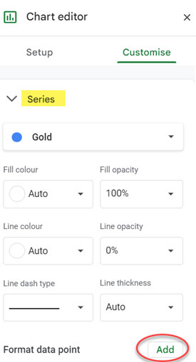
To customize the color of an individual data point, navigate to the “Customize” tab of the Chart editor.
Under “Series,” click on the “Add” button next to “Format data point.”
This will prompt you to select the data point, for which you want to change the color from a drop-down menu. Choose the one you want and click OK.
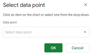
Then, select a color from the color palette to apply to this data point, and you’re done!
This method allows you to highlight specific data and convey additional information in Bar, Column, and Scatter charts.
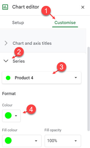
Customizing Colors for Bubbles in Bubble Charts
By default, each data point (bubble) has a different color in the Bubble chart, so additional customization won’t make much of an impact.
To customize the bubble color in Bubble charts, navigate to the Chart editor > Customize tab > Series. From there, you can select each data point by its label and change the color.
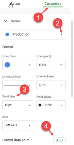
Customizing Data Point Colors in Line Charts
Most settings are similar to those in Bar, Column, and Scatter charts. However, there is one additional setting.
Navigate to the “Customize” tab of the Chart editor and select the “Series” for which you want to display the data points and change colors.
Under “Point size,” select a point size. Click “Add” next to “Format Data Point” and choose the desired data point, then click OK. Select a fill color.
Resources
Here are some guides with tips and tricks for Google Sheets charts.
- How to Create a Multi-category Chart in Google Sheets
- How to Get Dynamic Range in Charts in Google Sheets
- Bar or Column Chart with Red Colors for Negative Bars in Google Sheets
- How to Include Filtered Rows in a Chart in Google Sheets
- Reducing the Width of Columns in Column Charts in Google Sheets
- Two Baseline Values in a Scorecard Chart in Google Sheets (Workaround)
- Duplicates in the First Column in the Organizational Chart
- Google Sheets Bar and Column Chart with Target Coloring


So, Google Sheets has no color set for values? can’t I set green for +80%, yellow for 40-79% and red to <39%?