The bubble chart is a data visualization tool in Google Sheets that displays relationships between variables: x-coordinate, y-coordinate, and bubble size.
Each point represents a data entry with values for these three variables.
The bubble chart is similar to a scatter chart in that both display spreadsheet data as a series of points on a graph. The key difference is in how bubble sizes are controlled.
If you format your data properly, creating a bubble chart in Google Sheets is straightforward.
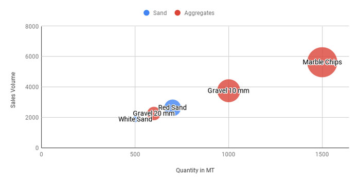
In the following example, each bubble’s position on the chart can visually show how Quantity (x-axis) correlates with Sales Volume (y-axis). Larger bubbles indicate higher sales volumes.
Formatting Data for Bubble Charts in Google Sheets
A bubble chart requires data in five columns, three essential and two optional. The essential data columns are X-axis, Y-axis, and Size. The optional columns are ID (bubble labels) and Series (for grouping data points to add similar colors).
Even if you have only the essential data, include the optional columns and leave them blank. I’ll explain later what to do with the blank columns.
Sample Data:
| Product Name | Quantity in MT | Sales Volume | Category | Percentage Share |
| White Sand | 500 | 1875 | Sand | 11.63% |
| Red Sand | 700 | 2625 | Sand | 16.28% |
| Gravel 10 mm | 1000 | 3750 | Aggregates | 23.26% |
| Marble Chips | 1500 | 5625 | Aggregates | 34.88% |
| Gravel 20 mm | 600 | 2250 | Aggregates | 13.95% |
This is my sample data, and I’ll explain what each column does:
- Product Name: ID (Optional)
- Quantity in MT: X-axis
- Sales Volume: Y-axis
- Category: Series that determines the color (Optional)
- Percentage Share: Size (use a formula to find the value to get the bubble size of each data point proportionate to the whole)
Bubble Size Variable and Formula
You can copy and paste the above data into cells A1:E6 in a blank sheet. Under the field label “Percentage Share”, i.e., in cell E2, enter the following formula and drag it down as far as needed:
=TO_PERCENT(C2/SUM($C$2:$C$6))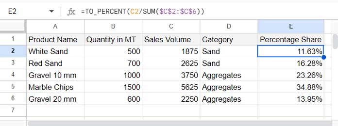
These values will determine the sizes of the bubbles in the chart.
Formatting the Optional Columns ID and Category
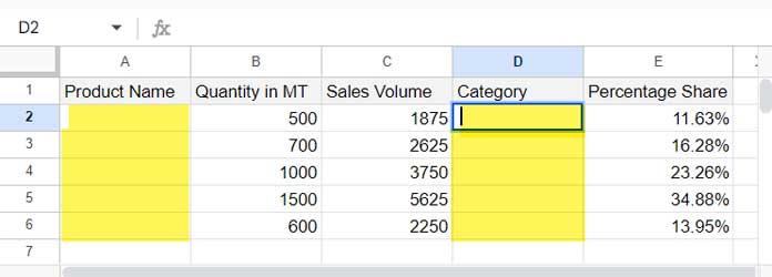
If you don’t have the IDs (the data in the first column that adds labels to bubbles), remove the values in column A, i.e., A2:A6. Leave a space character in cell A2 by tapping the spacebar.
If you don’t have the categories (the ‘Series’), remove the data in the fourth column, i.e., D2:D6, and leave a space character in cell D2.
I hope I have clearly explained how to format data for a bubble chart in Google Sheets. Now let’s proceed to creating the chart.
Steps to Create a Bubble Chart in Google Sheets
Once you have the five-column data formatted as above, you can easily create a bubble chart by following these steps:
- Select the data range A1:E6.
- Click Insert > Chart.
- Within the Chart Editor sidebar panel, under the Setup tab, select Bubble Chart under Chart Type.
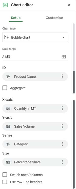
- Navigate to the Customize tab within the Chart Editor panel.
- Under Horizontal Axis, enter 0 in the Min field.
- Under Vertical Axis, enter 7000 (a value higher than the max value in the third column of the sample data) in the Max field.
- Check other customization options available.
That’s all. You have created your first bubble chart in Google Sheets.


