I hope this tutorial can help you to make a Scatter Chart in Google Sheets very easily. I have included all the necessary steps in this post to plot a Scatter (X-Y) Chart in Google Sheets.
You can visualize your data using different types of charts. But if you know which chart type can use to better visualize your data, then creating the chart is just a few clicks away.
In one of my earlier tutorial, I’ve given some insight into chart types and data formatting in Google Sheets. That will be useful for you in your process of decision making.
Tips: Choose Suitable Chart for Your Spreadsheet Data – How To
With my available dataset, should I go with a Scatter chart or a Line chart? I have asked this question myself. Do you?
Because both are similar, especially when the dots are connected using lines in Scatter, but there is a major difference.
Major Difference Between Scatter Chart and Line Chart
Chart Selection Tips Between Scatter and Line Charts
Here is the basic. Use the Line chart when you want to show a comparison and go with the Scatter chart for visualizing relationship.
Line Chart = Comparison
Scatter Chart = Relationship
This is the possibly simplest way of understanding these two charts.
The Scatter Chart has two axis values (X and Y) and both can show two different sets of numerical data.
Here lies the main difference between the Scatter Chart in Google Sheets with the Line Chart.
The Line chart supports category in the x-axis (horizontal axis) while the x-axis of a Scatter chart is always a value axis
Another name of Scatter Chart is XY graph. I think by this name you can easily understand the purpose of Scatter chart.
Example to Scatter Chart in Google Sheets
See one sample Scatter Chart showing hourly wind speed record. See the relationship between these two data in this chart.
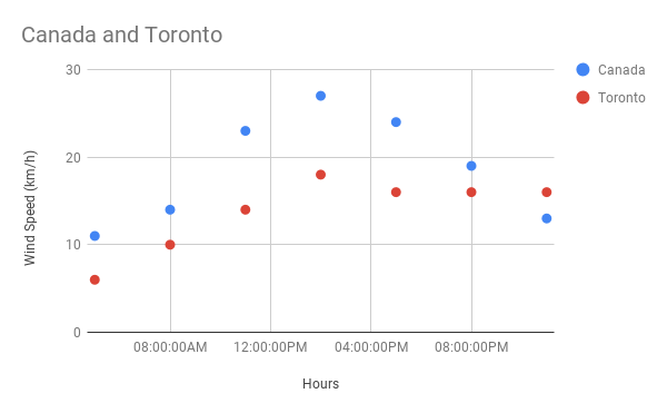
How to Plot A Scatter Chart in Google Sheets
Sample Data:
See the relationship between the number of houses in a locality and the number of cars per household in that locality.
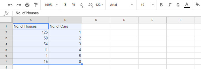
Let’s see how to make Scatter Chart in Google Sheets with this sample data.
Steps:
1. Select the data range A1: B7.
2. Go to the menu Insert > Chart.
3. In the chart editor panel under the DATA tab, select Scatter Chart.
4. Then go to the CUSTOMISE tab and uncheck “Treat Labels as Text” under Horizontal Axis.
5. Done! Your Scatter Chart is ready.
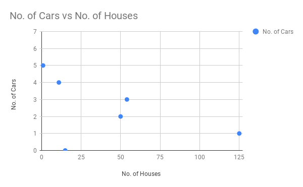
Similarly, you can plot a Scatter chart showing the relationship between the monthly salary of employees and their monthly rental etc.
Trendline in Scatter Charts:
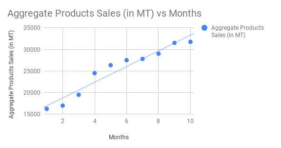
The Trendline is another reason to use a Scatter Chart over a Line Chart.
We can draw a Trendline in Scatter Chart in Google Sheets. To draw a Linear or other Trendlines in Scatter chart in Google Sheets, go to the chart editor “Customise” tab and click Series.
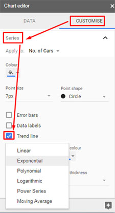
There select the series and apply the Trendline as per your data trend.
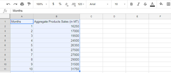
You can visualize the above sample data using a Line chart as well as Scatter Chart. But in Scatter Chart you can draw a linear trendline.
In the Line chart, if you want to draw a Linear Trendline, you may want to add an extra column C to your source data above. In that column, you can use the TREND function to get the required data to draw the Linear Trendline.
That’s all about Scatter Chart in Google Sheets.
Must Read:
1. How to Add Labels to Data Points in Scatter Graph.
2. Common Errors That You May Face in Scatter Chart in Google Sheets.

