A scatter chart is one of the best ways to show the relationship between two data points. However, when creating scatter charts in Google Sheets, you may encounter some common errors. In this post, I will address these common issues and provide solutions to ensure your scatter chart displays the data correctly.
Common Errors in Scatter Charts You May Encounter
Here are three common errors you might face when creating a scatter plot:
- Missing x-axis values.
- Data point labels are incorrectly placed on the x-axis.
- Errors in the trendline equation due to improper scaling of the x-axis.
Handling Common Errors in Scatter Charts
Many Google Sheets users face challenges when plotting a scatter chart with two sets of numeric values. While Google Sheets typically plots the correct chart, it sometimes fails to do so. Let’s go over how to handle these common errors in scatter charts.
Sample Data:

The sample consists of three columns:
- Column A: Adult Population (in millions) [X-axis values]
- Column B: Average Weight (in kg) [Y-axis values]
- Column C: Region (labels for data points)
1. Missing X-axis Values

If your scatter chart is missing x-axis values, you need to fix it. Follow these steps:
- Select the range A1:B7 (X and Y-axis values).
- Go to the menu: Insert > Chart.
- Set the chart type to Scatter (the default chart may be a column or line chart).
The correct chart should look like this:

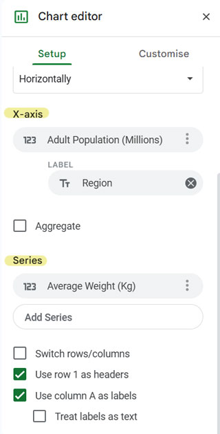
If the chart displays missing x-axis values, follow these steps in the Chart Editor’s Setup tab:
- Ensure Switch Rows/Columns is unchecked.
- Ensure Treat Labels as Text is unchecked.
- Ensure Use Row 1 as Headers and Use Column A as Labels are checked.
This will resolve the common error of incorrect x-axis values.
2. Incorrect Data Point Labels

Google Sheets may sometimes add data point labels incorrectly or fail to add them entirely. Here’s how to fix it:
- Select the range A1:C7 (labels and values) and insert a scatter chart.
- If data point labels are missing or incorrectly placed, follow these steps under the Setup tab:
- Click the three vertical dots next to the current X-axis and select Remove.
- Click Add X-axis and select Adult Population.
- Under Series, remove the currently added series and add the series Average Weight (Kg).
- Click the three vertical dots next to Adult Population (X-axis) and select Add Labels. This will add the label Region.
If you encounter issues, refer to the post on how to Add Labels to Scatter Chart Data Points in Google Sheets for further guidance.

3. Correcting the Scatter Chart Trendline Equation Error – Proper Scaling of the X-Axis
Sometimes, you may notice an error in the trendline equation in your scatter chart. Here’s how to resolve it:
- Incorrect trendline equations can occur if the Treat Labels as Text option is checked. This may affect how the x-axis is scaled, leading to incorrect equations.
- To fix this, uncheck Treat Labels as Text in the Setup tab of the Chart Editor.
Additionally, to add a trendline:
- Go to the Customize tab in the Chart Editor.
- Click on Series.
- Check the Trendline option and also select Show R².

If you follow these steps correctly, your trendline equation will appear correctly.
Conclusion
These are the most common errors in scatter charts in Google Sheets, along with solutions for fixing them. By following the steps outlined above, you can easily create a clean and accurate scatter chart.
Related:


