Adding labels to scatter charts in Google Sheets depends on how you format the source data for your chart. In a typical scatter chart, you need two columns of data: one for the X-axis and one for the Y-axis. However, in an annotated scatter chart, you’ll add a third column with labels for each data point.
Let’s walk through how to format the data for plotting a scatter chart with labels added to the data points.
Sample Data Preparation
I’m using sample data to demonstrate how to add labels to scatter chart data points. You can learn more about the purpose of this chart in my relevant tutorial here.
Sample Data (A1:C4):
| Labels | Value X | Value Y |
| A | 1 | 400 |
| B | 2 | 275 |
| C | 3 | 10 |
In this format, the first column contains labels for the data points, the second column holds values for the X-axis, and the third column contains values for the Y-axis.
Though we’ll use this sample data to create the chart, let’s consider a real-life example. For instance, the labels in the first column could be “Region,” the second column could represent “Adult Population,” and the third column could represent “Average Weight.” This scatter chart would visualize the relationship between adult population and average weight, and adding labels to the data points would make it easy to identify which region corresponds to each data point.
Adding Labels to Scatter Chart Data Points in Google Sheets
Once you arrange your data as shown above, adding labels to scatter chart data points becomes straightforward.
Steps to Follow:
- Select the data range B1:C4 (the X and Y value columns). Note that we’re skipping column A, which contains the labels.
- Click Insert > Chart. Google Sheets will create a default chart.
- In the chart editor, select Scatter Chart under the Chart Type.
- Your scatter chart is ready. Next, we’ll add labels to the data points on the chart.
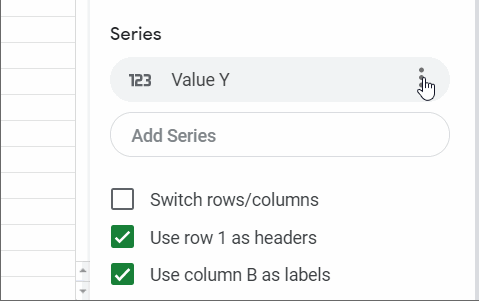
- Under the Setup (previously named Data) tab, click the three vertical dots in the Series box. Then select Add Labels and choose the range A1:A4, which contains the data point labels.

If you encounter an issue where default labels are added (like “X Value” or “Y Value”), follow these steps:
- After selecting Add Labels, you might see “X Value” or “Y Value” automatically added as the data point labels. Click on this and select the range A1:A4. You can refer to the GIF below for a visual guide.
Once that’s done, your scatter chart with labeled data points is ready!

Note: Ensure that “Treat Labels as Text” at the bottom of the Setup tab is unchecked.


Thank you!
Great tutorial as always. One question, though. How do you handle overlapping data labels? Say you have a few dots next to each other. How do you make it “readable”?
Hi, Arta,
I don’t find a way to do that with the available chart settings.
It seems the Bubble chart doesn’t have that issue. So try it.
I can not get this to work. I never seem to get an option to select the labels from a different column.
Do you know of a way to make the labels hover-only – when there are a lot of points it’s hard to see anything…
Hi, Julia,
Use Bubble chart. You can make the bubbles smaller similar to Scatter.
Inside my tutorial, Conditional Coloring Data Points in the Scatter Plot In Google Sheets, in the end, you can see a link to my sample sheet.
Copy that sheet. In that sheet, check the tab “bubble” for an example.
Hi,
This is currently driving me insane… I am trying to simply label the scatter plot values. When I click on series–> data labels –> the only option is type: value which is the y-axis, no way to customize. any ideas?
Many thanks,
Julia
Hi, Julia,
Sorry for making the confusion. I have just edited the post to include a new GIF image to make you understand the step clearly.
Actually, you are seeing the default labels added. You should click on it to select your required labels’ range.
Anyway to make replace the hover labels instead of an always-visible label?
Thank you! It was very helpful!
Thanks. I was pulling my hair out trying to figure out how to add labels! This was perfect.