The Annotated Timeline Chart in Google Sheets is a unique chart type similar to the popular Line Chart, but it offers interactivity and annotations that set it apart. It’s particularly useful for displaying time-series data in an engaging and interactive way. This interactivity is the primary difference between an Annotated Timeline Chart and a Line Chart.
As a side note, it’s important to distinguish between the Timeline View and the Annotated Timeline Chart in Google Sheets. Timeline View is designed for task tracking and visualization, and it’s available only in certain Google Workspace editions—not for free accounts.
Annotated Timeline Chart vs. Line Chart
Both the Annotated Timeline Chart and Line Chart are used to show trends over time, allowing you to compare one or more data series. However, they differ in key features:
Line Chart
- Simple and versatile; suitable for visualizing continuous data.
- Does not include annotations.
- Highly customizable with flexible styling options such as multiple series, markers, and customized axes.
Annotated Timeline Chart
- Includes labels or notes (annotations) attached to specific data points (although this feature appears to be buggy or temporarily unavailable at the moment).
- Limited options for styling, such as line styles and data point markers.
- Provides interactivity, allowing users to zoom in/out and focus on specific periods using preset zoom buttons and a date range selector.
Creating an Annotated Timeline Chart in Google Sheets
Here’s how you can create an Annotated Timeline Chart in Google Sheets. However, during my testing, the annotation feature seemed to be non-functional. While the legend (capital letters starting from A) appears on the chart, the annotation text itself is missing. This feature worked previously, so I’m unsure whether it has been intentionally removed or if it’s a temporary bug.
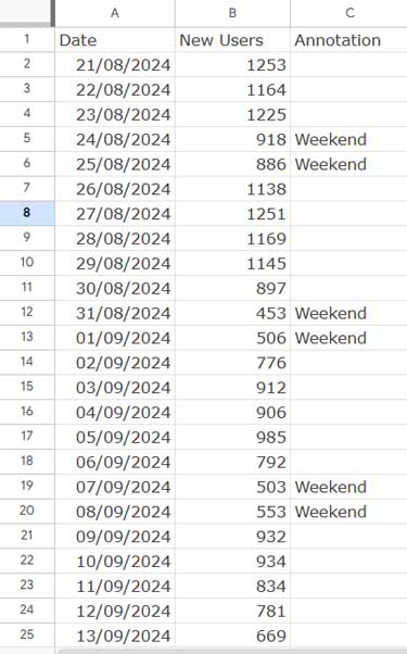
Formatting Data for the Chart
The foundation of any graph in spreadsheet applications is well-structured data. To create an Annotated Timeline Chart, your data should be organized as follows:
- Column A: Dates (time series).
- Column B: Data values (e.g., number of visitors).
- Column C: Annotations (e.g., reasons for traffic spikes or drops).
Here’s an example dataset for tracking website traffic:
As a side note, if you’re a webmaster, you can import similar data from Google Analytics, Google’s tracking tool, into Google Sheets using the free official Sheets add-on. Check out this guide: How to Connect Google Analytics (GA4) to Google Sheets.
Steps to Create the Chart
- Select the data range (A1:C).
- Go to the menu and click Insert > Chart.
- In the Chart Editor, change the chart type to Timeline Chart.
Your Annotated Timeline Chart is ready! (Keep in mind that the annotation feature may not display correctly due to the issue mentioned above.)
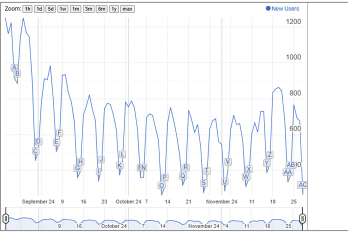
Controlling the Timeline View
One of the standout features of the Annotated Timeline Chart is its interactivity. You can zoom in and out or adjust the view to focus on specific date ranges. Here’s how you can control it:
Zoom Buttons and Date Range Selector
- At the top of the chart, you’ll see zoom buttons labeled 1h, 1d, 5d, etc. Clicking on these lets you visualize data for the specified time period.
- At the bottom of the chart, you’ll find a slider. Drag the ends of the slider to focus on a specific range of data.
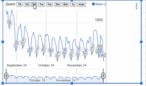
Customizing Zoom and Date Controls
You can enable or disable these interactive controls via the Chart Editor:
- Double-click the chart to open the Chart Editor.
- Navigate to the Customize tab.
- To toggle controls:
- Uncheck Show Zoom Buttons to remove the zoom options.
- Uncheck Show Date Range Selector to hide the slider.
Additional Customization Options
- Expand Range to Show Zero: By default, this option is unchecked. Enable it if you want the Y-axis scale to start at 0, regardless of your data range.
Conclusion
The Annotated Timeline Chart is a powerful tool for visualizing trends and highlighting significant events in your data. While the annotation feature may currently face issues, its interactivity—through zooming and date range selection—makes it an excellent choice for analyzing time-series data in Google Sheets. If Google resolves the annotation bug, this chart will regain its full potential for showcasing insights.


Google Sheets timeline chart is INCREDIBLY powerful. However, in the published version of the chart (for others to view), the timeline chart’s annotation column is blank, just like in your example picture above. It sounds like you were able to fix it though, so what was the fix? I’m trying this on May 5, 2020.
Hi, Fahim,
I’ve noticed a bug in the Timeline chart in the past (when I was first writing the above post) that sorted out by the developers later.
I’ve tested my chart sheet and it seems working flawlessly.
If you open the following post, in the last part, you can see a link text labeled “Download Google Sheets Charts Template”.
Click that to get my chart. It contains several charts including the TIMELINE with annotation.
How to Format Data to Make Charts in Google Sheets.
Cheers!
Looks like this format does it: 2019-02-07, 00:00:00
How do you format the date column so it includes the hour? (I have a datapoint for each hour.) Thanks.