We can individually change the colors of data points (the colors of the dots) in a scatter plot in Google Sheets. However, Google Sheets doesn’t offer a built-in option for conditional coloring of data points in a scatter plot.
In this post, I’ll walk you through two workarounds to solve this issue by re-formatting the chart’s source data.
The first workaround uses the scatter plot itself, while the second workaround uses a bubble chart.
Though the second workaround is simpler to implement and the plotted chart will resemble a scatter plot, it has one drawback: it does not allow you to add a trendline to the chart.
What’s the issue?
The bubble chart doesn’t support trendlines, while the first workaround does, but with a limitation.
For conditional coloring in a scatter plot in Google Sheets, we need to group the data points and move these groups into separate columns.
This creates a restriction: we can only draw trendlines based on the groups, not on the entire Y-axis series.
Below, you’ll find two examples to help you apply conditional coloring to your scatter plot.
How to Apply Conditional Coloring to a Scatter Plot in Google Sheets
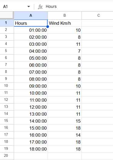
A scatter plot is typically used to show how one variable is affected by another. The plot displays numeric coordinates along the X and Y axes.
In the example below (see the image), the X-axis represents “Hours” and the Y-axis represents “Wind Km/h.”
Here are the step-by-step instructions to apply conditional coloring for a scatter plot in Google Sheets.
Grouping Data Points in the Scatter Plot
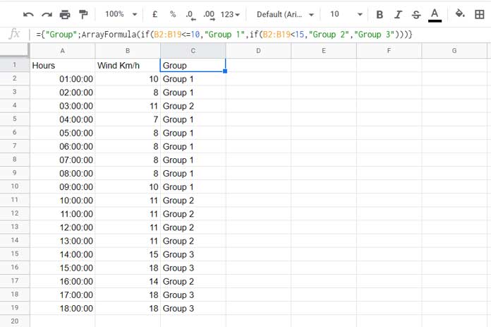
First, I’ll group the “Wind Km/h” data points based on the following conditions:
B2:B19 <= 10– “Group 1”B2:B19 > 10 and B2:B19 < 15– “Group 2”B2:B19 >= 15– “Group 3”
Use the following formula in cell C1 to group the scatter plot data points:
={
     "Group";
     ARRAYFORMULA(
        IF(B2:B19<=10, "Group 1", IF(B2:B19<15, "Group 2", "Group 3"))
     )
}
If you have fewer data points, you can manually type the groups in column C instead of using the formula, depending on how you wish to group the data.
Note: You don’t necessarily need to use a formula. What you want to do is assign “Group 1” to all data points that should be in one color, “Group 2” to those that should be in another color, and so on.
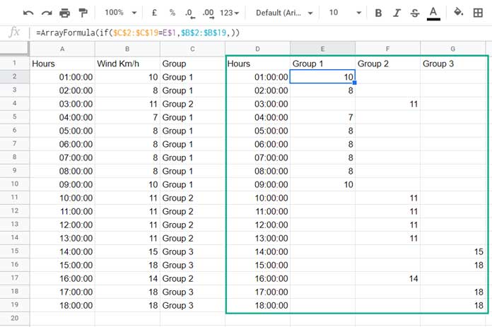
Moving Data Points to Columns
Next, let’s organize the data for plotting the scatter plot. First, in cell D1, enter this formula to copy the X-axis values as they are:
={A1:A19}In cells E1, F1, and G1, type “Group 1”, “Group 2”, and “Group 3” respectively. In cell E2, type the following formula and drag it across to F2 and G2:
=ArrayFormula(
     IF($C$2:$C$19=E$1, $B$2:$B$19,)
)
IF Syntax Reference: IF(logical_expression, value_if_true, value_if_false)
Even if your grouping formula or logical expressions in cell C1 differ, as long as you use “Group 1”, “Group 2”, and “Group 3” for the values, the formulas in cells E2, F2, and G2 will remain the same.
If you have more than three groups, say four groups, in cell H1 type “Group 4” and copy the formula from G2 to H2.
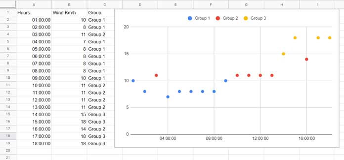
Scatter Plot with Conditional Colors
Now, let’s plot the scatter plot.
- Select the range D1:G19.
- Click Insert > Chart.
- Under the “Chart type” dropdown, select Scatter chart.
And voila! You’ve applied conditional coloring to the data points in the scatter plot.
As mentioned earlier, you can draw trendlines for each individual group by clicking Customize > Series, but not for the entire Y-axis series. This can be a drawback if you need a single trendline for all data points.
Workaround Using Bubble Chart
Instead of following the steps for the scatter plot, you can use a bubble chart to achieve conditional coloring more easily.
Here, we must first group the data points using a formula or manually, just as we did earlier. Let me explain the steps.
We will use the sample data in A1:B19, but we’ll move the columns. First, leave column A blank and move the Y-axis values to column C and the X-axis values to column B.
In cell A1, enter the following grouping formula:
={
     "Group";
     ARRAYFORMULA(
        IF(C2:C19<=10, "Group 1", IF(C2:C19<15, "Group 2", "Group 3"))
     )
}
This formula is similar to the one we used earlier, but the column references have been changed because we moved the columns from A:B to B:C.
Next, in cell D2, enter the following formula:
=ArrayFormula(
     {"Size"; IF(LEN(A2:A19), 1,); 2}
)
The purpose of this formula is to insert the value 1 into the range D2:D19 and 2 into cell D20.
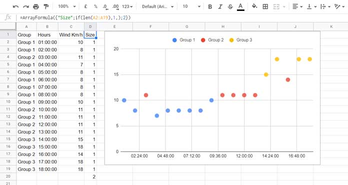
This will help reduce the bubble size, so they resemble data points in a scatter plot.
Select the range A1:D20, then click Insert > Chart.
In the chart editor panel, configure the bubble chart settings under the “Setup” tab:
- Chart type: Bubble
- Data range: A1:D20
- X-axis: Hours
- Y-axis: Wind Km/h
- Series: Group
- Size: Size
- Use row 1 as headers: ☑
This is the workaround using a bubble chart to apply conditional coloring for a scatter plot in Google Sheets.
If you encounter any issues when plotting the charts (scatter or bubble) or have trouble with the chart settings or formulas, feel free to copy my sheet here:
Thanks for reading! Hope this helps—happy charting!


Great article. One workaround to get a trendline for the whole dataset is to add all the data as another series. Then add a trendline only for this “all data” series. Then set the point size to 0. The result is the extra data points are invisible, but a single trendline is added.