Google Sheets doesn’t offer a built-in dot chart option, but that doesn’t mean you can’t make one. With a little formula magic and a scatter chart, you can easily create dot plots in Google Sheets to visualize frequency or count data.
This tutorial walks you through the steps with a simple dataset and two smart formulas to format the data. Let’s get started.
Start With Just Two Columns of Data
Let’s say you conducted a small survey asking students how long they took to solve a math problem. Your data might look like this (in the range A1:B6):
| Value (minutes) | Frequency (students) |
|---|---|
| 1 | 1 |
| 2 | 3 |
| 3 | 4 |
| 4 | 2 |
| 5 | 10 |
Each row shows how many students (frequency) took a particular amount of time (value) to solve the problem. Our goal is to turn this into a dot plot where each dot represents one student.
Step 1: Format the Data for the Dot Plot
We want to expand this dataset so that each dot can be plotted separately. That means repeating each value (e.g. 5) as many times as its frequency (e.g. 10 times).
In a blank area of the sheet, enter the following formulas:
In cell E2 (to list all values):
=ArrayFormula(TOCOL(MAP(A2:A6, B2:B6, LAMBDA(x, y, IF(SEQUENCE(1, y), x,))), 1))This formula repeats each value from column A as many times as specified in column B. For example, the number 5 will appear 10 times.
In cell F2 (to list dot positions):
=TOCOL(MAP(B2:B6, LAMBDA(r, SEQUENCE(1, r))), 1)This returns a sequence from 1 to the frequency for each value. It’s used as the Y-axis position for each dot.
Now your formatted data (columns E and F) will look like this:
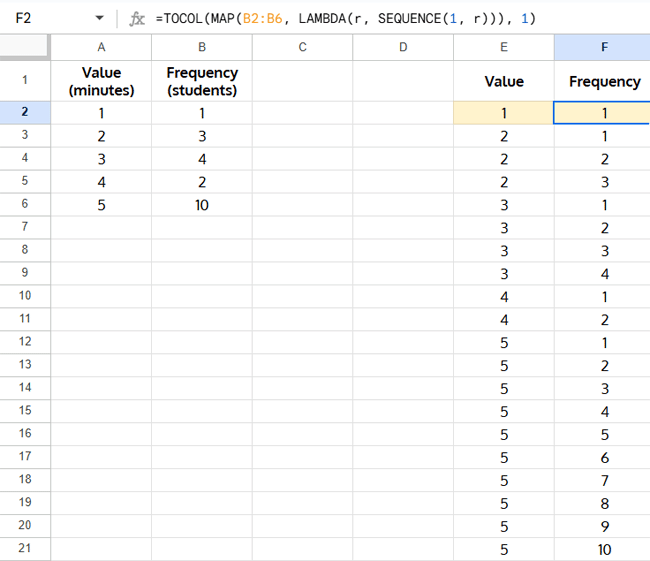
Note: You can manually add the column headers Value and Frequency in cells E1 and F1, respectively.
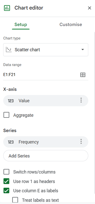
Step 2: Create the Dot Plot
- Select the range E1:F21, or extend the selection based on how far your data goes.
- Go to the menu: Insert > Chart.
- In the Chart editor sidebar, set the Chart type to Scatter chart if it’s not already selected. (To open the sidebar at any time, just double-click an empty area of the chart — ideally just to the left of the vertical axis.)
- Under Customize:
- Open Horizontal axis, set min = 0

- Open Vertical axis, set min = 0 and max = 11, or max column B + 1.
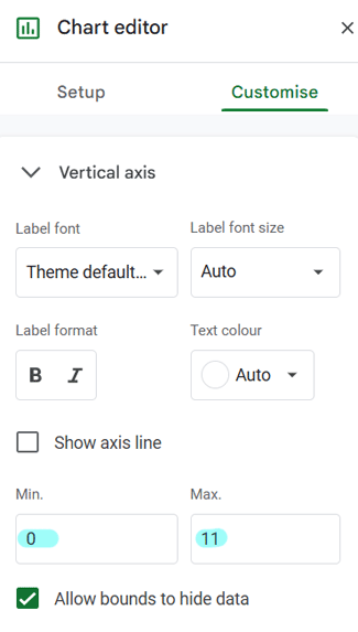
- Open Horizontal axis, set min = 0
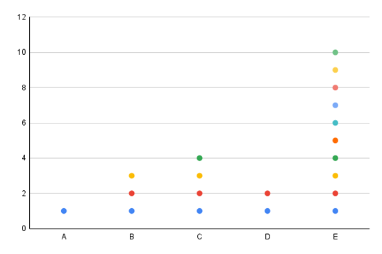
- To remove the axis labels “Value” and “Frequency,” simply click on each label in the chart and press Delete on your keyboard.
Similarly, you can remove the legend (if it’s displayed) and the chart title by clicking on them and pressing Delete.
You should now see a clean vertical stack of dots for each value.

Can Column A Contain Text Instead of Numbers?
Technically yes — but not with the current setup.
If you want to use text categories (like book titles or product names) in column A, you can still create a dot plot in Google Sheets. However:
- The two formulas provided earlier won’t work as-is, since they are designed for numeric X-axis values.
- You’ll need a different formula setup that arranges the data in a horizontal layout.
- Also, since scatter charts treat each horizontal point as a separate series, each dot will appear in a different color, which may not be ideal for readability.
✅ In short: Text categories are possible, but they require a different data layout — and without additional formatting, each dot will have its own color.
Tip: If you’re working with categorical data and want a cleaner visual, consider using a bar chart or column chart, which handle text labels more naturally.
How to Create a Dot Plot with Text Categories in Google Sheets
Here’s an alternate setup:
Sample data (A1:B6):
| House Number | Number of Cars |
|---|---|
| A | 1 |
| B | 3 |
| C | 4 |
| D | 2 |
| E | 10 |
In cell C2, enter the following formula:
=HSTACK(A2:A6, MAP(B2:B6, LAMBDA(r, SEQUENCE(1, r))))This generates a horizontal layout where each dot is plotted across columns.

- Select the output range.
- Go to Insert > Chart, and choose Scatter chart.
- Click the legend in the chart and press Delete to remove it.
Conclusion
Even though Google Sheets doesn’t support dot plots natively, this simple trick using formulas and scatter charts gives you full control. Whether you’re tracking survey responses, frequency counts, or event occurrences, dot plots make the data more visual and digestible.
Related Posts
- How to Create an S-Curve Chart in Google Sheets
- How to Create a Multi-category Chart in Google Sheets
- How to Create a Floating Column Chart in Google Sheets
- How to Create an Annual Rainfall Chart in Google Sheets
- How to Create a Pareto Chart in Google Sheets
- How to Create a Bell Curve Graph in Google Sheets
- How to Create a Clustered Stacked Column Chart in Google Sheets


