In this tutorial, we will see how to create a column chart as well as a clustered column chart in Google Sheets.
Column charts are designed for comparison. They use vertical bars, called columns, to visually display the values of different categories. This helps you quickly identify which values are higher, lower, or similar.
A clustered column chart is similar, but multiple data series are represented side-by-side (clustered) within each category. This is ideal for comparing multiple data series within the same category.
The steps to create both column and clustered column charts are the same. They only differ in data formatting.
Creating a Column Chart in Google Sheets
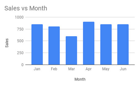
We will create a column chart with categories and corresponding values, such as months as categories and sales values as data points.
Consider this data in cell range A1:B7 in a blank Google Sheets file:
| Month | Sales |
| Jan | 850 |
| Feb | 800 |
| Mar | 600 |
| Apr | 900 |
| May | 850 |
| Jun | 850 |
Here are the steps to create the column chart with this sample data:
- Select the range A1:B7. If you add data in A8 and B8 later, they will be reflected in the chart.
- Click Insert > Chart.
- Google Sheets will identify the data and insert a column chart. If not, within the Chart Editor sidebar panel under the Setup tab, select Column Chart as the chart type (you will see the chart name while hovering your mouse pointer over the available chart icons).
Your column chart is now ready.
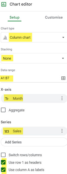
Setup Tab Settings:
The following should be the settings under the Setup tab:
- Chart Type: Column Chart
- Stacking: None
- Data Range: A1:B7
- X-axis: Month
- Series: Sales
- Aggregate: Unchecked (check it if you have duplicate categories and want them to merge)
- Switch Rows/Columns: Unchecked (check it if your categories are in one row and values in another)
- Use Row 1 as Headers: Checked
- Use Column A as Labels: Checked
Customization Options
There are plenty of chart customization options available for column charts in Google Sheets. Let me walk you through them. To find these options, click the Customization tab within the Chart Editor panel.
Chart Style:
This setting allows you to change the background color, border color, and font colors. For example, if you want a transparent background to see the sheet’s gridlines, select “None” as the background color.
Another notable setting under Chart Style is the option to switch the column chart to a 3D column chart.
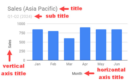
Chart and Axis Titles:
Here you can specify the chart title, subtitle, and titles for the horizontal and vertical axes. You can also change the font and color.
Series:
This section lets you change the color of the columns. You can fill the columns and their borders with different colors and adjust the opacity. I suggest using the same fill and border color, but setting the fill opacity to around 70% to make the chart stand out.
In this chart, you will see only one series to select. However, in a clustered column chart, you will see multiple series.
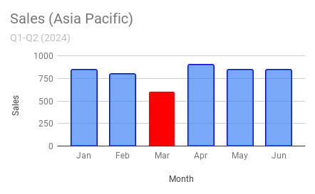
To highlight a specific data point, such as the column for “Mar,” click “Add” under Format Data Point, choose “Mar,” and apply the color you want, such as red.
The default vertical axis is on the left side. If you want to move it to the right, select “Right-Axis.”
You can also show error bars, data labels, and a trendline by checking the relevant checkboxes.
- Error Bars: Error bars are small lines extending from the tops of columns, representing the variability or uncertainty of the data points.
- Data Labels: Display the data point values as labels within the columns in the chart.
- Trendline: Displays the trendline for the data.
Legend:
You can turn the legend on or off and change its position. This is particularly relevant in clustered column charts.
Horizontal Axis:
Customize the horizontal axis labels here. You can format the labels and reverse the axis order. For example, if the current order is Jan to Jun, reversing it will change the order to Jun to Jan.
Vertical Axis:
Format the vertical axis by adjusting font styling, setting minimum and maximum value scales, and formatting the numbers.
Gridlines and Ticks:
Control the gridlines within the column chart with these options.
Creating a Clustered Column Chart in Google Sheets
When creating a clustered column chart, all the settings mentioned for a basic column chart are relevant. The main difference is in the data formatting.
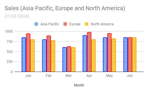
Assume the above column chart contains sales data from January to June for the Asia Pacific region. Now, add data for two more regions, with the following information:
| Month | Asia Pacific | Europe | North America |
| Jan | 850 | 944 | 800 |
| Feb | 800 | 894 | 775 |
| Mar | 600 | 625 | 600 |
| Apr | 900 | 975 | 800 |
| May | 850 | 949 | 815 |
| Jun | 850 | 850 | 850 |
To create the clustered column chart:
- Arrange this data in columns A1:D7.
- Select the range and click Insert > Chart.
- Choose Column Chart.
This will create the clustered column chart.
Most settings under the Setup tab in the Chart Editor are similar to those for a basic column chart. The key difference is that under Series, you will see three series: Asia Pacific, Europe, and North America. Previously, it was just “Sales.”
You can use the same customization options for this chart as well.
Resources
- Get a Target Line Across a Column Chart in Google Sheets
- Sparkline Column Chart Options in Google Sheets
- Bar or Column Chart with Red Colors for Negative Bars
- Adding Mean and Standard Deviation Lines on a Column Chart
- Floating Column Chart in Google Sheets
- Add Legend Next to Series in Line or Column Chart in Google Sheets
- Reducing the Width of Columns in Column Charts in Google Sheets
- Google Sheets Bar and Column Chart with Target Coloring


