With minimum effort, you can create a Site Organisation Chart in Google Sheets. For that, you need to learn how to format the data to plot it.
You should enter the name of employees in one column and their immediate bosses’ names in the next column.
Then select this data and click on Chart under the Insert menu.
That’s all you want to do to create Site Org Chart in Google Sheets.
Organisational Chart Vs. Site Organisational Chart
Site Organisational Chart is a regular Org. Chart. There is no difference in chart creation.
The changes are in the Chart Node structure, or you can say in the hierarchy.
It’s like a Project manager as the head, then followed by the manager, and under the manager comes site in-charge, safety officers, planning engineers, etc.
That means the only changes are in the designation of employees.
The Chart creation in Google Sheets is automated.
As I have already mentioned, you should learn to format the data correctly, and that you can learn with the help of this Google Sheets tutorial.
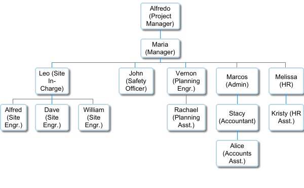
Why Should One Consider Google Sheets for Creating Organisational Charts?
In my experience, Google Sheets is one of the best free tools to create a site organization chart.
I’ve worked several years in Construction Sites as part of different projects.
On every site office, we should display the site org chart. It was mandatory as per the Work Order clause.
During that time, I had prepared site organization charts in Excel, using the Excel drawing tools.
It was easy to prepare but not flexible.
I mean, if we want to add or remove an employee from the chart, we may require to arrange the entire boxes again.
In Google Sheets, without using the drawing tool, you can easily create a Site Organisation Chart.
Here is how.
The Four Steps to Create Site Organisation Chart in Google Sheets
I am taking you straightaway to the steps.
- Enter the name of the employees in column A.
- Then enter the name of their immediate reporting officers or bosses and their designations within brackets in column B.
- Select the entered data and then go to the menu Insert > Chart.
- Choose Organisational Chart.
That’s all!
Data Formatting in Detail
You should enter the names in two columns as below.
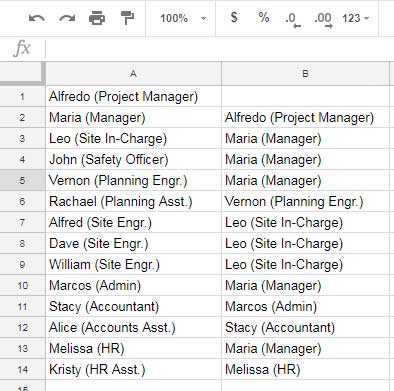
For example, in cell A2 the employee is “Maria,” whose designation is Manager. Her reporting officer or boss is “Alfredo,” and his designation is Project Manager.
So I’ve entered Alfredo’s name in cell B2.
The same is the case with other employees.
Plotting the Chart
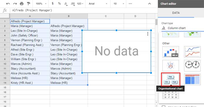
Just select the data, here it is in A1:B14, and insert the chart from the Insert menu.
Select the Organisational chart in the Chart editor, and voila!
The key in this chart creation is how you arrange/format your data.
The ideal way is first to enter the name of the employees, whose name should appear in the Company Organisation chart, in Column A.
Then enter the name of their immediate superior in the next column and which should form the organizational structure.
I suggest you enter each employee’s designations in the bracket also.
Org Chart Formatting and Other Tips
Unlike other charts, there is not much option in this chart formatting.
You can format the Nodes (the rectangular boxes) in different ways.
On the chart editor, you can change the node size to Small, Medium, or
Large.
Other than the above, you can change node colors. I mean the background color of the rectangles and the color of the active/selected rectangle.
And these tutorials may also help.
