Creating a histogram chart in Google Sheets is straightforward. However, it is equally important to understand what a histogram represents and how it helps analyze data.
When dealing with a large number of data points, a histogram chart organizes the data into a frequency distribution, making it easier to interpret patterns and trends.
What Is a Histogram?
In a histogram, values are grouped into classes or bins, displayed consecutively along the x-axis. For example, if you have student marks, you can group them into bins like 50–60 for one group, 60–70 for another, and so on. The height of each column represents the frequency (the number of data points in each bin), making it easier to identify distributions and patterns in the dataset.
In Google Sheets, you don’t need to manually calculate frequencies using formulas like:
=SUMPRODUCT(ISBETWEEN(range, lower_bound, upper_bound, TRUE, FALSE))or
=FREQUENCY(data, classes)Google Sheets automates this process when you create a histogram chart, simplifying data visualization significantly. Select your data, choose the histogram chart type, and Google Sheets will group your data into bins automatically. You can also customize bin sizes and other settings as needed.
Examples of Histogram Charts in Google Sheets
1. Daily Online Income from Advertisements and Affiliate Marketing
Many bloggers monitor their blogs by placing ads or affiliate links to generate income for covering expenses like hosting and maintenance. These earnings can fluctuate due to factors such as weekends, weekdays, and variations in site traffic.
For instance, if daily earnings range from $50 to $90, a blogger could group these into bins like 50–55, 55–60, 60–65, and so on. If earnings on a particular day are $68, they would fall into the 65–70 range. A histogram chart would show which ranges occur most frequently, helping to visualize trends.
In the example below, you can see that earnings fell within the $60–65 range 11 times.

2. Student Marks Distribution
Teachers can use a histogram chart to visualize the distribution of student marks across different ranges. For example, if 100 students’ marks are grouped into bins of 5 marks each (e.g., 65–70, 70–75, etc.), the histogram will show how many students scored within each range.

In this case, 22 students scored between 65–70.
How to Create a Histogram Chart in Google Sheets
Here’s a step-by-step example:
- Data Setup
Suppose column A contains the days of the month (1–31), and column B contains daily earnings. The data range is A1:B32 (including headers). - Steps to Create a Histogram Chart
- Select B1:B32.
- Go to Insert > Chart.
- Google Sheets will likely default to a histogram chart. If not, under the Setup tab in the chart editor, choose “Histogram” as the chart type.
- In the Customize tab, click on Histogram and set the bucket size (bin size). For example, setting it to 5 will create bins like 55–60, 60–65, and so on.
In histograms, the lower bounds are inclusive, while the upper bounds are exclusive. For example, the range 60–65 includes values ≥60 and <65.
Using a Column Chart to Mimic a Histogram
If you want to use custom bin sizes or categories, a column chart can mimic a histogram. Here’s how:
- Set Up Bins
Enter lower bounds in column D and upper bounds in column E. - Calculate Frequencies
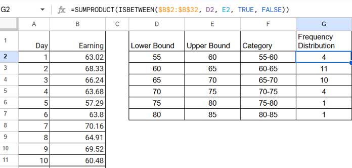
- In G2, enter:
=SUMPRODUCT(ISBETWEEN($B$2:$B$32, D2, E2, TRUE, FALSE))
Drag it down to G7. - Alternatively, clear G2:G8 and enter:
=FREQUENCY(B2:B32, E2:E7)
- In G2, enter:
- Create Categories
Combine the lower and upper bounds in column F for the x-axis labels by entering the following array formula in cell F2:=ArrayFormula(D2:D7&"-"&E2:E7) - Insert a Column Chart
Select F2:G7, then go to Insert > Chart > Column Chart.
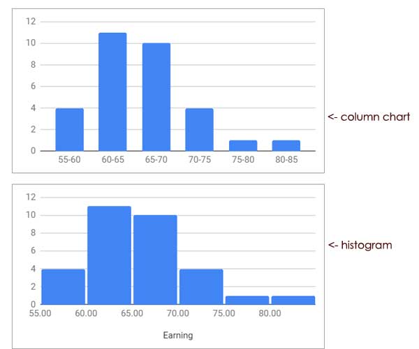
A column chart allows you to customize bin sizes and categories, offering flexibility for specific data needs.
That’s how you can create a histogram chart in Google Sheets or use a column chart as an alternative. Enjoy exploring your data!


