A Candlestick chart is similar to a column chart but provides more detailed information and is used to visualize price movements.
To create a Candlestick chart in Google Sheets, you need data organized into five columns: Labels, Open, High, Low, and Close.
You can use the output of the GOOGLEFINANCE function to plot a Candlestick chart. When using GOOGLEFINANCE historical data, ensure that the first column (which contains timestamps) is formatted as plain text, as it will be used for the X-axis labels.
Creating a Candlestick Chart in Google Sheets
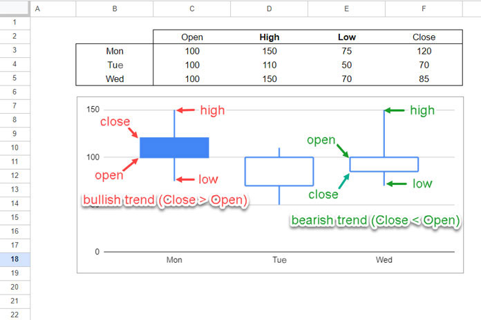
In Google Sheets Candlestick charts, if the closing value is greater than the opening value, the candle will be filled. Otherwise, it will be hollow.
- Filled candles represent a bullish trend (Close > Open).
- Hollow candles represent a bearish trend (Close < Open).
Let’s create a Candlestick chart using the following data in Google Sheets.
Sample Data:
| Open | High | Low | Close | |
| Mon | 100 | 150 | 75 | 120 |
| Tue | 100 | 110 | 50 | 70 |
| Wed | 100 | 150 | 70 | 85 |
Steps:
- Enter the sample data into cells B2:F5.
- Select the range B2:F5.
- Click Insert > Chart. This will open the Chart Editor sidebar panel.
- Select Candlestick chart under the Chart type.
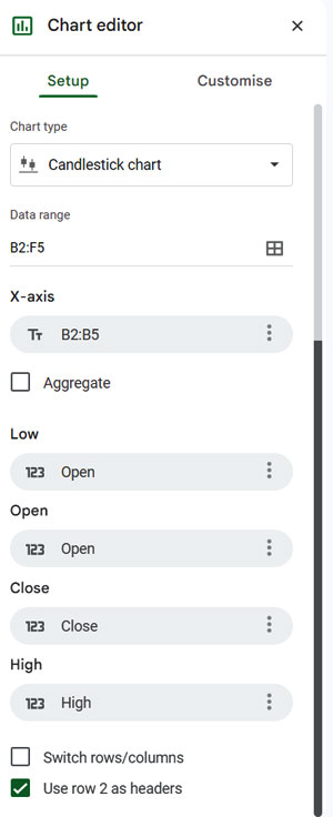
- In the Chart Editor, within the Setup tab, adjust the following settings:
- Under Low, click on the existing field (likely “Open”) and select “Low.”
- Under Open, select “Open.”
- Under Close, select “Close.”
- Under High, select “High.”
- Click the Customize tab in the Chart Editor.
- Under the Vertical axis, set the min and max values according to your data. For the sample data, you may set the min to 0 and the max to 150.
This way, you can create a Candlestick chart in Google Sheets.
Using GOOGLEFINANCE Historical Data to Create Candlestick Charts
You can use the GOOGLEFINANCE function to fetch historical stock information such as the open, high, low, and close prices of securities, and use this data to create a Candlestick chart in Google Sheets.
The syntax of the GOOGLEFINANCE function for this purpose is:
GOOGLEFINANCE(ticker, "all", start_date, end_date|num_days)For example, you can enter the following formula in cell B1 of an empty sheet:
=GOOGLEFINANCE("NASDAQ:GOOG" , "all" , "01/08/2018" , "31/08/2018" )This will retrieve historical stock data for the ticker symbol “GOOG” (Alphabet Inc.) from the NASDAQ stock exchange for the specified date range.
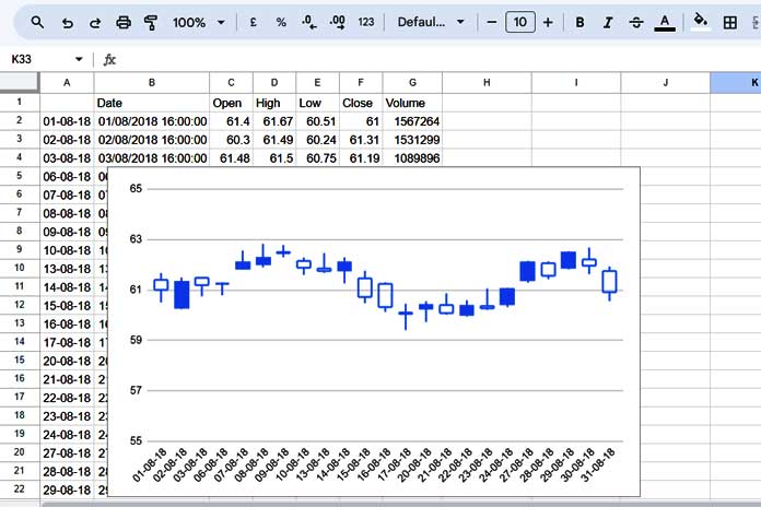
The output will be in the format: Date, Open, High, Low, Close, Volume
Before creating the Candlestick Chart, you need to convert the date values in column B into a text format for the X-axis labels. Enter the following formula in cell A2:
=ArrayFormula(IFERROR(TEXT(DATEVALUE(B2:B), "DD-MM-YY")))Steps to Create the Candlestick Chart:
- Select the range A1:F (excluding the “Volume” column).
- Click Insert > Chart.
- In the Chart Editor, select Candlestick Chart under the Chart type.
- Assign the correct data to each series:
- Select “Low” under Low.
- Select “Open” under Open.
- Select “Close” under Close.
- Select “High” under High.
- Under the Vertical Axis, set the Min and Max values based on your data.
That’s it! This is how you can create a Candlestick chart using the historical data fetched from GOOGLEFINANCE.
Get Your Candlestick Chart Template
Resources
- How to Format Data to Make Charts in Google Sheets
- Choosing a Suitable Chart Type for Your Data in Google Sheets
- Google Sheets Charts: Built-in Charts, Dynamic Charts and Custom Charts
- How to Change Data Point Colors in Charts in Google Sheets
- How to Include Filtered Rows in a Chart in Google Sheets


Hi, Your formula helped me solve the issue as described. However, can you modify the formula further to ensure that the table so generated has the latest values on top and older below (Basically, invert the present data)?
Thanks
Hi, Spidey,
See if this formula helps?
=query(insert_formula_2_here,"Select * order by Col1 desc")Formula 2 produces an error. Please solve
Error
Function ARRAY_ROW parameter 2 has mismatched row size. Expected: 2. Actual: 1.
Hi, Jo,
There are a few possible reasons.
1. Please do check your Sheets ‘Locale’ setting – How to Change a Non-Regional Google Sheets Formula.
2. If the above doesn’t solve your issue, replace the Formula2 with the below formula.
=googlefinance( "NSE:HINDALCO" , "all" , "01/08/2018" , "31/08/2018" )It would return the required columns for the chart. But the column order would be different. So manually format the output for the chart.
As a bonus please follow the below link to get the sample data for 18 popular charts in Google Sheets and the finished charts (includes Candlestick).
https://docs.google.com/spreadsheets/d/1oh5WXgyelxfWuSkaN10vs6jQiDRf_GvlsxNfrgCI1w8/edit?usp=sharing
Thanks.
Unfortunately, the google’s candlestick chart only allows the use of text on the x-axis (no dates or numbers) making it useless for anything more than trivial use cases.
Is it possible to share a copy of your file ?
Hi Praveen,
See the below post which is related to formatting data for 17 charts in Google Sheets.
In that post, I have included a link to my Google Sheets containing the copy of the said 17 charts including Candlestick.
How to Format Data to Make Charts in Google Sheets
Cheers!