Want to make your charts easier to read in Google Sheets—especially in print or grayscale? In this tutorial, you’ll learn how to add legend labels directly next to each data series in a Line or Column chart in Google Sheets. This method improves chart readability and helps your audience quickly associate values with labels.
Why Add Legend Next to Series?
By default, the legend in Google Sheets charts appears at the top, bottom, or side of the chart. While this works for general use, it’s not ideal when:
- You’re printing charts in grayscale
- You have limited space for a separate legend
- You want viewers to instantly associate values with labels
Placing the legend next to each data series (or even inside the columns) enhances clarity, especially for Line, Column, or Bar charts.
Built-in Legend Options in Google Sheets
In the Chart Editor under Customize > Legend, you’ll see several position options:
- None
- Top
- Bottom
- Left
- Right
- Inside
- Labelled
- Auto
However, “Labelled” is usually disabled (greyed out) for most chart types except the Pie chart. This means Google Sheets doesn’t natively support placing legend labels directly beside series for Line or Column charts—but we can achieve it manually using data labels and formatting.
Method 1: Add Legend Next to Series in Line Chart
Sample Data
| Years | EU | US |
| 2015 | 161 | 55 |
| 2016 | 142 | 62 |
| 2017 | 150 | 47 |
Step 1: Format Data for Legend Labels
Modify your data to repeat the region labels next to their corresponding values.
| Years | EU | US | ||
| 2015 | 161 | 55 | ||
| 2016 | 142 | 62 | ||
| 2017 | 150 | EU | 47 | US |
Placing the legend labels in the last row positions them next to the final data point on the chart. If you place them in the first data row (just below the headers), they’ll appear at the start of the series. Adding labels to every row will show them beside all data points.
For line charts, I prefer showing legend labels only at the last data point—it keeps the chart cleaner and more readable. That’s why I’ve used the setup shown above.
Step 2: Set “Years” Column to Plain Text
- Select
A2:Aand go to Format > Number > Plain text.
Step 3: Insert the Chart
- Select
A1:E4, then go to Insert > Chart.
Step 4: Customize the Chart
- In Chart Editor > Setup, set Chart Type to Line Chart.
- In Customize > Legend, choose None.
- In Customize > Series, enable Data Labels, and set Type to Custom.
Result
You’ll now see the EU and US labels (legend keys) next to each line. This mimics having the legend next to the series directly.
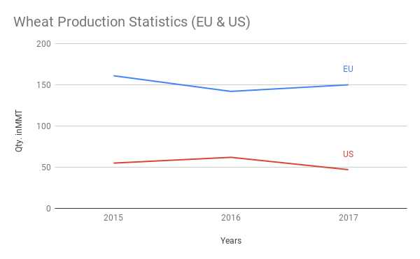
Note: Avoid this method if your chart includes many series—it may clutter the chart.
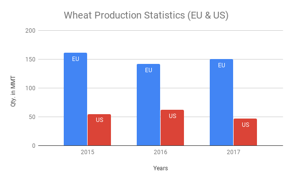
Method 2: Add Legend Inside Columns in Column Chart
Adjust the Data Format
To apply this method in a Column (or Bar) chart, your data needs to be structured like this:
| Years | EU | US | ||
| 2015 | 161 | EU | 55 | US |
| 2016 | 142 | EU | 62 | US |
| 2017 | 150 | EU | 47 | US |
Follow the same steps outlined for the line chart—just change the chart type to Column or Bar in the Chart Editor.
Result
You’ll see the legend labels displayed inside or next to each column, improving clarity and reducing the need for a separate legend box.
Example Sheet
Want to explore the settings directly? Check out this example Google Sheet with both Line and Column chart legend formatting applied.
Chart Design Tips
- Use data labels as dynamic legend keys
- Avoid clutter by limiting series if placing legend next to lines or bars
- Test in grayscale if printing charts


