You can create a multi-category chart in Google Sheets using either a Bar Chart or a Column Chart. However, the subcategory labels won’t appear below the category labels on the axes. Instead, they will be displayed within the chart grid.
When creating this chart, arranging your source data correctly is crucial. The process is similar in Excel and Google Sheets, but there’s a significant difference: Excel natively supports categories and subcategories on the x-axis for column charts and the y-axis for bar charts. While Google Sheets can plot the chart similarly, the subcategory labels won’t appear on the axes as they do in Excel. Instead, they are shown within the chart grid, as mentioned above.
Before we proceed, let’s look at how the chart appears in Excel versus Google Sheets:
Excel:

Google Sheets:

In these charts, “Cable,” “Transformer,” and “Street Lighting Pole” are categories, while “Laying,” “Testing,” etc., are subcategories.
I prefer the multi-category chart I created in Excel. Unfortunately, Google Sheets doesn’t offer an exact equivalent. You’ll have to work with the current limitations.
Now, let’s learn how to create a multi-category chart in Google Sheets.
Data Preparation for Multi-Category Chart in Google Sheets
A well-formatted dataset, with values properly arranged in rows and columns, is the foundation of any chart, and the multi-category chart is no exception.
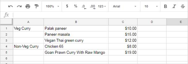
Here is the data used for the example charts. You should format your data similarly.
Sample Data:

- Enter the categories in the first column, leaving empty rows between each category. The number of empty rows, plus the category row, should match the number of subcategories.
- Enter the subcategories corresponding to each category in the second column.
- Add the data point values in the third column.
In the sample data, you’ll see a billing breakup for certain activities. For example:
- Column A contains the job categories.
- Column B lists the payment breakdown (subcategories).
- Column C provides the percentage of payment released (data points).
If you’d like another example, here it is:
Once your data is formatted as shown above, you’re ready to create the multi-category chart.
Steps to Create a Multi-Category Chart in Google Sheets
In this example, we’ll create a multi-category bar chart. If you’d prefer a column chart, the steps are almost identical except for the chart type selection.
- Select your data.
- Go to the menu Insert and click on Chart.
- In the Chart editor panel, under Setup > Chart type, select Bar chart. This will create a multi-category bar chart.
- For a column chart, select Column chart instead.
- If you encounter any issues, make a copy of my sample sheet linked below and check the chart settings by double-clicking the chart.

Resources
- How to Format Data to Make Charts in Google Sheets
- Choosing a Suitable Chart Type for Your Data in Google Sheets
- Get a Target Line Across a Column Chart in Google Sheets
- Floating Column Chart in Google Sheets – How to
- Add Legend Next to Series in Line or Column Chart in Google Sheets
- Reducing the Width of Columns in Column Charts in Google Sheets
- Bar or Column Chart with Red Colors for Negative Bars in Google Sheets
- Google Sheets Bar and Column Chart with Target Coloring
- How to Change Data Point Colors in Charts in Google Sheets


Here is a google sheet data I would like to chart. I can not seem to find a way to make a chart.
Each person has three test results in three different categories, i.e., Person 1 has three tests (UA1, UA2, 18W) in the “Approach” category.
A line chart would be nice, but a bar would do.
Thanks for your help.
Category >> | Approach |Meet |Master |
Tests >> |UA1 UA2 18W |UA1 UA2 18W |UA1 UA2 18W |
Person 1 |41 41 60 |31 14 18 |7 7 4 |
Person 2 |28 49 59 |3 16 14 |0 3 1 |
Person 3 |40 24 49 |16 8 17 |5 3 3 |
Person 4 |58 71 62 |16 36 34 |7 14 14 |
Hi, everett,
You just transpose your data and create the chart.
If it’s in A1:J6, you can use the following formula in cell A10 for the chart.
=TRANSPOSE(A1:J6)I’ve included a sample sheet with your data and my suggested chart. Please check the end of the tutorial.
Unsure if this is the right spot, but I have a graphing/charting question/issue.
I have 3 sets of data in one table, all dependent on one variable.
When one variable is chosen, the associated data set populates, leaving the other 2 blanks (or with zero, I’ve tried it several ways).
The intent was to have a combo chart. Stacked 100% and vertical column (non-stacked) with graphs only appearing for visible data when the variable is chosen.
However, Google Sheets seems to forget my choices or throw errors or simply go blank after I format the graph and test the other variables. Is there a way to fix this??
Hi, Kou,
I will appreciate a sample/demo sheet with more details on the problem and of course the sample data.