Let’s learn the purpose of and how to create scorecard charts in Google Sheets.
The purpose of scorecard charts in Google Sheets is to draw attention to key performance indicators (KPIs). For example:
- Highlight the total new contracts signed in January (or any specific month).
- Display the organic traffic to your blog during the first quarter of the year.
- Compare total sales in the first and second halves of the year.
Let’s get started by creating a basic scorecard chart in Google Sheets.
Step 1: Creating an Empty Chart
To insert a scorecard chart in Google Sheets, follow these steps:
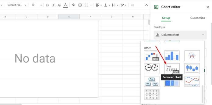
Assume your data range is A1:C. Click any cell outside this range—preferably a cell in column E.
I’m skipping column D to avoid selecting an adjacent cell to the data range. This ensures you’re starting with a completely blank chart—not a suggested one by Google Sheets.
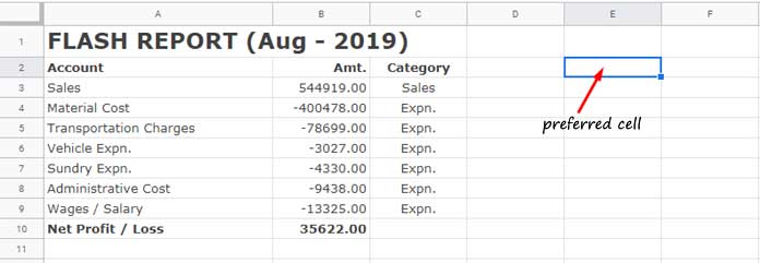
For example, let’s say I want to create a scorecard chart based on the key value in cell B10 from the following sample Flash report:
Click on cell E2 (leaving a blank column and row—avoiding row #10, which contains the key value). Then go to the Insert menu and click Chart. This will open the Chart editor panel instantly.
Under Chart type, select Scorecard chart. This will create a blank “No data” chart in your spreadsheet.
Step 2: Specifying the Key Value for the Scorecard Chart
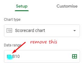
In the Chart editor panel, under the Setup tab, scroll down to find the Key value section.
The key value is the single data point you want to highlight. Click the Add key value field, select cell B10, and click OK. You’ve just created your first scorecard chart in Google Sheets.
Tip: You can remove the cell reference E2 from the data range under the Setup tab if needed.
Step 3: Adding a Title to the Scorecard Chart
Click on the Customize tab and scroll down. Then, click Chart & axis titles. In the Title text field, type something like “Net Profit / Loss”.
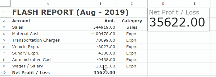
This method helps you call attention to any key performance indicator, like total January sales or contracts signed, since this scorecard chart focuses on a single cell value.
What About Using a Range in a Scorecard Chart in Google Sheets?
Additional Tip: Highlight a Range by Aggregated Values
To create a scorecard chart that uses a range instead of a single cell, follow the same steps with just a few adjustments.
Note: In this example, I'm using a different dataset. See the image below for reference.
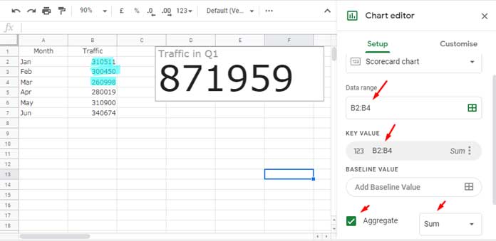
- Select the range
B2:B4under Key value instead of a single cell. - Toggle the Aggregate switch below it and select your desired function.
Example: This data shows blog traffic (monthly visitors) for the first two quarters. The scorecard chart in Google Sheets now shows the total number of visitors in Q1.
You can choose from Sum, Average, Count, Max, Median, or Min. These aggregation functions are useful for cases like:
- Displaying total or average sales across quarters (Q1–Q4).
- Showing maximum traffic during a specific period.
- Counting the number of transactions in a given month.
Baseline Value – Show Change When Comparing Two Ranges
Let’s take the website traffic example again. You can also add a baseline value to your chart.
Under Key value, click Baseline value, and add the range B5:B7. Again, choose the SUM function.
Now, your chart will compare the Q1 total (871,959) with the Q2 total (931,593). The chart will display the absolute change:=871959 - 931593 → Difference = -59,634
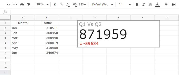
This means Q1 traffic is 59,634 less than Q2 traffic.
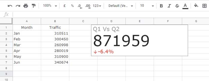
To customize the baseline value, go to Customize > Baseline value and switch to Percentage change.
By default:
- Positive change = green
- Negative change = red
You can customize these colors too.


Hi all!
My Sheet is very long, with plenty of cells down.
I’d like my Scorecard (I just discovered it, very cool!) to be always visible.
I tried freezing some lines at the top. When I scroll down, I lose it.
I’m wondering if there is a way to make it visible all the time.
Thanks in advance!
Hi, Manuel Bellsolell,
At present, Google Sheets doesn’t offer that feature.
Is there a way to show both the Absolute change and the Percentage change at the same time when comparing two data ranges?
Hi, Dan Lee,
Here is a workaround.
Two Baseline Values in a Scorecard Chart in Google Sheets (Workaround)