To create a Pareto chart, we’ll use the Combo chart in Google Sheets, since a Pareto chart (also called a Pareto diagram or graph) combines a column chart and a line chart.
No built-in Pareto chart? No problem—we’ll build one from scratch using the Combo chart.
In this step-by-step guide, I’ll show you how to create a Pareto chart in Google Sheets, starting with how to format the data, then generate a summary table using a single formula, and finally plot the chart.
What Is a Pareto Chart (And Why Use It)?
The Pareto chart is named after Italian economist Vilfredo Pareto (1848–1923). It’s based on the well-known Pareto Principle, or 80/20 rule, which says that roughly 80% of the effects come from 20% of the causes.
In simple terms: fix the top 20% of the issues, and you’ll likely solve 80% of the problem.
Pareto charts are commonly used in quality control and data analysis to spot the most frequent issues or the biggest contributors to a problem. They help you focus your effort where it matters most.
How to Read a Pareto Chart
As I said earlier, it’s a combo of columns and a line.
- The horizontal axis shows the categories (causes).
- The left vertical axis shows the frequency (how often something happened).
- The columns represent those frequencies, sorted from highest to lowest.
- The line, plotted on a right-side axis, shows the cumulative percentage.
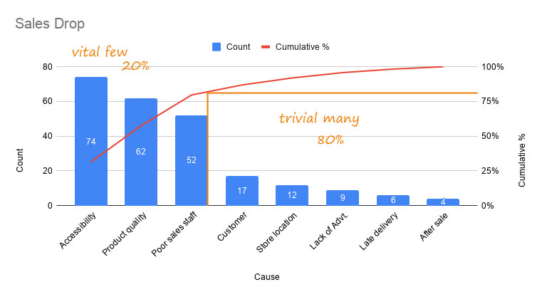
Let’s say we’re analyzing reasons for a drop in sales. A Pareto chart might show that the first few columns—like accessibility, product quality, and poor sales staff—account for around 80% of the total impact. That tells us where to focus.
Here’s how you’d calculate that:
=(74+62+52)/(74+62+52+17+12+9+6+4) = 188/236 = ~79.66%
The idea is simple: the first few categories (the “vital few”) are doing most of the damage.
Step 1: Format the Raw Data
Let’s say you’re recording reported defects during a work period. Your data might look like this:
| Issue ID | Issue Category |
|---|---|
| 001 | Late Delivery |
| 002 | Damaged Product |
| 003 | Incorrect Item |
| … | … |
Each row represents a reported issue, and column B contains the category. This raw data isn’t ready for a Pareto chart just yet—we’ll need to summarize it by category before plotting.
Note: If you want the full sample data used in this example, copy the template by clicking the button below:
Step 2: Create the Pareto Summary Table with a Formula
Here comes the best part—you don’t need to mess with multiple formulas like QUERY, SORT, or ARRAYFORMULA. You can create the whole summary table using a single formula.
Make sure columns D to F are empty, then enter this formula in cell D1:
=LET(
freq, QUERY(A1:B, "select B, count(B) where B is not null group by B order by count(B) desc label B '', count(B) ''", 1),
cumfreq, SCAN(0, CHOOSECOLS(freq, 2), LAMBDA(acc, val, acc + val / SUM(CHOOSECOLS(freq, 2)))),
header, HSTACK("Issue Category", "Frequency", "Cumulative %"),
VSTACK(header, HSTACK(freq, cumfreq))
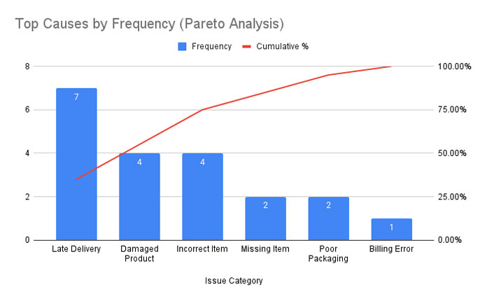
)This formula gives you a summary table that looks like this:

Note: Select column F and go to Format > Number > Percent to display the percentages properly.
How the Formula Works (Click to Expand/Collapse)
The QUERY groups the issues by category, counts how many times each one appears, and sorts the result in descending order.
CHOOSECOLS(freq, 2) picks just the frequency values from the query result. We’ll use these numbers to calculate the cumulative percentage.
SCAN goes row by row and builds a running total by dividing each frequency by the overall total. This gives us the cumulative % column.
LET keeps things clean by storing each part of the formula so we don’t have to repeat expressions multiple times.
HSTACK and VSTACK just arrange everything into a proper table format with headers on top.
So with that one formula, we get the issue-wise count, sorted order, and cumulative percentage — all ready for plotting in the Pareto chart.
Step 3: Create the Pareto Chart in Google Sheets
Once you’ve got your summary table, plotting the chart is easy:
- Select the range D1:F (including headers).
- Go to Insert > Chart.
- In the Chart Editor, under Chart type, choose Combo chart.
- In the Customize tab:
- Under Series, select Cumulative %, set Axis to Right Axis, and Type to Line.
- Select Frequency, make sure it’s set to Column, and enable Data Labels.
That’s it—your Pareto chart in Google Sheets is ready to go!
Wrapping Up
Even though Google Sheets doesn’t have a built-in Pareto chart option, with a bit of formula magic and the Combo chart type, you can easily build one.
This setup is dynamic, meaning if your data changes, the chart updates automatically. It’s great for quality checks, complaint analysis, inventory issues—you name it.


