Here are the step-by-step instructions to create a bell curve—also known as a normal distribution graph—in Google Sheets. This type of chart is especially useful for visualizing data distributions, such as in performance appraisals, test scores, or business metrics.
To plot a bell curve in Google Sheets, we can make use of the normal distribution (also called the Gaussian distribution) of data.
In a Gaussian distribution, values near the mean (average) occur more frequently than values far from the mean. If your data follows this pattern, the plotted chart will form a bell-shaped curve—hence the name “bell curve.”
According to the 68–95–99.7 empirical rule for a standardized normal distribution:
- About 68% of the dataset falls within ±1 standard deviation (SD) of the mean.
- About 95% lies within ±2 SD.
- About 99.7% lies within ±3 SD.
Note: SD or Std Dev stands for standard deviation, a measure of how spread out the data is from the average.
The most important part of creating a normal distribution chart in Google Sheets is proper data formatting. Let’s walk through the full process.
Sample Data and Formatting for the Bell Curve Chart
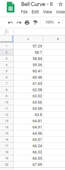
Here’s a sample dataset: digital ad revenue for one of my ad inventories (for demonstration purposes only) for the month of February 2019.
The data is in the range A1:A28. You can copy it from the linked sample sheet below the image.
We’ll use the following Google Sheets functions to format our data:
Let’s go through the steps to prepare the data for plotting a bell curve graph in Google Sheets.
Step-by-Step Data Formatting
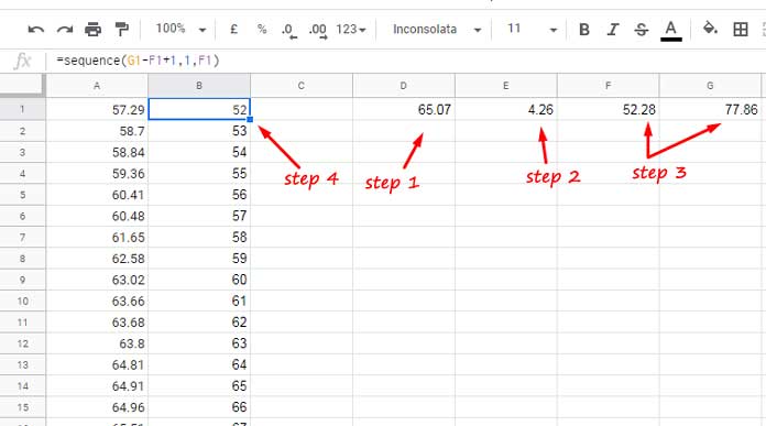
Step 1 – Calculate the Mean
Use the following formula in cell D1 to calculate the mean (average) of your dataset:
=AVERAGE(A1:A28)Example Result:
Mean: 65.07
Step 2 – Calculate the Standard Deviation
Use =STDEV.P(A1:A28) in cell E1 if the dataset represents the entire population. Use =STDEV.S(A1:A28) if it’s just a sample.
Example Result:
Standard Deviation: 4.26
Step 3 – Calculate the Range for the Curve
Based on the 68–95–99.7 rule, we want values within ±3 SD of the mean to plot the curve. Enter the following formulas:
In cell F1 (mean – 3 × SD):
=D1 - 3 * E1In cell G1 (mean + 3 × SD):
=D1 + 3 * E1Example Output:
- F1 = 52.28
- G1 = 77.86
Step 4 – Generate X-Axis Values for the Bell Curve
Use the SEQUENCE function to generate evenly spaced values from F1 to G1. Enter this in cell B1:
=SEQUENCE(G1 - F1 + 1, 1, F1)This formula fills column B (B1:B26) with values from 52 to 77.
Step 5 – Generate Y-Axis Values Using NORM.DIST
In cell C1, enter this array formula to calculate the normal distribution for the values in column B:
=ArrayFormula(NORM.DIST(B1:B26, D1, E1, FALSE))Column C now contains the corresponding normal distribution values for plotting the bell curve.
Creating a Bell Curve in Google Sheets
To plot the bell curve, follow these steps:
- Select the range B1:C26.
- Go to Insert > Chart.
- In the Chart Editor:
- Choose Smooth Line Chart as the chart type.
- Check the box “Use column B as labels”.
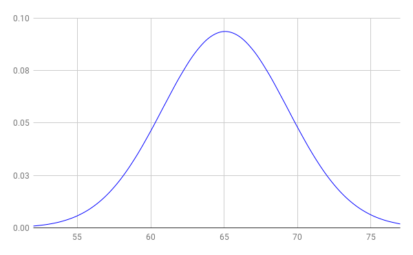
That’s it! You now have a proper bell curve (normal distribution graph) in Google Sheets.
Interpreting the Bell Curve
- A wider curve indicates a larger standard deviation—more spread-out data.
- A narrower and taller curve indicates a smaller standard deviation—data is tightly clustered near the mean.
- In a perfect normal distribution, the mean, median, and mode are the same. In real-world data (like our example), they may differ slightly due to natural variation.
Bell Curve Chart Tips
You can adjust the smoothness of the curve by using smaller step sizes in the SEQUENCE formula. For example, to use a step size of 0.5 instead of 1:
=SEQUENCE(2 * (G1 - F1) + 1, 1, F1, 0.5)This generates more X-axis values between the lower and upper bounds, resulting in a smoother bell curve.
You can also experiment with wider or narrower ranges around the mean (±3 standard deviations) depending on your dataset. For example, try ±2 SD if your data is tightly clustered, or ±4 SD if it’s more spread out.
Note:
When using the modified SEQUENCE formula with smaller step sizes (like 0.5), make sure to also adjust:
- The range used in the NORM.DIST formula to match the new number of values
- The chart’s data range to include all rows generated by the updated sequence
This ensures the bell curve displays correctly and smoothly.
Conclusion
With just a few formulas and a smooth line chart, you can easily create a bell curve in Google Sheets. This method is great for visualizing normal distribution in performance evaluations, exam results, and business metrics.
Whether you’re using the NORM.DIST function or relying on built-in chart tools, Google Sheets makes it easy to build a normal distribution chart that’s both functional and visually clear.


Thank you so much for showing us this awesome work 🙂
Helped me a lot in my statistics class.
Hi, Leonie,
Thanks for your valuable feedback!