How can we reduce the width of columns in a column chart in Google Sheets? Is there any “Gap Width” setting available similar to Excel?
In Excel, there is an option to control the gap width of columns in a column chart using a series option. However, this feature is not available in Google Sheets.
In Google Sheets, we can follow a workaround to adjust the gap width and thus reduce the column width in a chart.
Sample Data:
The following sample data consists of scores from three players (A, B, C) in a game over three attempts. The data range is A1:D4.
| Score 1 | Score 2 | Score 3 | |
| A | 5 | 5 | 5 |
| B | 10 | 5 | 10 |
| C | 5 | 5 | 5 |
Let’s first understand the gap width settings in Excel, then we’ll explore how to achieve a similar output using a workaround in Google Sheets.
Column Gap Width Settings in an Excel Chart
Since creating a column chart is a familiar step, let’s focus on reducing column width.
To control the gap width, follow these steps:
- Click on any column within the chart.
- Drag the slider under the ‘Gap width’ to the right.
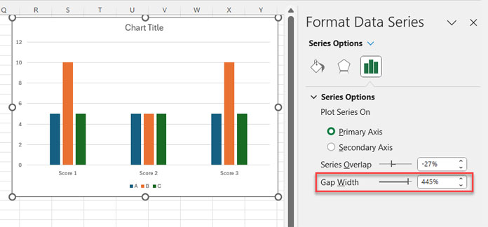
This method allows us to reduce the column width in Excel. Now, let’s explore the workaround in Google Sheets.
Reducing Column Width in Google Sheets Column Chart (Gap Width Workaround)
Here’s a trick to reduce column width in a column chart: Add two blank columns before the first series and after the last series in your source data. You can achieve this using a simple HSTACK and IFNA combo formula.
For your sample data: We’ll assume it’s in ‘Sheet1’ with categories in A1:A4 and series data in B1:D4. We’ll insert two blank columns filled with zeros before column B and after column D.
Generic Formula:
IFNA(HSTACK(category_range, , , series_range, ,), 0)For the sample data, use this formula in cell A1 of a new sheet:
=IFNA(HSTACK(Sheet1!A1:A4, , , Sheet1!B1:D4, ,), 0)Output:
| Score 1 | Score 2 | Score 3 | |||||
| A | 0 | 0 | 56 | 35 | 90 | 0 | 0 |
| B | 0 | 0 | 25 | 30 | 45 | 0 | 0 |
| C | 0 | 0 | 40 | 10 | 40 | 0 | 0 |
Let’s see how this workaround reduces the column width of a column chart in Google Sheets.
To insert a column chart:
- Select the array A1:H4 (returned by the above formula).
- Click Insert > Chart.
- Inside the Chart Editor sidebar panel:
- Under Setup, select chart type ‘Column chart’ (if not already selected).
- Under Customize, under ‘Legends’, select ‘None’ (Legend Position).
Now, you can see the columns are much thinner.
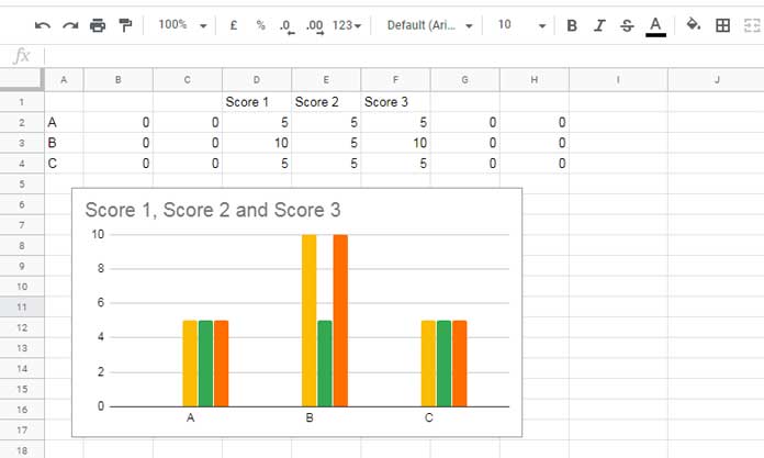
To control the gap width in the column chart:
Adjust the arguments in the formula. Add or remove the comma argument separator (highlighted in the formula) to increase or decrease the gap width of columns. This will impact the size of columns in the column chart.
Drawbacks of the Gap Width Workaround in a Column Chart
The above workaround has two drawbacks. The first one is creating a helper range specifically for the chart, and the second one is omitting “Legends.”
As you can see, I’ve disabled the “Legends” as it may add legends for the blank columns we added.
Resources
- Get a Target Line Across a Column Chart in Google Sheets
- Bar or Column Chart with Red Colors for Negative Bars in Google Sheets
- Adding Mean and Standard Deviation Lines on a Column Chart in Google Sheets
- Floating Column Chart in Google Sheets – How to
- Add Legend Next to Series in Line or Column Chart in Google Sheets
- Google Sheets Bar and Column Chart with Target Coloring


