To add an average line in a Google Sheets chart, you should prepare the source data with a column containing average values.
The average line is a straight line that visually represents the average value of the data points. This enables you to compare data points with the average to identify trends and determine whether most data points are below or above the average.
In business and financial realms, an average line can serve as a benchmark to evaluate performance against the average.
Here are the step-by-step instructions on how to add an average line in charts in Google Sheets.
Step 1: Preparing the Data
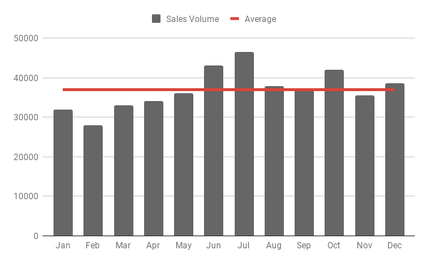
For this example, we will use 12 months of sales data where column A contains month names and column B contains the sales volume.
In the third column, enter the label “Average” in cell C1 and then enter the following AVERAGE formula in cell C2 and drag the fill handle down as far as you want:
=AVERAGE($B$2:$B)Sample Data with Average Column:
| Month | Sales Volume | Average |
| Jan | 32000 | 36950 |
| Feb | 28000 | 36950 |
| Mar | 33000 | 36950 |
| Apr | 34000 | 36950 |
| May | 36000 | 36950 |
| Jun | 43000 | 36950 |
| Jul | 46500 | 36950 |
| Aug | 37800 | 36950 |
| Sep | 37000 | 36950 |
| Oct | 42000 | 36950 |
| Nov | 35500 | 36950 |
| Dec | 38600 | 36950 |
If you have a larger dataset, you can alternatively use the following array formula in cell C2. It will expand automatically down the column:
=ArrayFormula(IF(B2:B, AVERAGE(B2:B), ))The sample data is now ready for preparing a chart with an average line added.
Step 2: Creating the Chart and Adding the Average Line
The most important part of creating a chart is structuring the data properly. Once you have done that clearly, it’s easy to create the chart.
- Select the data in columns A to C.
- Click Insert > Chart.
- In the sidebar panel that opens, select Combo Chart under the Chart Type. This will most likely return a column chart with a straight line added, as shown below.
- If not, ensure that under the Chart Editor’s Setup tab, the field Month is added to the X-axis, and Sales Volume and Average are added to Series.
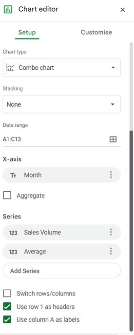
- If not, ensure that under the Chart Editor’s Setup tab, the field Month is added to the X-axis, and Sales Volume and Average are added to Series.
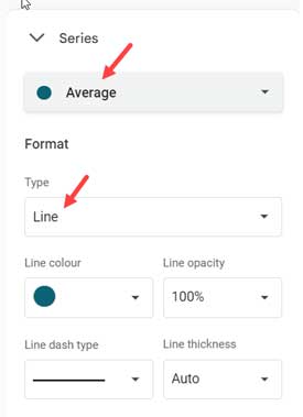
- Under the Customize tab of the Chart Editor, go to Series.
- Select the field Sales Volume and choose the chart type Column.
- Similarly, select the series Average and choose the chart type Line.
This way, you can add an average line to a column chart in Google Sheets.
You can switch between chart types like Columns, Area, Line, and Stepped Area for the series Sales Volume. Since we want to add an average line, the chart type must be Line for the field Average.
Want to Focus on Central Tendency?
Your data might have extreme values or outliers. For example, consider this array:
{1, 2, 25, 26, 30, 33, 35, 40, 45, 46, 150, 155}
In this array, the extreme values are 150 and 155. If you want to reduce the influence of such values when adding an average line to a chart, you can use the TRIMMEAN function instead of AVERAGE in column C. This will help you focus on the typical values in your data, excluding the influence of outliers.
Syntax:
TRIMMEAN(data, exclude_proportion)The exclude_proportion is the proportion of data points to exclude from each end of the dataset. For example, using TRIMMEAN(data, 0.1) excludes 10% of data points from each end.
To calculate the exclude_proportion, use the following formula:
exclude_proportion = number_of_outliers/numbr_of_data_points
For the given array, it would be 2/12=0.17.
So the formula would be:
=TRIMMEAN({1, 2, 25, 26, 30, 33, 35, 40, 45, 46, 150, 155}, 0.17)In cell C2 of your spreadsheet, enter the following formula, replacing 0.1 with the actual exclude_proportion value you calculate:
=ArrayFormula(IF(B2:B, TRIMMEAN(B2:B, 0.1), ))This formula calculates the trimmed mean for the values in column B, excluding 10% of data points from each end to focus on the central tendency. Adjust the exclude_proportion based on your specific data and analysis needs.


