


Can we get the horizontal bars on the left and right sides of a (virtual) vertical line in a SPARKLINE bar chart in Google Sheets (left side for negative values and right side for positive values)?
Yes! This post explains how to use the SPARKLINE function for creating a positive and negative bar graph within the cells in Google Sheets.
We will write a SPARKLINE non-array formula first and convert that to an array formula using the MAP Lambda function and then to a Named Function which is SPARKLINE_NEGATIVE_BAR().
When using the said Named Function, you only need to specify the range, the only argument within it. I am sure you are going to enjoy it.
SPARKLINE Non-Array Formula for Creating a Positive and Negative Bar Graph in Google Sheets
In three steps, we can code a SPARKLINE bar graph with positive and negative bars in Google Sheets.
We may require one more step to convert the coded formula to an array formula, which expands down.
The final step is possible because of the availability of the LAMBDA functions in Google Sheets.
The SPARKLINE function has two arguments which are data and options.
Syntax:- SPARKLINE(data, [options])
In this tiny in-cell chart, the width of the horizontal bars will be proportional to the absolute values they represent.
In other words, the function uses absolute values from the specified cell or cell range.
So, negative and positive values will have the same impact on the bar graph.
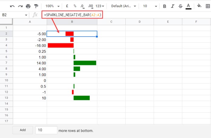
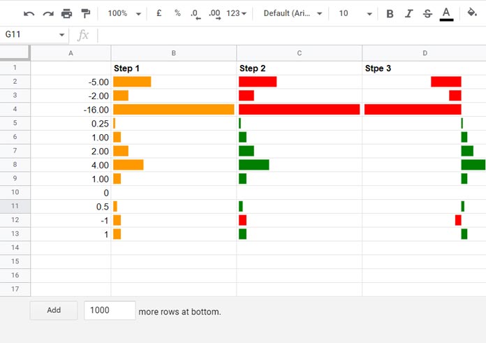
Step 1 Formula (In B2, copy-pasted down):
=ArrayFormula(SPARKLINE(A2,{"charttype","bar";"max",max(abs($A$2:$A))}))You only have the option to specify two colors (of your choice) based on their signs, e.g., red for negative and green for positive.
Step 2 Formula (In C2, copy-pasted down):
=ArrayFormula(SPARKLINE(A2,{"charttype","bar";"max",max(abs($A$2:$A));"color1",if(A2>0,"green","red")}))How do we move the horizontal bars on the left and right-hand sides of a virtual vertical bar based on positive and negative data points?
Step 3 Formula (In D2, copy-pasted down):
=sparkline({if(A2>0,min($A$2:$A),A2-min($A$2:$A)),A2},{"charttype","bar";"max",max(0,$A$2:$A)-min(0,$A$2:$A);"color1","white";"color2",if(A2>0,"green","red")})Step 3 Formula Explanation
The SPARKLINE formula above creates positive and negative bars proportional to the values they represent.
The negative and positive values will be aligned on the left and right-hand sides of a (virtual) vertical line.
Unlike the step 1 and 2 formulas, the step 3 formula returns a two-color bar chart – white, red/green.
That is the key part of the SPARKLINE formula for positive and negative bars in Google Sheets.
SPARKLINE data Points for Positive and Negative Bars:
{if(A2>0,min($A$2:$A),A2-min($A$2:$A)),A2}White – The cyan-bluish-grey logical part of the data returns data point 1 for the white bar.
Red/Green – The light green cyan highlighted part of the data returns data point 2 for the red/green bar.
To understand what the formula returns in each row, please check the table below.
SPARKLINE Max options for Positive and Negative Bars:
The maximum value along the horizontal axis of all the bar charts will be 20, i.e., max(0,$A$2:$A)-min(0,$A$2:$A).
Table # 1
| Cell Reference and Value (A2:A13) | Data Point 1 (White) | Data Point 2 (Red/Green) | Max Value |
| A2, -5 | 11 | -5 | 20 |
| A3, -2 | 14 | -2 | 20 |
| A4, -16 | 0 | -16 | 20 |
| A5, 0.25 | -16 | 0.25 | 20 |
| A6, 1 | -16 | 1 | 20 |
| A7, 2 | -16 | 2 | 20 |
| A8, 4 | -16 | 4 | 20 |
| A9, 1 | -16 | 1 | 20 |
| A10, 0 | -16 | 0 | 20 |
| A11, 0.5 | -16 | 0.5 | 20 |
| A12, -1 | 15 | -1 | 20 |
| A13, 1 | -16 | 1 | 20 |
Note:- The SPARKLINE formula will treat all the values in data points 1 and 2 as absolute values.
If the values in A2 is less than 0, the total of data point 1 (white) and 2 (red) will be 16, which is equal to the absolute min value in the range A2:A13. It applies to A3, A4, and so on.
If the values in A2 is greater than 0, the total of data point 1 (white) and 2 (green) will be 16+ (white=16, balance will be green). It also applies to A3, A4, and so on.
The max (20) in the options argument part aligns the bars.
This way, we can use the SPARKLINE function for creating positive and negative bar charts within cells in Google Sheets.
SPARKLINE Array Formula and Named Function for Positive and Negative Bar Graph
Array Formula:
Let’s convert the step 3 formula to an array formula.
You can either use the BYROW or MAP function for that. I’m using the latter one here.
Generic Formula:
=map(A2:A,lambda(r,non_array_formula))Replace non_array_formula with the step 3 formula and all the cell reference A2 in that formula with the name r.
SPARKLINE Array Formula for Positive and Negative Bar Graph:
=map(A2:A,lambda(r,sparkline({if(r>0,min($A$2:$A),r-min($A$2:$A)),r},{"charttype","bar";"max",max(0,$A$2:$A)-min(0,$A$2:$A);"color1","white";"color2",if(r>0,"green","red")})))This SPARKLINE negative and positive bar graph formula will spill the result down. So first empty the range B2:B, then enter it in cell B2.
Custom Named Function
I’ve already explained the steps to create a Named Function in Google Sheets.
We can copy the above SPARKLINE Positive and Negative Bar Array Formula and convert it to a named function which is SPARKLINE_NEGATIVE_BAR().
You can download it from my sample sheet below.
Syntax:
SPARKLINE_NEGATIVE_BAR(range)As per our above sample data, the custom SPARKLINE_NEGATIVE_BAR formula will be as follows.
=SPARKLINE_NEGATIVE_BAR(A2:A)Make sure you have emptied the column for the formula to expand down.
Resources:
Thank you for the instruction. I have been looking for a solution for quite a long time.
How can I change the formula in such a way that the virtual vertical line is always in the center of the cell?
Many Thanks again!
Hi, Sebastian,
Syntax: SPARKLINE_NEGATIVE_BAR(range)
Assume the range is A2:A13.
If you use my custom-named function for the -ve and +ve sparklines, insert the following formula at the bottom of the range, here in cell A14.
=if(abs(min(A2:A13))>=max(A2:A13),abs(min(A2:A13)),max(A2:A13)*-1)Use A2:A14 instead of A2:A13 and hide row#14.
Hi, I’ve been trying for two days, but still, I cannot figure out the final formula. It seems to be wrong.
There are three arguments in the IF function, whereas there should be just two.
There must be something wrong with the punctuation, i.e.,
,used instead of\or;.Many thanks.
Hi, Mauri,
You can follow the below steps to get the correct formula as per your locale.
1. Open a new spreadsheet.
2. Go to File > Settings and change the Locale to the United Kingdom.
3. Enter my formula within the tutorial above.
4. Then revert the Locale.
My issue is as follows: I have set the regional settings for Spain. While the formula functions properly, the problem arises in the visualization of the bars. Negative values fail to display on the left, and positive values on the right. I’ve observed that it only displays correctly when the regional settings are set to the United Kingdom.
Could you advise on how to rectify this?
Would you mind trying to make a copy of my sheet and changing the locale to Spain? It seems to be functioning correctly on my end.