Want to visualize how asset value decreases under different depreciation methods? With Google Sheets’ built-in financial functions, you can easily calculate and chart depreciation curves—no accounting software or advanced tools needed.
In this tutorial, I’ll show you how to create a depreciation curve chart in Google Sheets using functions like SLN, SYD, DB, and DDB. You’ll also learn how to format your data, add custom series labels, and compare methods side-by-side on a smooth line chart.
Whether you’re managing business assets or just want to understand how depreciation works, this guide will help you create clear, insightful visualizations. Plus, there’s a free sample sheet included to get you started instantly.
How to Plot Depreciation Curves in Google Sheets
Google Sheets offers several financial functions that make depreciation calculations simple. In this tutorial, we’ll use all available depreciation functions—except AMORLINC—to populate data series for our chart.
Note: We’re excluding AMORLINC (used in the French accounting system) because its required inputs differ from the others. Check out my dedicated tutorial on AMORLINC if you’d like to include it too.
For this chart, I’m using the following functions:
SLN– Straight-line depreciationSYD– Sum-of-years’ digitsDB– Fixed-declining balanceDDB/VDB– Double-declining balance and variable declining balance
Since DDB and VDB produce nearly identical results under standard settings, we’ll only include one curve for them.
Input Values for the Depreciation Curve Chart
Depreciation is the gradual reduction in the value of tangible assets—cars, laptops, printers, buildings, and more. You can allocate an asset’s cost over its useful life using these depreciation methods.
Here’s what you need to get started:
| Input | Description |
|---|---|
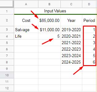
| Purchase cost | Initial asset value (e.g. $85,000) |
| Salvage value | Estimated value at the end of useful life (e.g. $11,000) |
| Useful life | Number of periods (e.g. 5 years) |
| Periods | Typically 1 to 6, with the final period showing the closing balance |
Why six periods for a 5-year asset?
The 6th row represents the opening balance after the final depreciation period—this value typically equals the salvage value.
Don’t worry about setting this up manually—I’ll link to a free sample sheet at the end of this post.
SLN, SYD, DB, DDB, and VDB in Google Sheets
I’ve structured the spreadsheet with columns A to D for input values, and column C for the X-axis (periods) in the chart.
Columns E to P calculate the depreciation, opening balance, and closing balance for each depreciation method across all periods.
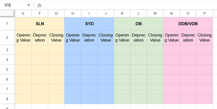
Column Structure Example (for SLN):
| E (Opening Value) | F (Depreciation) | G (Closing Value) |
|---|---|---|
| $85,000.00 | [Depreciation for Period 1] | =E3–F3 |
| =G3 | [Depreciation for Period 2] | =E4–F4 |
| … | … | … |
This same structure is repeated for the other methods:
- SLN – Columns E to G
- SYD – Columns H to J
- DB – Columns K to M
- DDB/VDB – Columns N to P
Setup Instructions
- Opening Balance (first row):
Enter the purchase cost ($85,000.00) in cells E3, H3, K3, and N3. - Opening Balance (subsequent rows):
In row 4 and down, link to the previous row’s closing value:=G3in E4,=J3in H4,=M3in K4,=P3in N4
Then drag down to row 8.
- Closing Balance:
Subtract depreciation from the opening value:=E3–F3in G3,=H3–I3in J3,=K3–L3in M3,=N3–O3in P3
Drag down to row 7.
Depreciation Formulas for Each Method
Here are the formulas for calculating depreciation in each method.
SLN (Straight Line)
In cell F3, copy this down to F7:
=SLN($E$3, $B$3, $B$4)SYD (Sum-of-Years’ Digits)
In I3, copy to I4:I7:
=SYD($H$3, $B$3, $B$4, D3)DB (Declining Balance)
In L3, copy to L4:L7:
=DB($K$3, $B$3, $B$4, D3)DDB (or VDB if preferred)
In O3, copy to O4:O7:
=DDB($N$3, $B$3, $B$4, D3)Now you’ve got everything needed to create a visual depreciation table.
Format Data for Charting in a Clean Tab
Instead of using the entire depreciation table, copy only the necessary columns—Periods, SLN, SYD, DB, and DDB/VDB—into a new tab. This makes the chart setup easier and allows for a cleaner layout with custom series labels.
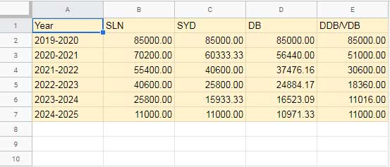
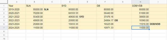
You’ll need data from columns C, E, H, K, and N. Copy the values from rows 3 to 8 in these columns, then paste them as values into adjacent columns in a new sheet using right-click > Paste special > Values only. Place the data in the range A2:E7, and add the appropriate headers—Period, SLN, SYD, DB, and DDB/VDB—in cells A1:E1.
Custom Labels to Avoid Chart Clutter
To clearly identify each depreciation line on the chart, use custom series labels inside the chart area instead of a traditional legend. This keeps the chart tidy and easier to read.
To do this, insert a blank column after each depreciation value column and type the label name (e.g., “SLN”, “SYD”, etc.).
Stagger the labels across different rows to prevent overlap. You’ll see the result once the chart is finalized—it creates a much cleaner and more informative layout.
Related: Add Legend Next to Series in Line or Column Chart in Google Sheets
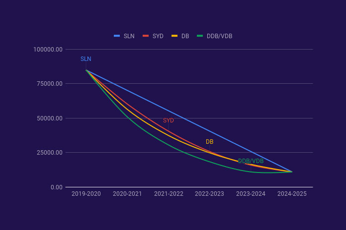
Create the Depreciation Curve Chart
Now let’s build the chart:
- Select your formatted data range (e.g.,
A1:Iin the clean tab). - Go to Insert > Chart.
- Under Setup, choose Smooth Line Chart as the chart type.
- Under Customize > Series > Apply to All Series, enable:
- Data labels
- Set label type to Custom
Done! Your chart should now clearly show the depreciation curves and straight-line comparison. Each line has a label, making it easy to distinguish between the different depreciation methods.
Final Thoughts
Depreciation charts in Google Sheets give you a visual way to understand how different depreciation methods affect an asset’s value over time. Whether you’re evaluating SLN, SYD, DB, or DDB/VDB, this tutorial gives you a complete, hands-on approach—with a sample sheet to get started fast.
🔗 Download Sample Sheet: Try the Google Sheets Depreciation Curves Template for yourself and start customizing depreciation charts for your own assets.


