


")


")

")
")
 in Excel & Google Sheets")


Currently, you can display both month and year together on the X-axis in a Google Sheets chart, but what if you want to display them separately?
This requires a multiple-category feature, which Google Sheets currently lacks. However, there is a workaround, different from what you might have experienced in Excel.
To display month and year on the X-axis, we aim to use years as the main category and months as sub-categories. The workaround outlined below should address this need to some extent.
Displaying Month and Year Together
Let’s first see how Google Sheets handles month and year on the X-axis.
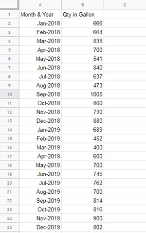
Assume I have the monthly gasoline consumption by a fleet of trucks (fleet fuel spending data) in our company for the last two years in columns A and B.
A2:A25 contains the beginning of the month dates such as 1/1/2018, 1/2/2018, …, 1/12/2019 formatted to “MMM-YYYY” (Format > Number > Custom Number Format > mmm-yyyy)
B2:B25 contains the quantity in gallons.
I can plot a column, bar, line, etc., graph with this data type in Google Sheets.
Here I am going to create a column chart, which is more common in such types of visualizations.
In that chart, the category axis (X-axis) will contain the month and year values. But it will be cluttered as below.
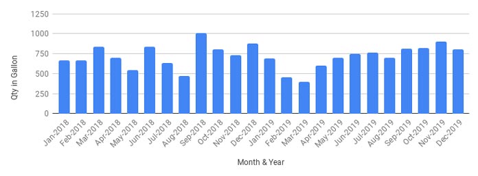
This is the typical way of displaying the month and year in a column chart. Here, you can see that the X-axis is crowded with values, making it somewhat cluttered. How can this be resolved?
Before explaining how to display the month and year separately on the X-axis, let’s examine the chart settings of the above column chart.
To create the chart, select the data range and navigate to the menu Insert > Chart. This action will insert a chart and open the chart editor in Sheets.
Below are the chart editor settings that you should follow under the “Setup” tab to create the aforementioned column chart.
Essential Column Chart Settings Related to Monthly Data:
- Chart type: Column
- Stacking: None
- Data range: A1:B25
- X-axis: A1:A25 (by default you will see the field label)
- Series: B1:B25 (by default you will see the field label)
- Check Mark Against:
- Use row 1 as headers
- Use column A as labels
- Treat labels as text.
The Workaround to Display Month and Year on the X-axis in Sheets
First of all, let’s see what the chart will look. I think it’s clutter-free compared to the above column chart.
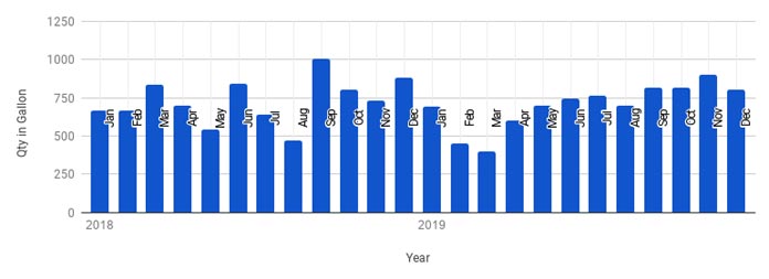
Here, the categories are the years, and the month names are the sub-categories, displayed as axis labels.
Do you like this chart? Then read on to understand how to plot it.
The crucial aspect of this workaround is restructuring the source data. For that, you can use formulas or manual methods.
To plot the above column chart, the data should resemble the format below. Only then can we display the month and year on the X-axis in a clutter-free manner.
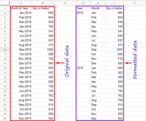
Step-by-Step Instructions to Format the Source Data for the Chart
I am using a few basic formulas to format the data. See the modified data in columns D, E, and F. You can use formulas to format the data as below.
First, enter the labels in the header row D1:F1. Then use the following formulas:
In cell D2:
=MAP(A2:A25, LAMBDA(v, IF(IFERROR(YEAR(v)<>YEAR(OFFSET(v, -1, 0)), YEAR(A2)), YEAR(v),)))The MAP function iterates over each value in the array A2:A25 to execute the following unnamed lambda function.
IF(IFERROR(YEAR(v)<>YEAR(OFFSET(v, -1, 0)), YEAR(A2)), YEAR(v),)This formula tests if the year of the date in the current row of the array is not the year of the date in the previous row. If it evaluates to TRUE, the formula returns the year.
The formula will evaluate to an error in the first row of the array because of the text value in the previous row. The IFERROR removes that error and returns the year of the date in the first row of the array.
In cell E2:
=ArrayFormula(TEXT(A2:A25, "mmm"))Returns the month text.
In cell F2:
={B2:B25}This simply copies the values from column B to column F.
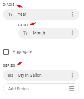
Chart Editor Settings to Display Month and Year on the X-axis
Here are the chart settings that I have followed:
- Chart type: Column
- Stacking: None
- Data range: D1:F25
- X-axis: D1:D25 (by default, you will see the field label “Year”; if not, remove the existing label and select “Year”)
- Label: E1:E25 (Month)
- Series: F1:F25 (by default, you will see the field label)
If you encounter difficulties following the points above to set the axis, please review the axis settings again.
Resources
Here are some resources related to customizing column charts in Google Sheets.
- Bar or Column Chart with Red Colors for Negative Bars in Google Sheets
- Floating Column Chart in Google Sheets – How to
- Add Legend Next to Series in Line or Column Chart in Google Sheets
- How to Reduce the Width of Columns in a Column Chart in Google Sheets
- Google Sheets Bar and Column Chart with Target Coloring
Is there a way to move the x-axis, which displays the months, to the bottom of the graph? It looks aesthetically unpleasing positioned in the middle of the chart, but I haven’t found a way to relocate it. Thank you.
Currently, there isn’t a feature available for that.