


I have already written several tutorials on Info Inspired related to Google Sheets Charts and in that, I’ve included S Curve too. But there is no dedicated tutorial for S CURVE as well as an example to S Curve so far on Info Inspired. I hope this tutorial will cover that void spot. Here I will explain not only the steps on how to create S Curve in Google Sheets but also the basic scheduling part of it.
At the end of this post, I also explained how to create S-Curve in Excel. Either you should have a scheduled quantity with you or you should at least know what is scheduling in order to create S-curve in Google Doc Spreadsheet. Don’t worry. I have the sample data for you and I will let you know how to prepare data for S Curve too. Creating an S curve is so easy if you understand the scheduling part of it.
S Curves are very useful in Construction jobs. My earlier experience with a well-established MNC related to construction industries helped me a lot in writing this tutorial. Before going to tell you how to create an S-curve in Google Sheets, I believe, I should explain the below things connected with S Curve.
- What is S Curve in Project Management?
- The relation of S-Curve with Line Graph or Line Chart in Spreadsheets.
- How to Schedule for S Curve?
There is no free template available for creating S Curve. But you can feel free to make a copy of our finished S Curve for your project use. Just message me in the comments at the end of this tutorial for that. Saying that we can move to our tutorial section.
S Curve in Project Management and in Spreadsheet Solutions
S-curve is related to job scheduling and tracking the progress of the scheduled job. S Curve or S Graph is an S-shaped curve that typically appears in project management. Basically, it’s none other than an S-shaped Line chart.
The Relation of S Curve with Line Graph or Line Chart in Spreadsheets
The purpose of a line chart is a comparison over time. If you have checked our chart selection tool, you may know about it. It’s applicable to S Curve too. But in S Curve, we use cumulative quantity or value to compare over time. The line chart gets an S shape in the schedule due to the cumulative quantity distribution over time.
Job Scheduling Part for S Curve
Now I should go a little bit off-topic. If you ask me what is the best tool for Job Scheduling, without any doubt, I can recommend you Microsoft Project and Primavera Project Management Tool. Both are different software from two different companies. The first one is of course from Microsoft and the latter is from Oracle.
What is the relation of these project management tools with S-Curve? Normally people tend to use any of the above tools to schedule their job systematically. But you can use spreadsheets too to schedule your job but not that much perfectly.
We can make a Completion Schedule of an assigned job with project management tools. I mean a month-wise, fortnight wise or week-wise schedule of a job to complete it in an allotted or specified time frame.
Sample Data Preparation to Create S Curve in Google Sheets
Suppose I have a job in hand for completing substation work. The job may involve lots of activities related to it like mobilization, the supply of material, cabling, panel erection, testing, and finally the commissioning activities. See the sample data under Column A on the below image.

To schedule this job, normally a planning person may first assign 100% weightage to the total job and then distribute the weightage among all the job activities involved.
The weightage distribution is depending on many things like the total number of manpower, time, priority, difficulty level, etc. required for the job. Then they assign the time frame to complete the job.
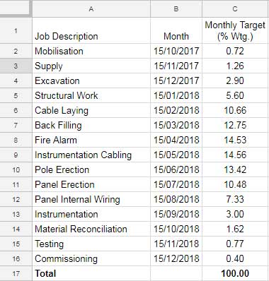
Here in the above, I just put the time schedule for each job. That means the particular job against the date should complete in that month itself.
But in the real case, each job can further summarise. For example, you can add related jobs like excavation, structural work, cable laying and backfilling under one main heading and add their weightage together.
I didn’t do this here because I only took few items for example purpose and I can’t further shorten it. Also, my main purpose is to give you an idea about the data which we are going to use for our S Curve. From the above, we can get the data for our S Curve.
With a start date and end date, we can easily create a GANTT chart from the above using Google Sheets itself. But it can easily be achieved using Primavera or MS Project in a dynamic way.
Now we have the data for S Curve. We should just make the monthly target weightage cumulative as below to create an S curve. I’ve done it in column D.
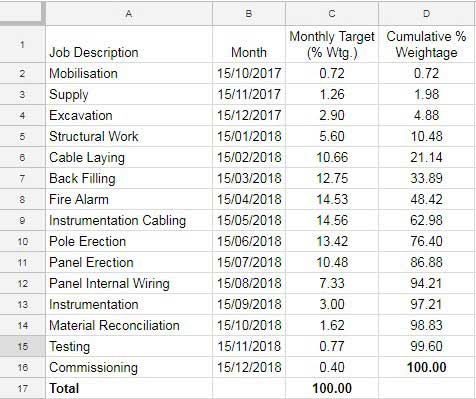
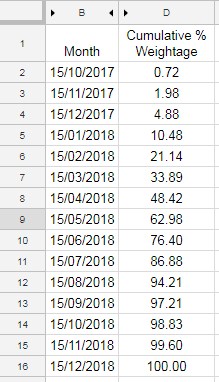
See the above image. We require Column B and Column D data to create S Curve in Google Spreadsheet. Hide the rest of the columns. See the below screenshot.
Final Steps – S Curve Creation
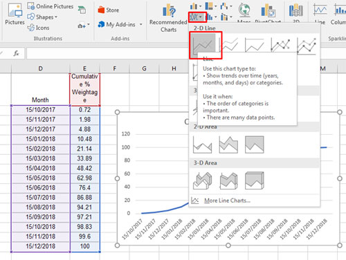
Now select the entire B1:D16 data and click insert menu Chart. It will insert a chart. Don’t worry about how the chart looks. It may or may not be perfect.
In most cases, the inserted chart will be S Curve. If not, you should change the settings on the chart editor as marked below. The chart editor you can see on your right-hand side of the screen.

Make sure that the Chart Type is Line Chart. Then click on X-AXIS and edit the range to B2-B16. It will create our perfect S Curve.

Now you can do the customization part yourself on the chart editor. If you want to show the entire date on X-AXIS select Treat Label as text on the customization panel as above.
Thus we have finished our S Curve. This S-Curve is showing the scheduled quantity. Now you can track monthly progress against the above schedule. I have another detailed tutorial on it. Click HERE.
S-Curve in Excel
You can use the same data above to create an S-curve in Excel. There also select the entire data and go to insert menu -> Line Chart.
It will automatically create the S Curve as the important thing is we have already had proper data to plot.
Conclusion
In this tutorial, my main focus was to explain to you how to create S Curve in Google Sheets.
I’ve just touched on the scheduling part to make you understand it. Please remember that I didn’t touch even 10% of the scheduling part above.
Hi Prashanth,
Great article! Thank you very much for the detailed tutorial. Could I have a template of yours on Google Sheets?
Thank you!
Hi there,
Thank you for your kind words! I’m glad you found my tutorial helpful. I do have a template, and I’d be happy to share it with you. You can find it here: Sample Sheet.
I hope you find it useful!
Best,
Prashanth
Thanks a lot, I have enjoyed the tutorial. I request for a tutorial in Ms project in form of a PDF file. Thanks, It will be very grateful.
Francis olem
Hi, Francis,
Nowadays I am fully concentrated on Google Sheets and not even have a working copy of MS Project.
It’s glad that you enjoyed this tutorial!
Thanks for the drop by.
Best,