")
")


")


")

")
")
 in Excel & Google Sheets")


Needless to say, data visualization is crucial in reporting. This time, let’s play around with Google Sheets charts. Here’s how to move the Y-axis to the right side in Google Sheets charts—a simple tip that can make your chart stand out from the rest.
As you may know, in Google Sheets, the vertical axis (Y-axis) is placed on the left side of the chart by default. This is common in most spreadsheet applications. However, if you want, you can move the vertical axis to the right side in Google Sheets. How?
Let me show you. As an example, I’ll create a line chart and demonstrate how to move the Y-axis to the right side.
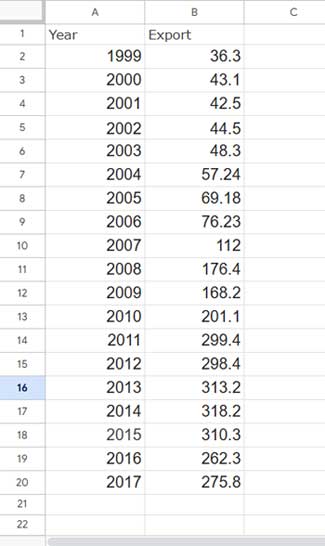
To plot the chart, I’m using the following sample data in A1:B20, which shows India’s foreign trade (exports) from 1999 to 2017:
- The first column contains the years from 1999 to 2017.
- The second column contains the export values (in billions of USD) for each year.
Just select these two columns, then go to Insert > Chart and choose Line chart under Chart Type. Google Sheets will instantly insert the line chart shown below.
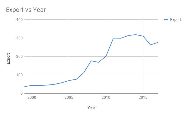
I’m not diving too deep into chart visualization and customization here, as our primary focus is on moving the vertical axis to the right side.
How to Move the Y-Axis to the Right Side in Google Sheets
Now that we have our chart ready, follow these steps to move the Y-axis to the right:
- Click on the chart to select it.
- Click the three vertical dots in the top-right corner of the chart and select Edit Chart.
- In the Chart Editor, go to the Customization tab.
- Under the Series section, select Right axis.

That’s it! Your Y-axis is now on the right side of the chart.
Does the Right Axis Work with All Chart Types?
No, not all chart types support this feature. However, popular chart types like Combo, Area, Column, Bar, and Line charts do. To check compatibility, navigate to the Customization tab in the Chart Editor as explained above.
Resources
- Choosing a Suitable Chart Type for Your Data in Google Sheets
- How to Get Dynamic Range in Charts in Google Sheets
- How to Create a Multi-category Chart in Google Sheets
- How to Format Data to Make Charts in Google Sheets
- How to Change Data Point Colors in Charts in Google Sheets
- Bar or Column Chart with Red Colors for Negative Bars in Google Sheets
- Add Legend Next to Series in Line or Column Chart in Google Sheets
- How to Include Filtered Rows in a Chart in Google Sheets
- Reducing the Width of Columns in Column Charts in Google Sheets
- Enabling the Horizontal Axis (Vertical) Gridlines in Charts in Google Sheets
- Create a Shaded Target Range in a Line Chart in Google Sheets
- How to Add a Vertical Line to a Line Chart in Google Sheets
- Google Sheets Bar and Column Chart with Target Coloring