


The function Average can return the average of a set of number. But how to use that value to add an average line in charts in Google Sheets (Column or Line chart).
Actually, adding an average line in a column (vertical bar) chart or line chart is quite simple. I have detailed the steps below.
If you add an average line in charts it would be a ‘central’ horizontal line. It’s because the average (mean) is the Sum divided by the Count of a set of numbers.
The mean is a single ‘central’ number representing the set of numbers used in the calculation. The average of the numbers 10, 9, 14 and 12 will be 11.25.
=(10+9+14+12)/4Assume the above values are in the array A1
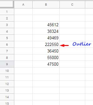
=average(A1:A4)I don’t recommend you to use an average line in charts if there are very small/large values that are not typical (outliers) in your dataset.
Here are the step-by-step instructions on how to add an average line in charts in Google Docs Sheets.
How to Add an Average Line in Charts in Google Sheets
Similar to target/schedule/benchmark line, we can use a combo chart in Google Sheets to add an average line.
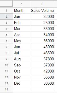
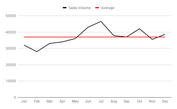
I am using the below mocked month wise sales data to plot a column chart and add a horizontal average line to it.
Average Line in Column Chart in Google Sheets
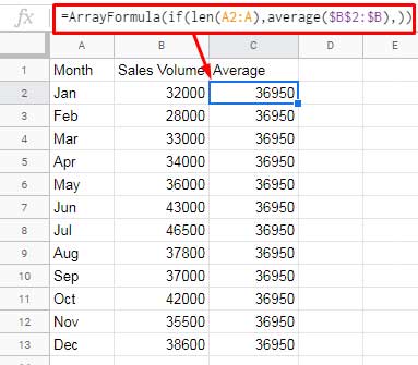
To draw an average line find the average of above sales. It’s 36950.00. Using the below formula you can get the average value.
=average(B2:B13)But I am not going to use this formula as it is. I am using it as an Array Formula in an infinite range as below in cell C2.
=ArrayFormula(if(len(A2:A),average($B$2:$B),))This will place the average in all the rows in column C as below. The column will be filled with average, if the column A is not blank.
In next step, select the entire column A, B and C by clicking on the column heading. Then go to Insert > Chart.
In the Chart editor sidebar panel, select the chart type “Combo chart”. Under the “Customize” tab “Series”, make sure the following settings are there. If not, change.
Sales Volume – Column
Average – Line
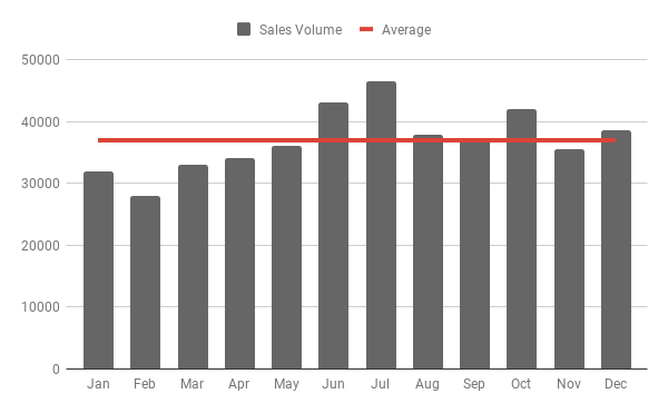
That’s all. The Column chart with average line is ready.
You have the option to change the color of all the columns as a whole or individually. I am leaving that customization part – How to Change Data Point Colors in Charts in Google Sheets.
Average Line in Line Chart in Google Sheets
Similar to the Column chart, the average line will also well fit in a Line graph. You just need to make one change to switch the above Column to Line.
First create the combination chart as above. Then in the “Customize” tab click “Series”.
Select the series “Sales volume” and change the “Type” to “Line”. You have added an average line to the line chart as below!
This way you can add average line in charts in Google Sheets.
Additional Reading: