")
")


")


")

")
")
 in Excel & Google Sheets")


To create a simple pie chart using Boolean values in Google Sheets, you can use the COUNTIF function. This method is straightforward, making it perfect for beginner-level Sheets users.
Let’s say you want to compare the monthly performance of two employees based on their daily targets and achievements. Since a pie chart is ideal for visualizing proportions and is easy to interpret, it fits well for this scenario.
In my sample data, there are three columns: the first column contains date entries, and the other two columns are filled with TRUE/FALSE checkboxes—one for each employee.
You May Like: How to Convert TRUE/FALSE to Checkboxes in Google Sheets
Here’s the sample dataset. For simplicity, I’ve used 15 days’ worth of data to reduce the number of rows in the screenshot.
Sample Data to Plot a Pie Chart Using Boolean Values
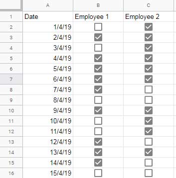
I inserted the checkboxes using the Insert > Tick box command. A ticked (checked) box has the value TRUE (which is treated as 1), and an unticked box has the value FALSE (or 0).
Must Read: 10 Best Tick Box Tips and Tricks in Google Sheets
Now let’s see how to create a pie chart using the count of Boolean values in Google Sheets.
How to Create a Pie Chart Using Boolean Values (TRUE/FALSE) in Google Sheets

Here are the COUNTIF formulas you’ll need:
Step 1: Count the TRUE values
To count the total number of ticked boxes for Employee 1 (range B2:B16), enter the following formula in cell D1:
={B1; COUNTIF(B2:B16, TRUE)}Additional Tip
You can also use the SUM function as an alternative:
={B1; ARRAYFORMULA(SUM(N(B2:B16)))}In this formula:
- The
Nfunction convertsTRUEto1. ARRAYFORMULAis required becauseNis a non-array function.- The result is the count of TRUE values in the range.
This is just for your information—you can stick with the COUNTIF method.
Next, in cell E1, use this formula to count TRUE values for Employee 2 (range C2:C16):
={C1; COUNTIF(C2:C16, TRUE)}Step 2: Create the Pie Chart Using Boolean Values in Google Sheets
Now that you have the counts of TRUE values for both employees:
- Select cells
D1:E2, which contain the count results. - Go to Insert > Chart.
- Change the chart type to Pie chart.
- Under Chart setup, enable Switch rows/columns.
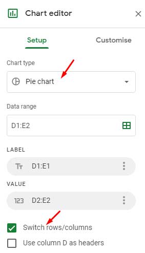
You should now see a pie chart comparing the performance of both employees based on the number of days they met their targets.
Example 2: Pie Chart Showing Attendance (Present vs Absent)
Let’s say you’re tracking the attendance of an employee over 15 working days using a single checkbox column. A ticked box (TRUE) means Present, and an unticked box (FALSE) means Absent.
In this case, we want to show both the present and absent counts in a pie chart.
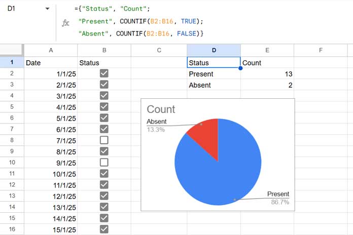
Step 1: Use this formula to count both TRUE and FALSE values:
={"Status", "Count";
 "Present", COUNTIF(B2:B16, TRUE);
 "Absent", COUNTIF(B2:B16, FALSE)}
This will output a small summary table with the count of Present and Absent days.
Step 2: Insert the Pie Chart
- Select the formula output (e.g.,
D1:E3). - Go to Insert > Chart.
- Choose Pie chart under the Chart type.
- Done! You now have a pie chart showing attendance status.
This is another good example of creating a pie chart using Boolean values in Google Sheets.
Wrap Up
We’ve now covered two useful examples of creating a pie chart using Boolean values in Google Sheets:
- Comparing the performance of two employees (counting only
TRUEvalues). - Showing attendance status using both
TRUEandFALSE.
To summarize: when working with TRUE/FALSE or tick box fields, use COUNTIF (or SUM) to get the numerical values first, and then use that output to build your pie chart.
Related Reading
- How to Sort Pie Slices in Google Sheets
- How to Create a 3D Pie Chart in Google Sheets
- How to Change Data Point Colors in Charts in Google Sheets
- How to Prepare Data for Charts in Google Sheets
- Google Sheets Charts: Built-in Charts, Dynamic Charts, and Custom Charts
- How to Get Dynamic Range in Charts in Google Sheets
- Choose Suitable Chart for Your Spreadsheet Data – How To