


")


")

")
")
 in Excel & Google Sheets")


In Google Sheets, line charts usually run horizontally — time on the X-axis and values on the Y. But what if your data or layout works better rotated? In this tutorial, we’ll walk you through how to make a vertical line graph in Google Sheets using a simple workaround. This method is best for plotting a single data series and can be especially useful in mobile dashboards, timelines, or narrow layouts.
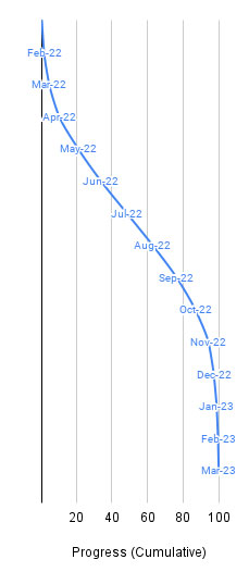
What Is a Vertical Line Graph?
A vertical line graph is just a regular line chart rotated 90 degrees. The category axis (normally horizontal) appears vertically on the left, and the values (normally on the Y-axis) run from left to right. The result: the line appears to rise or fall vertically as you move down the categories.
It’s not a native chart type in Google Sheets, which is why we’ll need to build one creatively.
Why Use a Vertical Line Graph in Google Sheets?
While it’s uncommon, a vertical line chart in Google Sheets can be incredibly useful in the right context:
- Handles Long or Crowded Labels
When your category labels (like months, product names, or tasks) are too long to fit neatly on the X-axis, rotating the layout gives them space to breathe. - Offers a Fresh Perspective
Turning the view can make patterns or outliers stand out — especially when the data isn’t time-based. - Fits Tall, Narrow Layouts
Perfect for mobile dashboards or sidebar visuals where horizontal space is limited. - Mimics Vertical Progression
Helpful in visualizing timelines or process steps — where things move from top to bottom, not left to right. - Reverses the Expected Flow
Great for storytelling dashboards or niche reports that intentionally flip the axis perspective.
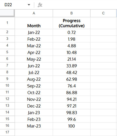
Sample Data
Let’s say you’re tracking cumulative project progress across 15 months. Here’s a sample dataset:
Step-by-Step: Create a Vertical Line Graph in Google Sheets
Step 1: Create a Helper Column
We’ll use a helper column to guide the visual layout of the vertical line.
In cell C1, enter:
=VSTACK("Helper", SEQUENCE(15, 1, 15, -1))This gives you a descending list from 15 to 1 (matching the number of rows in your dataset).
Why this matters: It lets the chart draw the line from top to bottom instead of the usual left to right.
Step 2: Format the Category Labels
Select A2:A16, then go to Format > Number > Plain Text.
This step ensures the months won’t be misinterpreted as dates during chart setup.
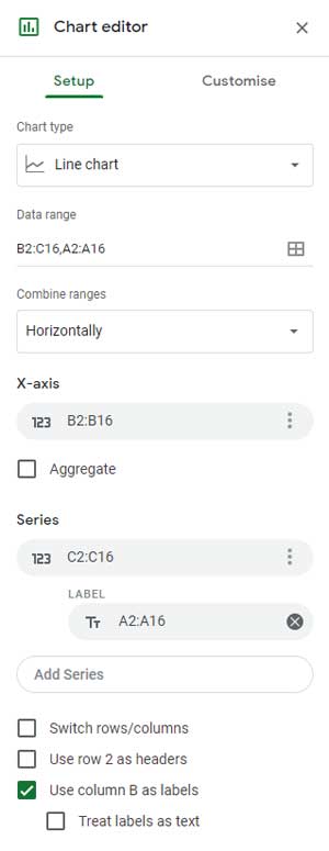
Step 3: Build the Chart
- Select the range
B2:C16. - Go to Insert > Chart.
- In the Chart Editor panel (under the Setup tab), make these adjustments:
- Chart type: Line chart
- X-axis:
B2:B16 - Series:
C2:C16 - Under Series options, click the three-dot menu → Add labels
- If the labels aren’t right, click to edit and point to
A2:A16
Now your line will appear vertical, descending (or ascending) along the chart’s vertical axis.
Tip:
To enhance the vertical appearance, drag the chart’s edges to reduce its width and increase its height. This helps reinforce the “vertical” direction and makes your line climb or fall more visually prominent.
Step 4: Customize the Chart
Go to the Customize tab and apply a few final tweaks:
- Chart Title → remove or rename it
- Vertical Axis Title → delete or edit for clarity
- Adjust colors, gridlines, and fonts as needed
Conclusion
A vertical line graph in Google Sheets might not be standard, but with a little trickery, you can make one that’s both functional and visually striking. It’s especially handy for:
- Tracking project progress over time
- Displaying data with long labels
- Building compact visualizations for mobile dashboards
FAQs About Vertical Line Graphs in Google Sheets
Can you make a true vertical line chart in Google Sheets?
Not directly. Google Sheets doesn’t offer a built-in vertical line chart, but with a simple workaround using a helper column and formatting adjustments, you can rotate a line chart visually.
What types of data work best with vertical line charts?
Vertical line graphs are great for long or crowded category labels, mobile dashboards, or any use case where data progression feels more natural from top to bottom — such as timelines or workflows.
Can I create a vertical line graph with multiple series?
This workaround only supports a single data series effectively. For multi-series, the layout may become confusing or misaligned without additional tricks.
How do I label categories in a vertical line graph?
Use the original category values (like months or names) as data labels. You can enable or adjust them through the chart editor’s “Series” section by clicking “Add labels” and pointing to the correct cell range.
Related Resources
- How to Create a Line Chart in Google Sheets
- Add a Vertical Line to a Line Chart in Google Sheets
- Create a Shaded Target Range in a Line Chart
- How to Create an S-Curve Chart in Google Sheets
- Get a Target Line Across a Column Chart in Google Sheets
- How to Add Legend Next to Series in Line and Column Charts in Google Sheets
- Multi-Colored Line Charts – Automated Approach