

 in Google Sheets")


")


")


Learn how to utilize various Sparkline Bar Chart Formula Options in Google Sheets through practical examples and visuals.
Introduction to the SPARKLINE Function
The SPARKLINE function in Google Sheets allows you to create miniature charts within a single cell. By default, it generates a line chart. To create a bar chart, you must specify the "charttype" option as "bar". Another essential option is "max", which defines the maximum value for scaling the bars.
Syntax:
SPARKLINE(data, [options])The [options] parameter is optional and is used to customize the chart’s appearance. Each option should be enclosed in curly braces {} and separated by semicolons ;. For example:
=SPARKLINE(A2, {"charttype", "bar"; "max", 100})
=SPARKLINE(A3:B3, {"charttype", "bar"; "max", 100})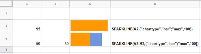
Basic Usage of Sparkline Bar Chart Formula Options
In the first formula, setting the "max" value to 100 ensures that a value of 100 in cell A2 fills the entire cell with the bar. Values less than 100 will fill the cell proportionally. This makes the "max" option crucial for single-series bar charts.
In the second formula, since there are multiple values (a stacked bar chart), you can omit the "max" option. If omitted, the formula will consider the sum of all values in the series as the maximum value.
Utilizing Cell References for Sparkline Bar Chart Formula Options
Instead of directly inputting options within the formula, you can reference them from cells. For instance, if you have all the Sparkline Bar Chart Formula Options listed in the range A3:B9, you can use:
=SPARKLINE(D4, $A$3:$B$9)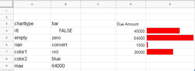
This approach simplifies the formula and allows for easier adjustments. Manually typing the options would look like:
=SPARKLINE(D4, {"charttype","bar";"rtl",FALSE;"empty","zero";"nan","convert";"color1","red";"color2","blue";"max",MAX($D$4:$D$9)})Detailed Explanation of Sparkline Bar Chart Formula Options
1. "rtl" (Right-to-Left)
The "rtl" option determines the direction of the bar chart. Setting it to TRUE renders the bar from right to left.
=SPARKLINE(D4, {"charttype","bar";"rtl",TRUE;"empty","zero";"nan","convert";"color1","red";"color2","blue";"max",MAX($D$4:$D$9)})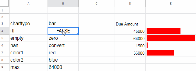
2. "empty"
This option controls how empty cells are treated. You can set it to "zero" to treat empty cells as zero, or "ignore" to skip them.
It’s typically used with multiple data points, such as a range like A2:A5. If used with a single data point that is empty, the formula may return #N/A or an empty cell, depending on whether "zero" or "ignore" is specified.
=SPARKLINE(D4, {"charttype","bar";"rtl",FALSE;"empty","ignore";"nan","convert";"color1","red";"color2","blue";"max",MAX($D$4:$D$9)})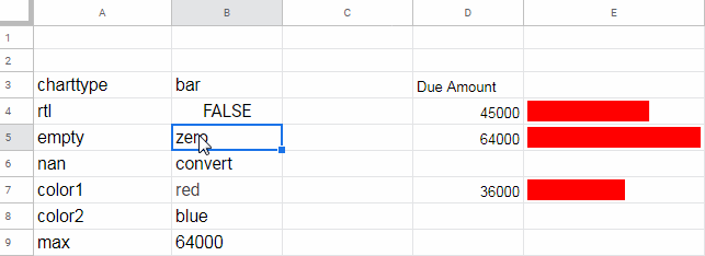
3. "nan"
The "nan" option dictates how non-numeric values are handled in the chart. Setting it to "convert" treats them as zero, while "ignore" skips them entirely.
Like "empty", this option is typically used with multiple data points.
=SPARKLINE(D4, {"charttype","bar";"rtl",FALSE;"empty","zero";"nan","ignore";"color1","red";"color2","blue";"max",MAX($D$4:$D$9)})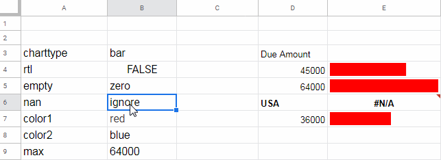
4. "max"
Defines the maximum value for scaling the bars. For example, if you’re displaying student scores out of 50, setting "max" to 50 ensures accurate scaling.
=SPARKLINE(B2, {"charttype", "bar"; "max", 50})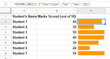
5. "color1" and "color2"
Customize the colors of the bars using "color1" for the first series and "color2" for the second. You can use color names or hex codes.
=SPARKLINE(A2:C2, {"charttype", "bar"; "color1", "red"; "color2", "green"})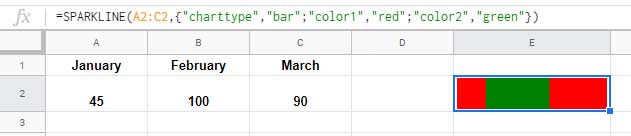
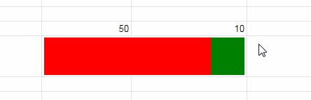
Conditional Coloring Using IF Statements
You can dynamically change bar colors based on conditions using the IF function. For example:
=SPARKLINE(D2:E2, {"charttype", "bar"; "color1", IF(D2>E2, "red", "green"); "color2", IF(E2>D2, "red", "green")})This formula changes the bar colors based on the comparison between D2 and E2.
Additional Resources
- Visually Track Where Your Data Falls Within Limits (Google Sheets)
- How to Create a Gantt Chart with Sparkline in Google Sheets
- Track Remaining Days in Tasks with Sparkline Gantt Charts
- Multi-Color Gantt Chart in Google Sheets
- Date Filter in Gantt Chart in Google Sheets
- GANTT_CHART Function in Google Sheets (Named Function)
- SPARKLINE for Positive and Negative Bar Graph in Google Sheets (Array Formula)
Hi there! I’m trying to create a progress bar for my Amazon spreadsheet. I would like the bar to be green at 100% and red if the percentage is below 100%. Can you help me, please? I’m pretty new to Google Sheets. Thank you!
You can try this formula:
=SPARKLINE(A1, {"charttype", "bar"; "color1", IF(A1=100%, "green", "red"); "max", 100%})Hello!
I have a formula:
=SPARKLINE (G30;{"charttype";"column";"color1";IF(G30>75%;"Blue")})However, I’m encountering a #REF error. Can you help me correct my formula? Thank you.
Hi Ica,
For the correct syntax, please refer to this guide: Sparkline Column Chart Options in Google Sheets.
In that syntax, you need to replace
,with\.Hello,
I am a teacher working on creating a data sheet for report cards.
We grade off a competency level with the options ME, AE, and EU.
I was wondering if it is possible to create a progress chart with sparkline that uses the values “ME, AE, or EU” from a dropdown menu in cells to determine progress.
For now I have switched to numeric values but hope to switch to values mentioned above.
Thank you so much for your help!
Hi, Amy M,
That seems possible using a SWITCH formula that replaces the SPARKLINE data.
Here is an example.
Current Formula:
=sparkline(D5:G5,{"charttype","bar";"max",10})Replace it with the below one once you replace the numerical values with the said strings.
=sparkline(switch(D5:G5,"ME",1,"AE",2,"EU",3),{"charttype","bar";"max",10})
Feel free to adjust the SWITCH formula based on grades.
Hello,
I have made a Sparkline in comparison to the max and I would like to change the color if the value is above or below the average.
=SPARKLINE((RECHERCHEV($A$1;MUFILTRE!$A$3:$B$100;2));{"charttype"\"bar";"max"\max(MUFILTRE!$A$3:$B$51);
"color"\SI(RECHERCHEV($A$1;MUFILTRE!$A$3:$B$100;2))>
MUFILTRE!$B$52\"#e00000"})
Hi, Anthony A,
I could find two issues.
1. Replace
colorwithcolor1.2. It seems the logical test is not correct.
=SPARKLINE(VLOOKUP($A$1;MUFILTRE!$A$3:$B$100;2;false);{"charttype"\"bar";
"color1"\if(VLOOKUP($A$1;MUFILTRE!$A$3:$B$100;2;
false)>MUFILTRE!$B$52;"red";"blue");
"max"\max(MUFILTRE!$A$3:$B$51)})
Hello Prasanth,
I keep getting ERROR!
The only result I get is when I input =Sparkline(AH4:AJ4), which is the line chart, but I want the bar chart…… I´ve tried everything.
Hi, Romina,
Consider sharing your Sheet URL below after removing personal, sensitive, and confidential info, if any.
N.B.:- I won’t publish it (the link).
Hello Prasanth,
Column I = start time, Column J = end time and Column K = Duration (max 3 hours).
What I intend that:
When duration is above 3 hours in column K, the sparkline filled with a color (say yellow).
Less than 3 hours, a combination of two colors showing complete (yellow) Vs Rest (red).
I didn’t expect I would be receiving a reply.
Thanks for your prompt reply.
Hi, Rajkumar Rishikesh Sinha,
I think we were very close. Let’s include one more “option” which is “Max”.
Instead of my previous SPARKLINE formula, try this new one.
=sparkline({K3,3/24},{"charttype","bar";"color1","yellow";"color2","red";"max",3/24})Hello Prasanth,
It is working perfectly.
If possible, can you please explain what ‘3/24’ is doing. I see it is converting to a percentage.
[I invested complete 2 days working on it. Read a lot of articles written by you.]
Thanks again.
Hi, Rajkumar Rishikesh Sinha,
Sorry for not explaining.
If you directly use 3, it will be treated as 3 days, not 3 hours. So dividing 3 by 24, we are actually formatting it to hours.
Note: Just format the cell that you get the percentage value to duration (Format > Number > Duration) and see what it returns.
Hi,
Start time | End time | Duration
13/08/2020 10:21:04 | 13/08/2020 13:06:42 | 02:45:38
The allotted time period is 3 hours of the Start time. How to show a sparkline (if possible with arrayformula):
Duration Vs Allotted time (Start time + 3 hours).
Thanks.
Hi, Rajkumar Rishikesh Sinha,
Here is my sparkline bar chart formula which should be used in cell D2.
=sparkline({C2,3/24},{"charttype","bar";"color1","red";"color2","green"})I assume the timestamp 13/08/2020 10:21:04 (start time) is in cell A2, 13/08/2020 13:06:42 (end time) is in cell B2, and the duration 2:45:38 is in cell C2.
If you have further values down the rows, you may copy-paste the formula down (won’t expand using ArrayFormula).