


")


")

")
")
 in Excel & Google Sheets")


I usually prefer to exclude filtered rows in charts, as it helps fine-tune the visualization. However, I want filtering not to affect the chart in some situations. Google Sheets provides a built-in option for this. Below, you’ll find step-by-step instructions on including filtered rows in a chart in Google Sheets.
Ways to Include or Exclude Filtered Rows in a Chart
You can control whether filtered rows appear in a chart using two methods:
- The built-in option in the Chart Editor pane.
- The pop-up notification that appears in Google Sheets when filtering data.
Let’s start by creating a basic pie chart and applying the necessary settings.
Sample Data for the Chart:
| Student | Mark |
| a | 88 |
| b | 99 |
| c | 86 |
| d | 90 |
| e | 91 |
Select columns A and B (A1:B) and navigate to Data > Create a filter. Next, create a pie chart using the following steps:
- Select the range A1:B.
- Go to Insert > Chart.
- In the Chart Editor, set the Chart type to Pie chart.
How Filtering Affects a Chart in Google Sheets
Before learning how to include filtered rows in a chart, let’s see how filtering affects a newly created pie chart in Google Sheets.
Click the filter icon in cell A1, uncheck student names ‘a’ and ‘b’, and click “OK.” This action will exclude the relevant data points from the chart.
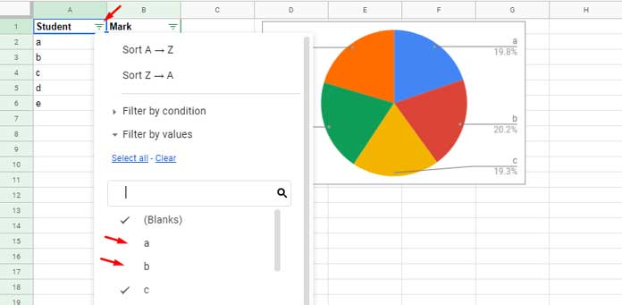
When you filter your data for the first time after creating the chart, you may see a notification at the bottom of your screen stating, “Data in filtered rows is excluded from the chart. You can change the setting in the chart editor.” This notification allows you to enable or disable the inclusion of filtered rows in the chart. However, the notification disappears after a few seconds, and filtered rows are eventually excluded from the chart.
Can I Re-enable the Notification or Use Another Method to Control Filtered Rows in Charts?
Yes! Below are two ways to manage filtered rows in charts.
Two Methods to Include Filtered Rows in a Chart in Google Sheets
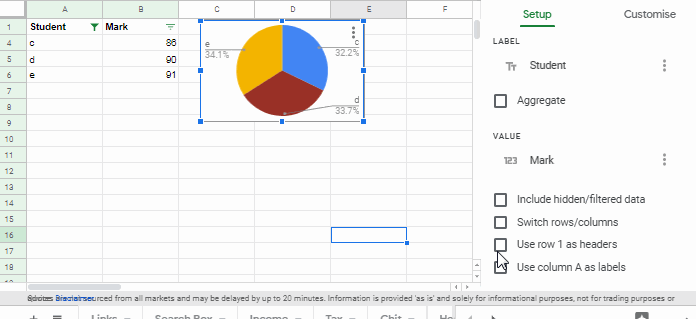
1. Include/Exclude Filtered Rows Using the Chart Editor Pane
This is the recommended method.
Step 1:
- Double-click on the chart to open the Chart Editor pane on the right-hand side of your screen.
Step 2:
- Scroll down to the bottom of the Setup tab.
Step 3:
- Enable the Include hidden/filtered data option.
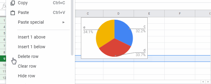
2. Re-enable the Notification to Control Filtered Data in Charts
I often follow this method as I find it convenient.
Assume your data is filtered and the chart has excluded the filtered rows. To re-enable the notification that allows you to control filtered rows, follow these steps:
Step 1:
- Assume your chart is in Sheet 1. Just navigate to Sheet 2, then return to Sheet 1.
Step 2:
- Right-click and hide any visible row in the chart source data in Sheet 1. The notification will reappear.
By following either of these methods, you can ensure that filtered rows remain included in your chart in Google Sheets.
More Chart Tips and Tricks:
- How to Get a Dynamic Range in Charts in Google Sheets
- Date Filter in Gantt Chart in Google Sheets
- Add a Legend Next to Series in Line or Column Charts in Google Sheets
- Floating Column Chart in Google Sheets – How To
- Bar or Column Chart with Red Colors for Negative Bars in Google Sheets
- How to Prepare Data for Charts in Google Sheets