


The only options that you may want to try with Sparkline Line chart will be the options to control line thickness and color. But in this post, I am detailing how to use all the Sparkline Line chart formula options in Google Sheets.
The reason is then you can easily understand a similar formula shared with you in a Sheet.
The purpose of Sparkline Line Graph is to quickly track changes over a short/long periods of time.
All Sparkline Line Chart Formula Options in Google Sheets
Syntax:
SPARKLINE(data, [options])First see a Sprakline Line graph formula with all the options included.
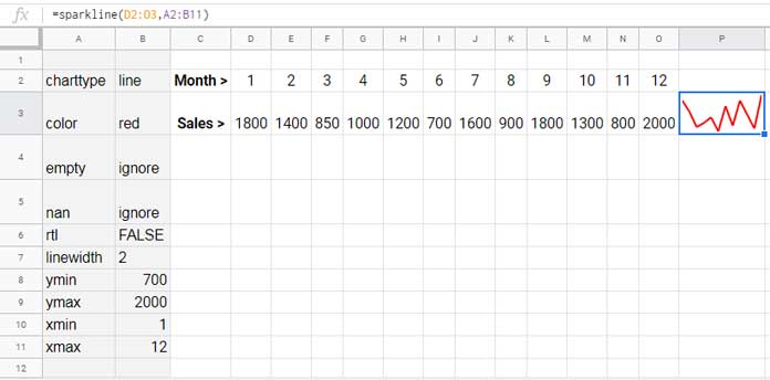
You can use either of the below two formulas with full options covered.
=sparkline(D2:O3,A2:B11)or;
=SPARKLINE(D2:O3,{"charttype","line";"color","red";"empty","ignore";"nan","ignore";"rtl",false;"linewidth",2;"xmin",1;"xmax",12;"ymin",min(D3:O3);"ymax",MAX(D3:O3)})In the first formula, the array A2:B11 contains all the Sparkline chart options.
The cool thing is that you will get the ‘same’ chart without including any options in the formula. No doubt, the color and line thickness will be different.
=sparkline(D2:O3)Color and Line Width Options in the Sparkline Line Graph
Here see the two (“line” and “linewidth”) Sparkline Line chart formula options that may come very useful. I don’t like the default color of Sparklines.
Formula:
=SPARKLINE(D2:O3,{"charttype","line";"color","red";"linewidth",3})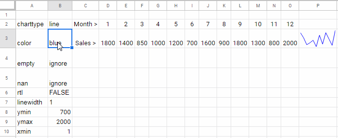
Options to Control Empty, Non Numeric Data in Sparkline Line Graph
You can use the Sparkline Line chart options “empty” and “nan” for this purpose.
The “empty” option supports the values “zero” and “ignore” while the “nan” supports “convert” and “ignore”. See how these options are going to make changes in a Line Sparkline Chart.
To understand the difference I am applying these two options in a different set of data.
“empty” option set to “zero” and “ignore”
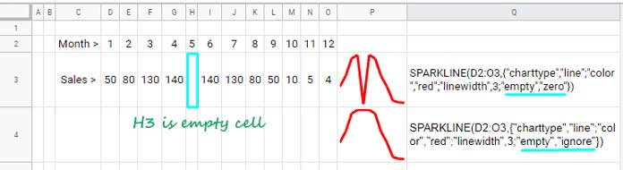
See the changes in the curve. There is a sudden fall in the first chart since the value in cell H3 is set to 0 in the formula.
In the second formula, there is nothing visible as the formula ignores the empty cell H3.
“nan” option set to “convert” and “ignore”
Assume instead of keeping the cell H3 as blank, you entered the string “Nil” in that cell. In such cases, you will get the same above Sparkline charts if you use “nan” options.
To get the first chart use this formula. Here converted the non-numeric value in cell H3 to 0.
=SPARKLINE(D2:O3,{"charttype","line";"color","red";"linewidth",3;"nan","convert"})To get the second chart, use the below formula. It ignores the cell H3.
=SPARKLINE(D2:O3,{"charttype","line";"color","red";"linewidth",3;"nan","ignore"})Draw the Line Graph from Right to Left (RTL)
Set the “
=SPARKLINE(D2:O3,{"charttype","line";"color","red";"linewidth",3;"rtl",true})“xmin”, “xmax”, “ymin”, and “ymax” Sparkline Line Chart Options
You can draw a line graph with or without using the x-axis using the Sparkline formula.
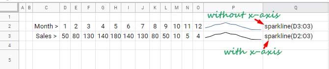
In the above examples, you can see that both the line graphs are the same albeit the second formula uses both the x and y-axis.
The difference, if you use x-axis you can set the “
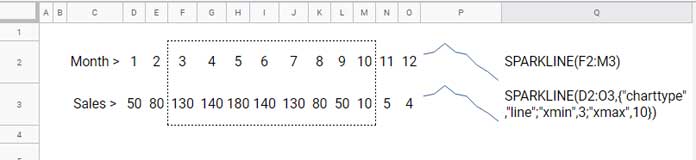
In the below data, the x-axis values are in the range D2
In the second formula in below example, I have used the range D2
The output is equal to the range F2:M3 that the first formula shows.
Normally we can find the “ymin” and “ymax” values using the MIN and MAX functions in the y-axis range.
=SPARKLINE(D2:O3,{"charttype","line";"ymin",min(D3:O3);"ymax",max(D3:O3)})That’s all about using Sparkline Line chart formula options in Google Sheets. Enjoy.