


")


")

")
")
 in Excel & Google Sheets")


Creating a Line Chart from Lap Times in Milliseconds is easy—if your data is properly formatted. In this tutorial, I’ll show you how to prepare your lap time data and plot a line chart in Google Sheets.
Before we begin, it’s important to understand a few key points. These tips apply not only to line charts but also to any chart where lap times in milliseconds are used, whether directly as a data series or in calculations.
Why Formatting Matters for Millisecond Lap Times
To successfully create a Line Chart from Lap Times in Milliseconds, you must ensure that your time values are in the correct format. Google Sheets expects time values to follow the HH:MM:SS.000 format (hours, minutes, seconds, milliseconds).
In most cases, lap times are entered in the MM:SS.000 format (without hours). While this might look correct, Google Sheets treats such entries as plain text—not as time values. Using the Format menu won’t fix this issue.
Instead, you can use a formula to reformat the lap times correctly. I’ve explained how to do this later in the post.
Note: This formatting approach works for all chart types that use milliseconds, including bar and column charts—not just line charts.
Data Formatting Is Crucial for Charting
When it comes to charting in Google Sheets, data formatting is just as important as chart selection. I’ve emphasized this in my earlier tutorial: How to Prepare Data for Charts in Google Sheets
In that guide, I mainly focused on the orientation and order of the data. In this post, I’ll go deeper into formatting the data series to help you plot a Line Chart from Lap Times in Milliseconds.
Fixing the Time Format for Lap Times
As mentioned earlier, entering lap times as MM:SS.000 will not work properly because Sheets interprets them as text. You need to convert them to the correct format: HH:MM:SS.000.
If your data currently looks like this:
02:35.456
01:58.789
You’ll need to prepend 00: to each value to make it valid:
00:02:35.456
00:01:58.789
To do this efficiently, use a formula. I’ve covered it in detail in this guide: How to Format Time to Millisecond Format in Google Sheets
Once the data is correctly formatted, your chart will display the lap times properly.
Steps to Create a Line Chart from Lap Times in Milliseconds
Step 1: Select the Data
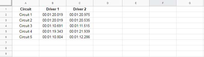
Assume your data is in the range A1:C6:
- Column A: Circuit numbers
- Column B: Lap times for Driver 1
- Column C: Lap times for Driver 2
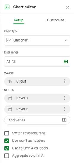
Step 2: Open the Chart Editor
- Go to Insert > Chart.
- In the Chart Editor, under the Setup tab, choose Line chart from the chart type options.
You can also choose Bar or Column charts if preferred, but this tutorial focuses on a Line Chart from Lap Times in Milliseconds.
Step 3: Adjust Setup Settings
Ensure the following settings in the Setup tab:
- X-axis: Circuit numbers (Column A)
- Series: Time data from Columns B and C
Google Sheets usually detects these settings automatically. If not, adjust them manually.
Step 4: View the Finished Chart
Your Line Chart from Lap Times in Milliseconds should now look something like this:
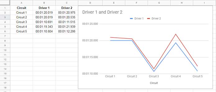
The line chart will clearly show how each driver performed across different circuits, with time values displayed accurately on the vertical axis.
More Charting Tips for Google Sheets
If you found this helpful, check out some of my other chart-related tutorials:
Hiya, nice post thank you. Can you help, my charts lose the info when shared or published and can’t chart the lap times in data studio either?
Many thanks