


")


")

")
")
 in Excel & Google Sheets")


In a Google Sheets Organizational Chart, you can use one more column besides the ID and Parent columns. That means you can add a third column that contains additional notes to show as tooltips on the chart. Let’s see how to add tooltips to Org Chart in Google Sheets easily.
In Organization Charts, tooltips are the messages that appear when you point your cursor over a box (node) on the chart.
To view the tooltip, the chart must be active (selected) in the Sheet. Simply click on the chart to make it the actively selected one. Then, you can point your mouse over a node to see the tooltip if available.
As an example, I am going to plot a hierarchical Org Chart in Google Sheets that contains tooltips. But before learning how to add tooltips to Org Chart in Google Sheets, you should know the benefit of adding them.
How Tooltips Are Useful in Org Charts
By adding tooltips to Org Charts in Google Sheets, you can visualize employee names and hierarchy in a single chart, as shown below. You can also use tooltips to display additional information about employees, such as their joining dates, departments, addresses, and more.
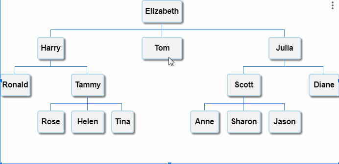
How to Plot Employee Names and Hierarchy in a Single Org Chart
Prepare Data to Add Tooltips to Org Chart in Google Sheets
When creating charts, the formatting of chart data plays a crucial role. I have a detailed tutorial on data formatting for charts in Google Sheets here — How to Prepare Data for Charts in Google Sheets.
In that guide, I’ve explained how to format your data to plot an Org Chart in Google Sheets. However, it doesn’t cover how to add tooltips. So, I’m addressing that part below.
Three-Column Data Formatting for Org Chart
Sample Data:
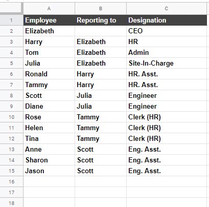
You’ll need three columns in your source data:
- First column: Contains unique employee names (ID).
- Second column: Contains the names of the managers or supervisors (Parent).
- Third column: Contains notes you want to display as tooltips.
If you’ve prepared your data like this, plotting an organizational chart with tooltips becomes child’s play! I’m not exaggerating. Just follow these simple steps.
Steps to Add Tooltips to Organizational Chart
- Select the range A2:C15 (based on the sample data).
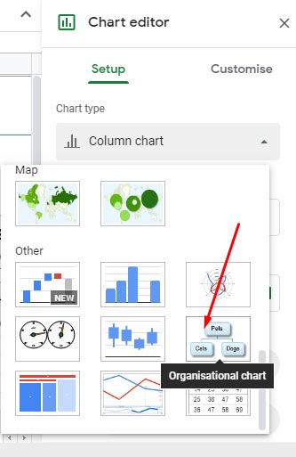
- Click on the menu Insert > Chart.
- In the Chart Editor, choose Organizational Chart.
That’s it! Your Org Chart with tooltips is ready.
Please note that Google Sheets doesn’t offer much customization for Organizational Charts, like changing background colors, font colors, or font sizes. So, you’ll need to stick with the default settings.
To help you practice, I’m sharing the link to my example Sheet below.
Common Issues When Adding Tooltips
If your tooltips are not showing up, here are a few things to check:
- Chart Selection: Make sure the chart is actively selected when hovering over a node.
- Data Formatting: Ensure the third column actually contains text. Blank entries won’t show a tooltip.
- Column Order: The ID must be in the first column, Parent in the second, and Tooltip notes in the third — exactly in that order.
- Chart Type: Confirm that you have selected an Organizational Chart, not any other chart type.
Following these will make sure your tooltips appear correctly.
Limitations of Tooltips in Google Sheets Org Charts
Before you rely heavily on tooltips, keep these limitations in mind:
- Limited Formatting: You can’t customize the appearance of tooltips (no bold text, line breaks, or links).
- Tooltip Length: Very long tooltips might not display fully when hovering.
- No Static Display: Tooltips only show when hovering; you can’t make them always visible.
Still, despite these limitations, adding tooltips is a very handy way to provide extra information without cluttering your Org Chart.