


")


")

")
")
 in Excel & Google Sheets")


In Google Sheets, charts don’t offer a built-in option to hide or exclude x-axis labels when the corresponding y-axis values are 0 or blank. This can make your charts look cluttered or misleading—especially when visualizing clean, meaningful data.
Thankfully, there are a few workarounds that help you exclude x-axis labels if y-axis values are 0 or blank in Google Sheets charts. In this guide, I’ll walk you through three practical methods:
- Using the Filter menu
- Using a Slicer (recommended)
- Using the QUERY function
When Would You Need This?
Say you have a chart showing daily sales volume, and some days—like weekends or holidays—have 0 sales or no data at all. Instead of displaying all dates on the x-axis regardless of activity, you’d prefer to hide those inactive days to keep the chart cleaner and more focused.
Method 1: Manually Hide Rows (Quick but Not Recommended)
The most basic way to exclude x-axis labels tied to blank or zero values is by manually hiding the rows in your dataset. This works with most chart types (Line, Column, Pie, Candlestick, etc.).

Limitations:
- Time-consuming if your dataset is large.
- Easy to accidentally hide rows you didn’t mean to.
- Doesn’t scale well with dynamic data.
I suggest skipping this method if you’re looking for something reliable and scalable. Instead, try the next three.
Method 2: Use the Filter Menu to Hide 0 or Blank Y-Axis Values
This is a quick and user-friendly way to hide x-axis labels based on their y-values.
Steps:
- Select your range, including some extra blank rows if you expect future entries (e.g.,
A2:B17even if data is only up toB9). - Go to Data > Create a filter.
- In the filter icon for your Y-axis column (e.g., “Volume”), click the dropdown and deselect both “Blanks” and “0” — or just one of them, depending on whether you want to hide empty cells, zero values, or both.
- Click OK.

Now your chart will exclude x-axis labels where the y-axis values are 0 or blank.
Pros:
- Easy to set up.
- Works even if the chart is moved to its own sheet.
Cons:
- You’ll need to reapply the filter after editing or adding rows with 0 or blank values—just open the filter dropdown and click OK to refresh it.
Method 3: Use a Slicer to Exclude X-Axis Labels (Recommended)
A Slicer is a floating filter that gives you control over what data appears in your chart—without modifying your original dataset.
Keep your data in one sheet (e.g., “Sheet1”) and your chart and slicer in another (e.g., “Sheet2”).
Why Use a Separate Sheet for Slicers?
When the chart and slicer are on the same sheet as the source data, applying slicer filters can also hide rows in the data, which makes it harder to edit or maintain.
By moving the chart and slicer to a separate sheet:
- Your original data remains untouched and fully visible.
- The slicer filters apply only to the chart, not to the source data.
Steps:
1. Copy your chart from Sheet1 and paste it into Sheet2.
2. In Sheet2, go to Data > Add a slicer.
3. In the Slicer settings:
- Set the data range to match your source.
- Choose your y-axis column (e.g., “Volume”).
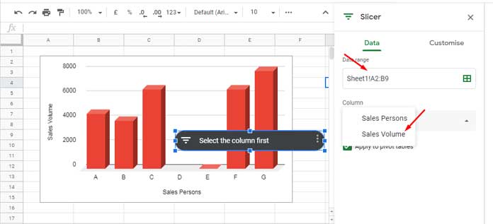
4. On the slicer, uncheck ‘Blanks’ and ‘0’.
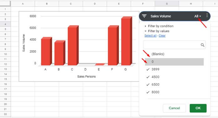
Your chart will now update dynamically to exclude x-axis labels with 0 or blank y-values.
Pros:
- Cleaner control: filters only apply to the chart, not your data.
- Easier to maintain over time.
Cons:
- The slicer won’t work if you move the chart to its own sheet using the “Move to own sheet” option (from the chart’s three-dot menu).
- If you update the source data and add new rows with 0 or blank values, the slicer won’t automatically filter them out. You’ll need to open the slicer dropdown and simply click OK again to refresh the filter and exclude the new values.
Method 4: Use the QUERY Function to Filter Chart Data
If you prefer a formula-based solution, use the QUERY function to create a filtered version of your data and base your chart on that.
Example:
=QUERY(Sheet1!A2:B, "SELECT A, B WHERE B > 0", 1)This excludes any row where the y-axis value (column B) is 0 or blank.
Pros:
- Fully automated once set up.
- Keeps your main dataset untouched.
Cons:
- You’re creating a new data range just for the chart.
Conclusion
Google Sheets doesn’t give you an out-of-the-box way to hide x-axis labels based on y-values, but with a little creativity, it’s absolutely possible.
If you’re looking for a quick fix, the Filter menu might be enough. But if you want a more reliable and dynamic setup, I recommend using a Slicer or a QUERY-based solution.
Related Tutorials
- Choosing a Suitable Chart Type for Your Data in Google Sheets
- How to Get Dynamic Range in Charts in Google Sheets
- How to Prepare Data for Charts in Google Sheets
- How to Change Data Point Colors in Charts in Google Sheets
- How to Include Filtered Rows in a Chart in Google Sheets
- Reducing the Width of Columns in Column Charts in Google Sheets
- Enabling the Horizontal Axis (Vertical) Gridlines in Charts in Google Sheets
- Adding a Custom Formula in a Slicer for a Chart in Google Sheets