


")


")

")
")
 in Excel & Google Sheets")


Google Sheets doesn’t offer a built-in option to create a clustered stacked column chart, but with a few smart workarounds, it can be done. That said, there is no one-size-fits-all method. The best approach depends entirely on:
- The structure of your data
- The message you want to convey
- The layout you want to achieve
To help you adapt to different scenarios, we’ll walk through two carefully chosen examples that show how to create variations of clustered stacked column charts in Google Sheets.
Example 1: Combine a Regular Column with a Stacked Column in Google Sheets
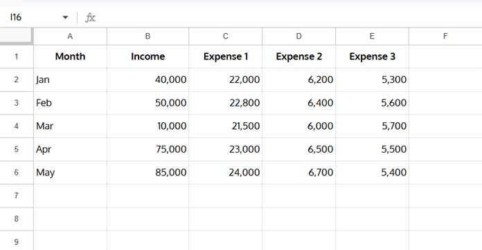
Let’s consider the following monthly data, which shows total income and a breakdown of expenses across three categories.
Sample Data
You can use this layout to create:
- A regular column for Income
- A stacked column for the three expense categories
This chart type is ideal for comparing revenue vs. total operating costs broken down by category. For example, it allows you to show:
- Monthly income beside a stacked view of where that money was spent
- A clear contrast between incoming and outgoing funds
- Whether income exceeds total expenses, and where most costs are concentrated
Method 1: Without Modifying the Source Data
This approach allows you to create a visually combined chart — but with limited control over the order of the columns.
Chart Creation Steps:
- Select the range A1:E — even though the actual data ends at row 6, this ensures future entries in the Month, Income, and Expense columns are automatically included in the chart.
- Go to Insert > Chart.
- In the Chart Editor, change the chart type to Stacked Column Chart.
- Go to the Customize tab > Series, then select the Income series.
- Under “Axis”, set it to Right Axis.
- Adjust the axis scales for better comparison:
- Look at the left and right vertical axes on the chart.
- Identify which axis has the smaller maximum value (usually the stacked Expenses).
- Go to Customize > Vertical Axis (or Right Vertical Axis) and set the Min and Max values to match or align with the other axis.
- This ensures both Income and Expenses are scaled proportionally, improving readability and accuracy.
This creates a chart where Income appears as a standalone column beside a stacked column of Expenses, grouped by month.
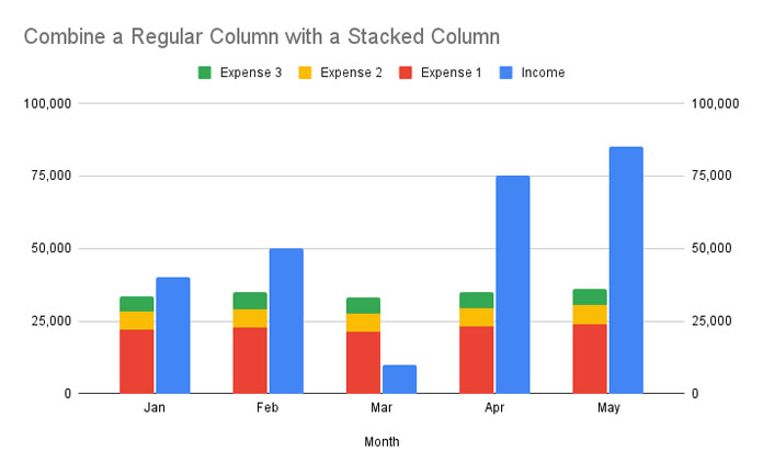
Can You Reorder the Columns (Move Income to the Left)?
No — this method doesn’t allow you to control the order of the columns. If you want Income to appear before the stacked Expenses, use Method 2.
Method 2: Modifying the Source Data
This method gives you control over the column order within each group — for instance, showing Income first, followed by stacked Expenses.
Adjusted Data Layout
To achieve this layout:
- Insert two empty rows below each month.
- Move the values for Expense 1, 2, and 3 into the first empty row.
- Enter 0s in those columns in the second empty row.
This creates spacing between each month and positions the standalone Income column before the stacked columns.

Chart Creation Steps
- Select the adjusted range
A1:E. - Go to Insert > Chart.
- In the Chart Editor, set the chart type to Stacked Column Chart.
Result:
You now have a clustered chart where Income appears first, followed by a stacked column of Expenses, grouped by month.
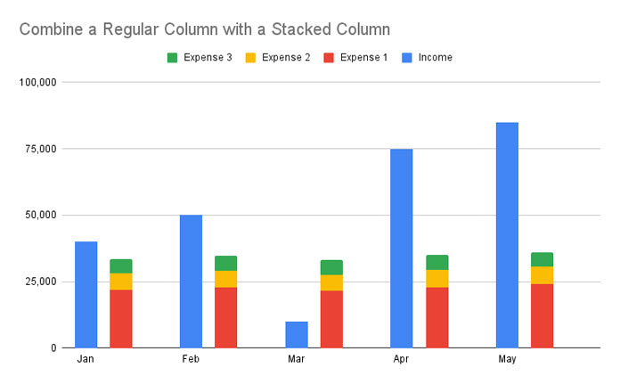
This layout is perfect for dashboards or reports where you want to:
- Compare monthly income directly with total expenses
- Show a high-level financial metric (Income) next to its detailed breakdown (Expenses)
- Make it clear if revenue is outpacing or lagging behind costs, and which categories are driving those costs
Example 2: Create a Clustered Stacked Column Chart in Google Sheets
Let’s say you want to compare Mandarin and Orange production across three countries from 2020 to 2024.
Sample Data
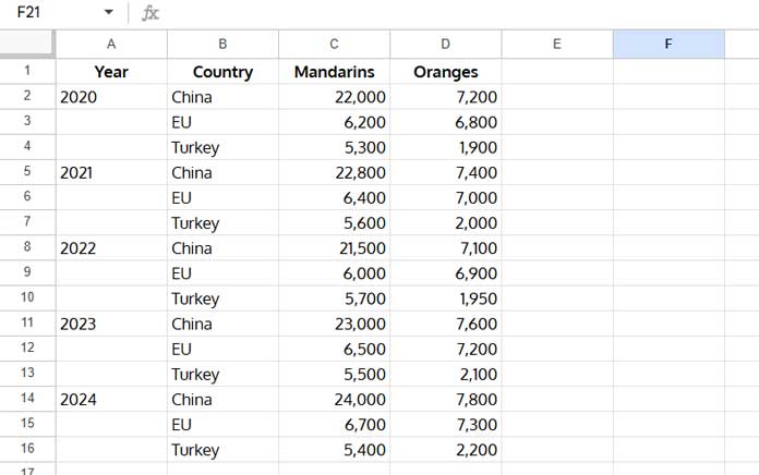
Chart Creation Steps
- Insert an empty row above each new year (except the first one).
- In the rows you inserted, enter 0 for both Mandarins and Oranges. This acts as a visual separator for each year.
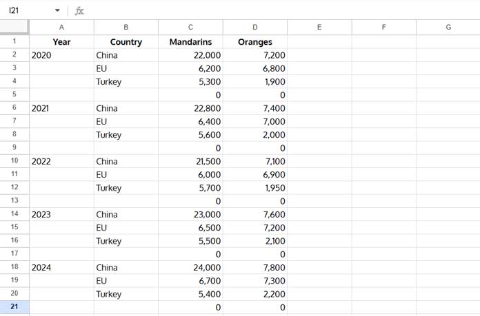
- Select the range
B1:D. - Insert a Stacked Column Chart.
- In the Chart Editor, click the three-dot menu on the X-axis and choose Add labels.
- Google Sheets may automatically guess and assign a label range.
- If it does, click on the suggested range, then change it to
A1:Ato ensure the year labels are accurate and aligned with your chart data.
- Click OK.
You now have a proper clustered stacked column chart in Google Sheets.

This type of chart is perfect for comparing different categories within groups over time. For example, visualizing how two different product lines (e.g., Mandarins and Oranges) perform in each region year after year helps in regional performance reviews, trend analysis, and forecasting.
Sample Sheet
Use this sample Google Sheet to try the examples yourself.
Resources
- Creating a Gantt Chart with Stacked Bar Chart in Google Sheets
- How to Create a Column Chart in Google Sheets
- Get a Target Line Across a Column Chart in Google Sheets
- Google Sheets Bar or Column Chart with Red Negative Bars
- How to Create a Floating Column Chart in Google Sheets (Step-by-Step)
- How to Add Legend Next to Series in Line and Column Charts in Google Sheets
- Reducing the Width of Columns in Column Charts in Google Sheets
- Google Sheets Bar and Column Chart with Target Coloring
- How to Create a Multi-category Chart in Google Sheets