


")


Do you need to track whether your data points fall within or outside the limits and their current position in Google Sheets? In this tutorial, you will get a formula and instructions to plot a bar with four colors:
The colors will be red, green, and red, denoting below the lower limit, within the required range, and above the higher limit, respectively. In this bar, there will be a black hairline that denotes the current position.
In Google Sheets, there is no specific chart to visually track where your data falls within limits. So, we will use the SPARKLINE function, which helps us create tiny in-cell charts in Google Sheets.
You will find this chart useful in many scenarios, such as:
- Health Monitoring: Visually track whether your current BMI score is within limits. Red denotes underweight, green denotes normal, and another red section denotes overweight. The black hairline indicates the actual BMI score on the bar.
- Sales Targets: Evaluate sales performance relative to targets. Green shows targets met, while red indicates shortfalls or surpluses.
- Financial Analysis: Track expenses against budgeted amounts. Green indicates within budget, while red indicates under or overspending.
- Quality Control: Assess product measurements against quality standards. Green denotes acceptable measurements, and red indicates deviations.
- Salary Range Penetration: Visualize where a person’s salary falls within a pay range.
This bar chart is useful in many scenarios to visually track data points within defined limits.
Data Formatting
You need the minimum value, maximum value, and actual value to visually track where your data (actual value) falls within the range defined by the minimum and maximum values.
Arrange your data in the following order:
- Description in Column A
- Actual value in Column B
- Minimum value in Column C
- Maximum value in Column D
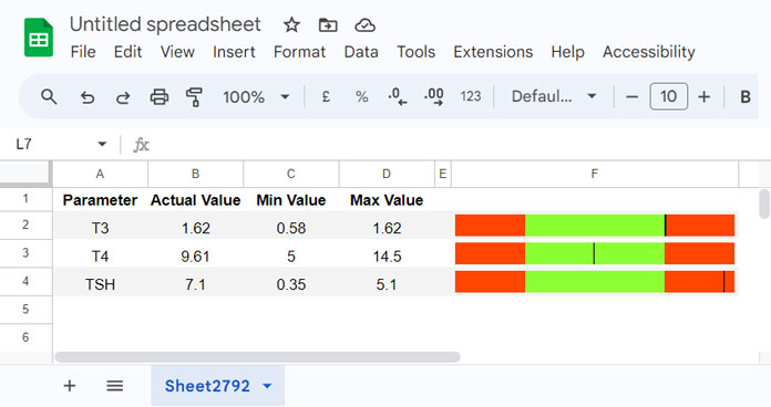
Assume the actual value is 0.67 in cell B2, the minimum value is 0.58 in cell C2, and the maximum value is 1.62 in cell D2.
Track Data Limits with Sparklines (Google Sheets)
Based on the sample data provided above, you can use the following formula in cell F2 to create a SPARKLINE bar that visually represents your actual data within or outside specified limits:
=LET(actual, ROUND((B2-C2)/(D2-C2)*100), ll, 50, ml, 100+ll, hl, ml+ll, cl, IFNA(XMATCH(actual, SEQUENCE(hl, 1, UMINUS(ll))), 9^9), x, WRAPROWS(IF(ISBETWEEN(cl, 0, ll), HSTACK(cl-1, 1, ll-cl), ll), 3), y, WRAPROWS(IF(ISBETWEEN(cl, ll+1, ml), HSTACK(cl-(ll+1), 1, ml-cl), ml-ll), 3), z, WRAPROWS(IF(ISBETWEEN(cl, ml+1, hl), HSTACK(cl-(ml+1), 1, hl-cl), hl-ml), 3), dps, TOCOL(VSTACK(x, y, z)), clrs, VSTACK("#FF4500", "black", "#FF4500", "#8cff32", "black", "#8cff32", "#FF4500", "black", "#FF4500"), SPARKLINE(FILTER(dps, dps), {"charttype", "bar"; INDEX("color"&SEQUENCE(COUNTIF(dps, ">0"))), FILTER(clrs, dps); "min", 0; "max", hl}))Where:
- B2: actual value
- C2: min value
- D2: max value
Replace B2, C2, and D2 with the corresponding cell references in your sheet.
If you don’t see the black hairline, it means the actual data spans significantly below or above the expected range.
The bar area is currently set to a 1 : 2 : 1 ratio. If your data spans much below or above the expected range, adjust the ll variable in the formula to 75 (or a higher value) to achieve a 3 : 4 : 3 ratio. It’s currently set to 50.
Note that the size of the SPARKLINE bar adjusts based on the width and height of the cell. If you prefer not to increase the column width, you can merge adjoining columns.
Template for Tracking Data Limits with Sparklines: Usage Instructions
If you prefer to use my template, you can preview and copy it from the link below.
The template utilizes a Google Sheets table formatted as described in the example above, with columns A to D containing description, actual value, min value, and max value.
The formula is located in cell E2 and uses structured table references, automatically expanding to accommodate all rows in the table.
Currently, it includes data in three rows other than the header row. You can delete the second and third rows, but retain the first row as it contains the formula.
To add new rows, click the “Add” link at the bottom of the sheet. No changes are needed to the formula as it adjusts automatically for newly added rows.
The only adjustment you might consider in the formula is changing the value of the ll variable from 50, as mentioned earlier.
This template is freely available for use to visually track where your data falls within the specified range (limits) in Google Sheets. Refer to the sheet for additional user instructions.