


")


")

")
")
 in Excel & Google Sheets")


Most users customize only the color and line width in Sparkline Line charts. But there are more options available. In this guide, I’ll show you how to use all the Sparkline Line Chart Options in Google Sheets—so you can better understand and modify advanced formulas when you come across them.
What Is a Sparkline Line Chart?
A Sparkline Line chart is a mini line graph in a single cell that helps you quickly visualize changes over time. It’s ideal for tracking trends without using a full chart.
All Available Sparkline Line Chart Formula Options
Syntax
SPARKLINE(data, [options])Here’s a full example that includes all the line chart options:
=SPARKLINE(D2:O3, A2:B11)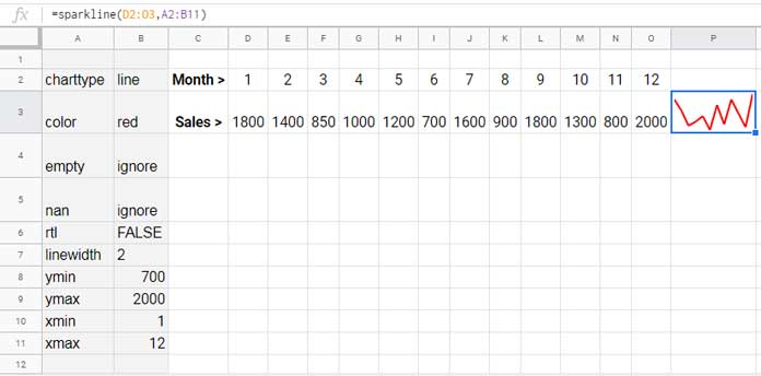
Or using inline parameters:
=SPARKLINE(D2:O3, {
  "charttype","line";
  "color","red";
  "empty","ignore";
  "nan","ignore";
  "rtl",false;
  "linewidth",2;
  "xmin",1;
  "xmax",12;
  "ymin",MIN(D3:O3);
  "ymax",MAX(D3:O3)
})
You can also skip options entirely:
=SPARKLINE(D2:O3)The chart still works—just with default settings.
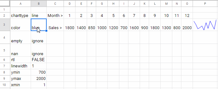
1. Color and Line Width Options
To change the line color and thickness, use the "color" and "linewidth" options:
=SPARKLINE(D2:O3, {
  "charttype","line";
  "color","red";
  "linewidth",3
})
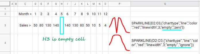
2. Handling Empty and Non-Numeric Values
Use the "empty" and "nan" options to control how Sparkline treats missing or invalid data.
“empty” Option
=SPARKLINE(D2:O3, {"charttype","line";"color","red";"linewidth",3;"empty","zero"})
=SPARKLINE(D2:O3, {"charttype","line";"color","red";"linewidth",3;"empty","ignore"})- “zero”: treats empty cells as 0.
- “ignore”: skips empty cells.
“nan” Option
If a cell contains non-numeric text like "Nil":
=SPARKLINE(D2:O3, {"charttype","line";"color","red";"linewidth",3;"nan","convert"})
=SPARKLINE(D2:O3, {"charttype","line";"color","red";"linewidth",3;"nan","ignore"})- “convert”: converts text to 0.
- “ignore”: ignores it completely.
3. Draw the Line from Right to Left (RTL)
Use "rtl" to reverse the direction of the chart:
=SPARKLINE(D2:O3, {"charttype","line";"color","red";"linewidth",3;"rtl",true})4. Set Axis Limits: "xmin", "xmax", "ymin", "ymax"
Sparkline auto-detects y-axis bounds, but you can define them:
=SPARKLINE(D3:O3, {"charttype","line";"ymin",MIN(D3:O3);"ymax",MAX(D3:O3)})Set X-Axis Min/Max
You can use "xmin" and "xmax" to filter the x-values only if you provide an explicit x-axis row. If you omit the x-axis, these settings won’t filter the data—they’ll have no visible effect on the chart.
To demonstrate, I’ll use virtual arrays created with HSTACK and VSTACK functions instead of real cell ranges.

Example 1:
=SPARKLINE(VSTACK(HSTACK(1, 2, 3, 4, 5, 6, 7), HSTACK(10, 20, 15, 25, 12, 30, 18)),
 {"charttype","line";"xmin",2;"xmax",6})
Here, the first row represents the x-axis values:{1, 2, 3, 4, 5, 6, 7}
The second row is the y-values:{10, 20, 15, 25, 12, 30, 18}
Since "xmin" is 2 and "xmax" is 6, only the y-values corresponding to x = 2 through x = 6 are plotted:{20, 15, 25, 12, 30}
Example 2:
=SPARKLINE(HSTACK(20, 15, 25, 12, 30), {"charttype","line"})This uses just those same five y-values directly, without an x-axis.
Note: When "xmin" and "xmax" are used with an explicit x-axis, Sparkline filters the y-values that fall within that x-range. It does not affect the axis scale alone—it determines which data points are drawn.
Related Line Chart Tutorials
- Make a Vertical Line Graph in Google Sheets (Workaround)
- Automate Multi-Colored Line Charts in Google Sheets
- Plot a Line Chart Using Lap Times in Milliseconds
- Add a Legend Next to Series in Google Sheets
- Create a Shaded Target Range in a Line Chart
- Add a Vertical Line to a Line Chart in Google Sheets